CSS place-content属性是align-content和justify-content属性的简写。 CSS中的简写属性意味着您可以在单个属性中设置多个属性值。在此,place-content属性可以保存align-content和justify-content属性值。
用法:
place-content:align-content-property-value justify-content-property-value
属性值:该属性接受align-content和justify-content属性值可以产生的所有可能的组合值。
- start:此属性用于从容器的开头对齐弹性项目。
- end:此属性用于从容器的末端对齐弹性项目。
- flex-start:此属性在flex容器的开头显示行。
- flex-end:此属性在flex容器的末尾显示柔性线。
- center:此属性将弹性项目在容器的中心对齐。
- space-around:此属性在伸缩线周围平均分配空间。
- space-between:此属性以相等的间距分布柔性线空间。
- space-evenly:此属性定义位置,它们之间具有相等的间距,但距角的间距不同。
- stretch:此属性定义拉伸的线以占用flex容器的剩余空间。它是默认值。
以下示例说明了CSS place-content属性:
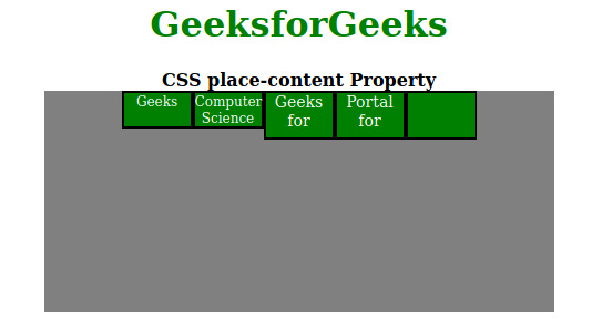
范例1:在此示例中,我们将使用以下place-content属性值:flex-start中心。
HTML
<!DOCTYPE html>
<html>
    <head>
        <title>CSS place-content Property</title>
        <style>
            h1 {
                color:green;
            }
            #container {
                display:flex;
                height:200px;
                width:460px;
                flex-wrap:wrap;
                background-color:gray;
                /* Setting property values */
                place-content:flex-start center;
            }

            div > div {
                border:2px solid black;
                width:60px;
                background-color:green;
                color:white;
            }

            .short {
                font-size:12px;
                height:30px;
            }

            .tall {
                font-size:14px;
                height:40px;
            }
        </style>
    </head>
    <body>
        <center>
            <h1>GeeksforGeeks</h1>
            <b>CSS place-content Property</b>
            <div id="container">
                <div class="short">Geeks</div>
                <div class="short">
                    Computer<br />
                    Science
                </div>
                <div class="tall">
                    Geeks<br />
                    for
                </div>
                <div class="tall">
                    Portal<br />
                    for
                </div>
                <div class="tall"></div>
            </div>
        </center>
    </body>
</html>
输出:
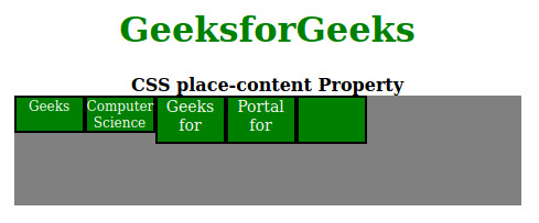
范例2:在这里,我们将使用place-content:flex-start起始属性值。
HTML
<!DOCTYPE html>
<html>
    <head>
        <title>CSS place-content Property</title>
        <style>
            h1 {
                color:green;
            }
            #container {
                display:flex;
                height:100px;
                width:460px;
                flex-wrap:wrap;
                background-color:gray;

                /* place-content can be changed
                   in the live sample */
                place-content:flex-start start;
            }

            div > div {
                border:2px solid black;
                width:60px;
                background-color:green;
                color:white;
            }

            .short {
                font-size:12px;
                height:30px;
            }

            .tall {
                font-size:14px;
                height:40px;
            }
        </style>
    </head>

    <body>
        <center>
            <h1>GeeksforGeeks</h1>
            <b>CSS place-content Property</b>
            <div id="container">
                <div class="short">Geeks</div>
                <div class="short">
                    Computer<br />
                    Science
                </div>
                <div class="tall">
                    Geeks<br />
                    for
                </div>
                <div class="tall">
                    Portal<br />
                    for
                </div>
                <div class="tall"></div>
            </div>
        </center>
    </body>
</html>
输出:
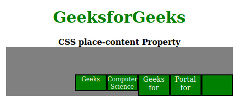
范例3:在这里,我们将使用place-content:flex-end结束属性值。
HTML
<!DOCTYPE html>
<html>
    <head>
        <title>CSS place-content Property</title>
        <style>
            h1 {
                color:green;
            }
            #container {
                display:flex;
                height:100px;
                width:460px;
                flex-wrap:wrap;
                background-color:gray;

                /* place-content can be
                  changed in the live sample */
                place-content:flex-end end;
            }

            div > div {
                border:2px solid black;
                width:60px;
                background-color:green;
                color:white;
            }

            .short {
                font-size:12px;
                height:30px;
            }

            .tall {
                font-size:14px;
                height:40px;
            }
        </style>
    </head>
    <body>
        <center>
            <h1>GeeksforGeeks</h1>
            <b>CSS place-content Property</b>
            <div id="container">
                <div class="short">Geeks</div>
                <div class="short">
                    Computer<br />
                    Science
                </div>
                <div class="tall">
                    Geeks<br />
                    for
                </div>
                <div class="tall">
                    Portal<br />
                    for
                </div>
                <div class="tall"></div>
            </div>
        </center>
    </body>
</html>
输出:
支持的浏览器:
- Firefox(最佳支持)
- Chrome
- Safari
- Opera
- Edge
相关用法
- CSS transition-property用法及代码示例
- CSS table-layout用法及代码示例
- CSS text-align用法及代码示例
- CSS border-top-width用法及代码示例
- CSS isolation属性用法及代码示例
- CSS border-inline-start-style属性用法及代码示例
- CSS column-rule-width用法及代码示例
- CSS word-spacing用法及代码示例
- CSS animation-delay用法及代码示例
- CSS margin-top用法及代码示例
- CSS grid属性用法及代码示例
- CSS font-size-adjust用法及代码示例
- CSS visibility属性用法及代码示例
- CSS grid-template-columns用法及代码示例
- CSS height属性用法及代码示例
- CSS transform-origin用法及代码示例
- CSS animation-name用法及代码示例
- CSS flex-wrap用法及代码示例
- CSS align-content用法及代码示例
- CSS page-break-before属性用法及代码示例
- CSS empty-cells用法及代码示例
注:本文由纯净天空筛选整理自skyridetim大神的英文原创作品 CSS place-content Property。非经特殊声明,原始代码版权归原作者所有,本译文未经允许或授权,请勿转载或复制。