CSS的overflow-y属性指定内容在其超出块级元素的顶部和底部边时的行为。根据分配给overflow-y属性的值,可以剪切,隐藏内容或相应地显示滚动条。
用法:
overflow-y:scroll | hidden | visible | auto
属性值:
-
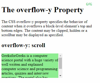
Scroll:如果分配给该属性的值为“scroll”,则内容将被裁剪以适合元素,浏览器将显示滚动条以帮助滚动溢出的内容。滚动条将被添加,而不管剪辑的内容如何。
例:
<!DOCTYPE html> <html> <head> <title> CSS overflow-y Property </title> <style> .content { background-color:lightgreen; height:100px; width:250px; overflow-y:scroll; } </style> </head> <body> <h1>The overflow-y Property</h1> <!-- Below paragraph doesnot have a fixed width or height and has no overflow set. So, it will just take up the complete width of it's parent to fit the content --> <p> The CSS overflow-y property specifies the behavior of content when it overflows a block-level element’s top and bottom edges. The content may be clipped, hidden or a scrollbar may be displayed as specified. </p> <h2>overflow-y:scroll</h2> <!-- Below div element has fixed height and width and thus overflow may occur. --> <div class="content"> GeeksforGeeks is a computer science portal with a huge variety of well written and explained computer science and programming articles,quizzes and interview questions. The portal also has dedicated GATE preparation and competitive programming sections. </div> </body> </html>输出:

-
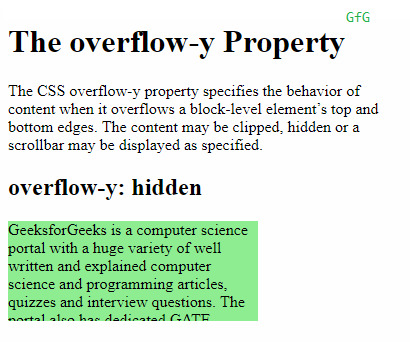
Hidden:将“hidden”分配为属性值时,内容将被裁剪以适合元素。没有提供滚动条,并且内容被隐藏。
例:
<!DOCTYPE html> <html> <head> <title> CSS overflow-y Property </title> <style> .content { background-color:lightgreen; height:100px; width:250px; overflow-y:hidden; } </style> </head> <body> <h1>The overflow-y Property</h1> <!-- Below paragraph doesnot have a fixed width or height and has no overflow set. So, it will just take up the complete width of it's parent to fit the content --> <p> The CSS overflow-y property specifies the behavior of content when it overflows a block-level element’s top and bottom edges. The content may be clipped, hidden or a scrollbar may be displayed as specified. </p> <h2>overflow-y:scroll</h2> <!-- Below div element has fixed height and width and thus overflow may occur. --> <div class="content"> GeeksforGeeks is a computer science portal with a huge variety of well written and explained computer science and programming articles,quizzes and interview questions. The portal also has dedicated GATE preparation and competitive programming sections. </div> </body> </html>输出:

-
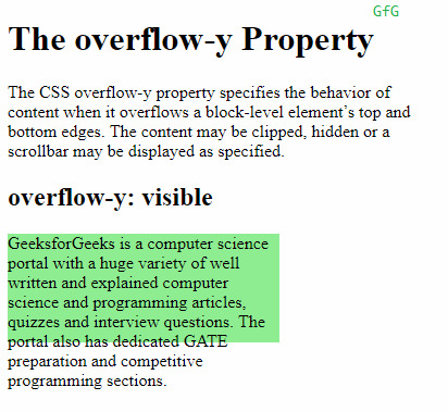
Visible:如果分配给“overflow-y”属性的值为“visible”,则内容不会被裁剪,并且可能溢出到包含元素的顶部或底部。
Example:<!DOCTYPE html> <html> <head> <title> CSS overflow-y Property </title> <style> .content { background-color:lightgreen; height:100px; width:250px; overflow-y:visible; } </style> </head> <body> <h1>The overflow-y Property</h1> <!-- Below paragraph doesnot have a fixed width or height and has no overflow set. So, it will just take up the complete width of it's parent to fit the content --> <p> The CSS overflow-y property specifies the behavior of content when it overflows a block-level element’s top and bottom edges. The content may be clipped, hidden or a scrollbar may be displayed as specified. </p> <h2>overflow-y:scroll</h2> <!-- Below div element has fixed height and width and thus overflow may occur. --> <div class="content"> GeeksforGeeks is a computer science portal with a huge variety of well written and explained computer science and programming articles,quizzes and interview questions. The portal also has dedicated GATE preparation and competitive programming sections. </div> </body> </html>输出:

-
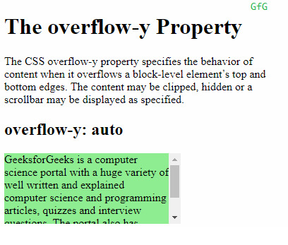
Auto:auto的行为取决于内容,并且滚动条仅在内容溢出时才添加,这与滚动条不同。
scroll滚动条被添加到的值,而不管溢出。例:
<!DOCTYPE html> <html> <head> <title> CSS overflow-y Property </title> <style> .content { background-color:lightgreen; height:100px; width:250px; overflow-y:auto; } </style> </head> <body> <h1>The overflow-y Property</h1> <!-- Below paragraph doesnot have a fixed width or height and has no overflow set. So, it will just take up the complete width of it's parent to fit the content --> <p> The CSS overflow-y property specifies the behavior of content when it overflows a block-level element’s top and bottom edges. The content may be clipped, hidden or a scrollbar may be displayed as specified. </p> <h2>overflow-y:scroll</h2> <!-- Below div element has fixed height and width and thus overflow may occur. --> <div class="content"> GeeksforGeeks is a computer science portal with a huge variety of well written and explained computer science and programming articles,quizzes and interview questions. The portal also has dedicated GATE preparation and competitive programming sections. </div> </body> </html>输出:

支持的浏览器:下面列出了overflow-y属性支持的浏览器:
- Chrome
- IE浏览器
- Firefox
- Opera
- Safari
相关用法
- HTML Style overflowY用法及代码示例
- CSS transition-property用法及代码示例
- CSS table-layout用法及代码示例
- CSS text-align用法及代码示例
- CSS border-top-width用法及代码示例
- CSS isolation属性用法及代码示例
- CSS border-inline-start-style属性用法及代码示例
- CSS column-rule-width用法及代码示例
- CSS word-spacing用法及代码示例
- CSS animation-delay用法及代码示例
- CSS margin-top用法及代码示例
- CSS grid属性用法及代码示例
- CSS font-size-adjust用法及代码示例
- CSS visibility属性用法及代码示例
- CSS grid-template-columns用法及代码示例
- CSS height属性用法及代码示例
- CSS transform-origin用法及代码示例
- CSS animation-name用法及代码示例
- CSS flex-wrap用法及代码示例
- CSS align-content用法及代码示例
- CSS page-break-before属性用法及代码示例
注:本文由纯净天空筛选整理自sayantanm19大神的英文原创作品 CSS overflow-y Property。非经特殊声明,原始代码版权归原作者所有,本译文未经允许或授权,请勿转载或复制。
