元素的CSS mix-blend-mode属性用于指定元素背景与元素父元素的混合。
用法:
 mix-blend-mode:normal | multiply | exclusion
            | overlay | lighten | darken
            | color-dodge | color-burn
            | hard-light | soft-light
            | difference | hue
            | saturation | color | screen
            | luminosity
值:
- initial-默认设置,此设置不设置混合模式。
- inherit-这继承了其父元素的混合模式。
- unset-这将从元素中删除当前的混合模式。
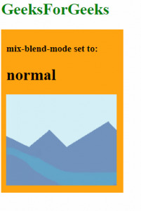
- normal-不会在元素上应用任何混合。
<!DOCTYPE html>
<html>
<body>
    <h1 style='color:green'>GeeksForGeeks</h1>
    <div style="background-color:orange; width:225px; padding:10px;">
        <h3>mix-blend-mode set to:</h3>
        <h1>normal</h1>

        <!-- mix-blend-mode Property -->
        <div style="mix-blend-mode:normal">
            <img src="https://media.geeksforgeeks.org/wp-content/uploads/sample_image.png">
        </div>
    </div>
</body>
</html>
输出:
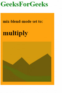
- multiply-这会将元素的颜色与背景相乘。所得的颜色始终与背景一样暗。
<!DOCTYPE html>
<html>
<body>
    <h1 style='color:green'>GeeksForGeeks</h1>
    <div style="background-color:orange; width:225px; padding:10px;">
        <h3>mix-blend-mode set to:</h3>
        <h1>multiply</h1>

        <!-- mix-blend-mode Property -->
        <div style="mix-blend-mode:multiply">
            <img src="https://media.geeksforgeeks.org/wp-content/uploads/sample_image.png">
        </div>
    </div>
</body>
</html>
输出:
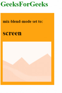
- screen-这会将元素的颜色与背景相乘,然后对结果进行补充。所得的颜色始终与混合层之一一样明亮。
<!DOCTYPE html>
<html>
<body>
    <h1 style='color:green'>GeeksForGeeks</h1>
    <div style="background-color:orange; width:225px; padding:10px;">
        <h3>mix-blend-mode set to:</h3>
        <h1>screen</h1>

        <!-- mix-blend-mode Property -->
        <div style="mix-blend-mode:screen">
            <img src="https://media.geeksforgeeks.org/wp-content/uploads/sample_image.png">
        </div>
    </div>
</body>
</html>
输出:
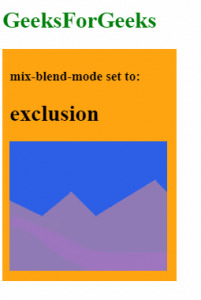
- exclusion-从元素的最浅颜色中减去两种颜色中的较深颜色。结果类似于‘difference’,但对比度较低。
<!DOCTYPE html>
<html>
<body>
    <h1 style='color:green'>GeeksForGeeks</h1>
    <div style="background-color:orange; width:225px; padding:10px;">
        <h3>mix-blend-mode set to:</h3>
        <h1>exclusion</h1>

        <!-- mix-blend-mode Property -->
        <div style="mix-blend-mode:exclusion">
            <img src="https://media.geeksforgeeks.org/wp-content/uploads/sample_image.png">
        </div>
    </div>
</body>
</html>
输出:
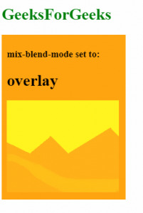
- overlay-这将在元素中的浅色上应用‘multiply’,在深色上应用‘screen’。该效果实际上与“ hard-light”相反。
<!DOCTYPE html>
<html>
<body>
    <h1 style='color:green'>GeeksForGeeks</h1>
    <div style="background-color:orange; width:225px; padding:10px;">
        <h3>mix-blend-mode set to:</h3>
        <h1>overlay</h1>

        <!-- mix-blend-mode Property -->
        <div style="mix-blend-mode:overlay">
            <img src="https://media.geeksforgeeks.org/wp-content/uploads/sample_image.png">
        </div>
    </div>
</body>
</html>
输出:
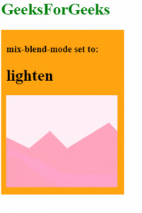
- lighten-用较浅的元素的颜色替换背景。
<!DOCTYPE html>
<html>
<body>
    <h1 style='color:green'>GeeksForGeeks</h1>
    <div style="background-color:orange; width:225px; padding:10px;">
        <h3>mix-blend-mode set to:</h3>
        <h1>lighten</h1>

        <!-- mix-blend-mode Property -->
        <div style="mix-blend-mode:lighten">
            <img src="https://media.geeksforgeeks.org/wp-content/uploads/sample_image.png">
        </div>
    </div>
</body>
</html>
输出:
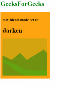
- darken-用较暗的元素的颜色替换背景。
<!DOCTYPE html>
<html>
<body>
    <h1 style='color:green'>GeeksForGeeks</h1>
    <div style="background-color:orange; width:225px; padding:10px;">
        <h3>mix-blend-mode set to:</h3>
        <h1>darken</h1>

        <!-- mix-blend-mode Property -->
        <div style="mix-blend-mode:darken">
            <img src="https://media.geeksforgeeks.org/wp-content/uploads/sample_image.png">
        </div>
    </div>
</body>
</html>
输出:
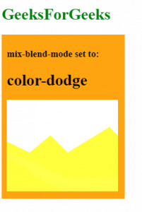
- color-dodge-这会使背景颜色变浅以反映元素的颜色。
<!DOCTYPE html>
<html>
<body>
    <h1 style='color:green'>GeeksForGeeks</h1>
    <div style="background-color:orange; width:225px; padding:10px;">
        <h3>mix-blend-mode set to:</h3>
        <h1>color-dodge</h1>

        <!-- mix-blend-mode Property -->
        <div style="mix-blend-mode:color-dodge">
            <img src="https://media.geeksforgeeks.org/wp-content/uploads/sample_image.png">
        </div>
    </div>
</body>
</html>
输出:
- color-burn-这会使背景颜色变暗以反映图像的自然色。结果增加了元素和背景之间的对比度。
<!DOCTYPE html>
<html>
<body>
    <h1 style='color:green'>GeeksForGeeks</h1>
    <div style="background-color:orange; width:225px; padding:10px;">
        <h3>mix-blend-mode set to:</h3>
        <h1>color-burn</h1>

        <!-- mix-blend-mode Property -->
        <div style="mix-blend-mode:color-burn">
            <img src="https:/<li><b>Normal:</b>

<strong>Syntax:</strong>
<pre>mix-blend-mode:normal</pre>


Output:

hard-light - this applies ‘multiply’ on lighter colors and ‘screen’ on darker colors of the element. This effect is effectively the opposite of ‘overlay’.


<!DOCTYPE html>
<html>
<body>
    <h1 style='color:green'>GeeksForGeeks</h1>
    <div style="background-color:orange; width:225px; padding:10px;">
        <h3>mix-blend-mode set to:</h3>
        <h1>hard-light</h1>
        <div style="mix-blend-mode:hard-light">
            <img src="https://media.geeksforgeeks.org/wp-content/uploads/sample_image.png">
        </div>
    </div>
</body>
</html>


Output:


soft-light - this applies ‘multiply’ on lighter colors and ‘screen’ on darker colors in the element. The resulting effect is softer than that of ‘overlay’.


<!DOCTYPE html>
<html>
<body>
    <h1 style='color:green'>GeeksForGeeks</h1>
    <div style="background-color:orange; width:225px; padding:10px;">
        <h3>mix-blend-mode set to:</h3>
        <h1>soft-light</h1>
        <div style="mix-blend-mode:soft-light">
            <img src="https://media.geeksforgeeks.org/wp-content/uploads/sample_image.png">
        </div>
    </div>
</body>
</html>


Output:


difference - this subtracts the absolute difference of the background color and the element’s color.


<!DOCTYPE html>
<html>
<body>
    <h1 style='color:green'>GeeksForGeeks</h1>
    <div style="background-color:orange; width:225px; padding:10px;">
        <h3>mix-blend-mode set to:</h3>
        <h1>difference</h1>
        <div style="mix-blend-mode:difference">
            <img src="https://media.geeksforgeeks.org/wp-content/uploads/sample_image.png">
        </div>
    </div>
</body>
</html>


Output:


hue - this applies the hue of the element with the saturation and luminosity of the background.


<!DOCTYPE html>
<html>
<body>
    <h1 style='color:green'>GeeksForGeeks</h1>
    <div style="background-color:orange; width:225px; padding:10px;">
        <h3>mix-blend-mode set to:</h3>
        <h1>hue</h1>
        <div style="mix-blend-mode:hue">
            <img src="https://media.geeksforgeeks.org/wp-content/uploads/sample_image.png">
        </div>
    </div>
</body>
</html>


Output:


saturation - this applies the saturation of the element with the hue and luminosity of the background.


<!DOCTYPE html>
<html>
<body>
    <h1 style='color:green'>GeeksForGeeks</h1>
    <div style="background-color:orange; width:225px; padding:10px;">
        <h3>mix-blend-mode set to:</h3>
        <h1>saturation</h1>
        <div style="mix-blend-mode:saturation">
            <img src="https://media.geeksforgeeks.org/wp-content/uploads/sample_image.png">
        </div>
    </div>
</body>
</html>


Output:


color - this applies the hue and saturation of the element with the luminosity of the background.


<!DOCTYPE html>
<html>
<body>
    <h1 style='color:green'>GeeksForGeeks</h1>
    <div style="background-color:orange; width:225px; padding:10px;">
        <h3>mix-blend-mode set to:</h3>
        <h1>color</h1>
        <div style="mix-blend-mode:color">
            <img src="https://media.geeksforgeeks.org/wp-content/uploads/sample_image.png">
        </div>
    </div>
</body>
</html>


Output:


luminosity - this applies the luminosity of the element with the hue and saturation of the background.


<!DOCTYPE html>
<html>
<body>
    <h1 style='color:green'>GeeksForGeeks</h1>
    <div style="background-color:orange; width:225px; padding:10px;">
        <h3>mix-blend-mode set to:</h3>
        <h1>luminosity</h1>
        <div style="mix-blend-mode:luminosity">
            <img src="https://media.geeksforgeeks.org/wp-content/uploads/sample_image.png">
        </div>
    </div>
</body>
</html>


Output:


Browsers that support mix-blend-mode are:

Chrome 41.0
Firefox 32.0
Opera 35.0
Safari 8.0
相关用法
- CSS transition-property用法及代码示例
- CSS table-layout用法及代码示例
- CSS text-align用法及代码示例
- CSS border-top-width用法及代码示例
- CSS isolation属性用法及代码示例
- CSS border-inline-start-style属性用法及代码示例
- CSS column-rule-width用法及代码示例
- CSS word-spacing用法及代码示例
- CSS animation-delay用法及代码示例
- CSS margin-top用法及代码示例
- CSS grid属性用法及代码示例
- CSS font-size-adjust用法及代码示例
- CSS visibility属性用法及代码示例
- CSS grid-template-columns用法及代码示例
- CSS height属性用法及代码示例
- CSS transform-origin用法及代码示例
- CSS animation-name用法及代码示例
- CSS flex-wrap用法及代码示例
- CSS align-content用法及代码示例
- CSS page-break-before属性用法及代码示例
- CSS empty-cells用法及代码示例
注:本文由纯净天空筛选整理自sayantanm19大神的英文原创作品 CSS mix-blend-mode Property。非经特殊声明,原始代码版权归原作者所有,本译文未经允许或授权,请勿转载或复制。