有兩種類型的條形圖: geom_bar() 和 geom_col() 。 geom_bar() 使條形的高度與每組中的案例數量成正比(或者如果提供了 weight 美學,則為權重的總和)。如果您希望條形的高度代表數據中的值,請改用geom_col()。 geom_bar() 默認使用 stat_count():它計算每個 x 位置的情況數。 geom_col() 使用 stat_identity() :它保持數據不變。
用法
geom_bar(
  mapping = NULL,
  data = NULL,
  stat = "count",
  position = "stack",
  ...,
  just = 0.5,
  width = NULL,
  na.rm = FALSE,
  orientation = NA,
  show.legend = NA,
  inherit.aes = TRUE
)

geom_col(
  mapping = NULL,
  data = NULL,
  position = "stack",
  ...,
  just = 0.5,
  width = NULL,
  na.rm = FALSE,
  show.legend = NA,
  inherit.aes = TRUE
)

stat_count(
  mapping = NULL,
  data = NULL,
  geom = "bar",
  position = "stack",
  ...,
  width = NULL,
  na.rm = FALSE,
  orientation = NA,
  show.legend = NA,
  inherit.aes = TRUE
)
參數
- mapping
-
由
aes()創建的一組美學映射。如果指定且inherit.aes = TRUE(默認),它將與繪圖頂層的默認映射組合。如果沒有繪圖映射,則必須提供mapping。 - data
-
該層要顯示的數據。有以下三種選擇:
如果默認為
NULL,則數據繼承自ggplot()調用中指定的繪圖數據。data.frame或其他對象將覆蓋繪圖數據。所有對象都將被強化以生成 DataFrame 。請參閱fortify()將為其創建變量。將使用單個參數(繪圖數據)調用
function。返回值必須是data.frame,並將用作圖層數據。可以從formula創建function(例如~ head(.x, 10))。 - position
-
位置調整,可以是命名調整的字符串(例如
"jitter"使用position_jitter),也可以是調用位置調整函數的結果。如果需要更改調整設置,請使用後者。 - ...
-
其他參數傳遞給
layer()。這些通常是美學,用於將美學設置為固定值,例如colour = "red"或size = 3。它們也可能是配對的 geom/stat 的參數。 - just
-
調整柱位置。默認設置為
0.5,這意味著列將以軸中斷為中心。設置為0或1將列放置在軸中斷的左側/右側。請注意,當與其他位置一起使用時,此參數可能會產生意想不到的行為,例如position_dodge()。 - width
-
條形寬度。默認情況下,設置為數據
resolution()的 90%。 - na.rm
-
如果
FALSE,則默認缺失值將被刪除並帶有警告。如果TRUE,缺失值將被靜默刪除。 - orientation
-
層的方向。默認值 (
NA) 自動根據美學映射確定方向。萬一失敗,可以通過將orientation設置為"x"或"y"來顯式給出。有關更多詳細信息,請參閱方向部分。 - show.legend
-
合乎邏輯的。該層是否應該包含在圖例中?
NA(默認值)包括是否映射了任何美學。FALSE從不包含,而TRUE始終包含。它也可以是一個命名的邏輯向量,以精細地選擇要顯示的美學。 - inherit.aes
-
如果
FALSE,則覆蓋默認美學,而不是與它們組合。這對於定義數據和美觀的輔助函數最有用,並且不應繼承默認繪圖規範的行為,例如borders()。 - geom, stat
-
覆蓋
geom_bar()和stat_count()之間的默認連接。
細節
條形圖使用高度來表示值,因此必須始終顯示條形的底部以產生有效的視覺比較。在條形圖上使用轉換後的比例時請務必小心。始終為酒吧的底部使用有意義的參考點非常重要。例如,對於對數變換,參考點為 1。事實上,當使用對數刻度時,geom_bar() 自動將條形的底數置於 1。此外,切勿使用具有變換刻度的堆疊條形,因為縮放發生在堆疊之前。因此,當使用變換後的比例進行堆疊時,條形的高度將是錯誤的。
默認情況下,占據相同 x 位置的多個條將通過 position_stack() 堆疊在一起。如果您希望躲避它們side-to-side,請使用position_dodge()或position_dodge2()。最後,position_fill() 通過堆疊條形然後將每個條形標準化為具有相同的高度來顯示每個 x 的相對比例。
方向
該幾何體以不同的方式對待每個軸,因此可以有兩個方向。通常,方向很容易從給定映射和使用的位置比例類型的組合中推斷出來。因此,ggplot2 默認情況下會嘗試猜測圖層應具有哪個方向。在極少數情況下,方向不明確,猜測可能會失敗。在這種情況下,可以直接使用 orientation 參數指定方向,該參數可以是 "x" 或 "y" 。該值給出了幾何圖形應沿著的軸,"x" 是您期望的幾何圖形的默認方向。
美學
geom_bar() 理解以下美學(所需的美學以粗體顯示):
-
x -
y -
alpha -
colour -
fill -
group -
linetype -
linewidth
在 vignette("ggplot2-specs") 中了解有關設置這些美學的更多信息。
geom_col() 理解以下美學(所需的美學以粗體顯示):
-
x -
y -
alpha -
colour -
fill -
group -
linetype -
linewidth
在 vignette("ggplot2-specs") 中了解有關設置這些美學的更多信息。
stat_count() 理解以下美學(所需的美學以粗體顯示):
-
x或者y -
group -
weight
在 vignette("ggplot2-specs") 中了解有關設置這些美學的更多信息。
計算變量
這些是由層的 'stat' 部分計算的,可以使用 delayed evaluation 訪問。
-
after_stat(count)
bin 中的點數。 -
after_stat(prop)
分組比例
也可以看看
geom_histogram() 用於連續數據,position_dodge() 和 position_dodge2() 用於創建並排條形圖。
stat_bin() ,它將數據存儲在範圍內並計算每個範圍內的情況。它與 stat_count() 不同,stat_count() 計算每個 x 位置的事例數量(不分檔到範圍中)。 stat_bin() 需要連續的x 數據,而stat_count() 可用於離散和連續的x 數據。
例子
# geom_bar is designed to make it easy to create bar charts that show
# counts (or sums of weights)
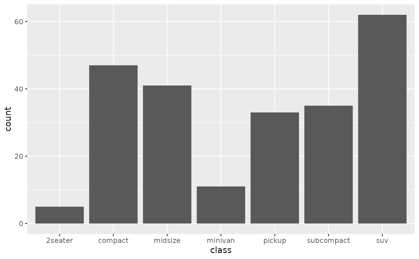
g <- ggplot(mpg, aes(class))
# Number of cars in each class:
g + geom_bar()
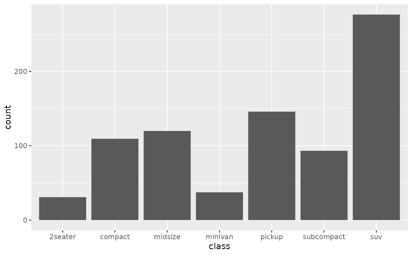
 # Total engine displacement of each class
g + geom_bar(aes(weight = displ))
# Total engine displacement of each class
g + geom_bar(aes(weight = displ))
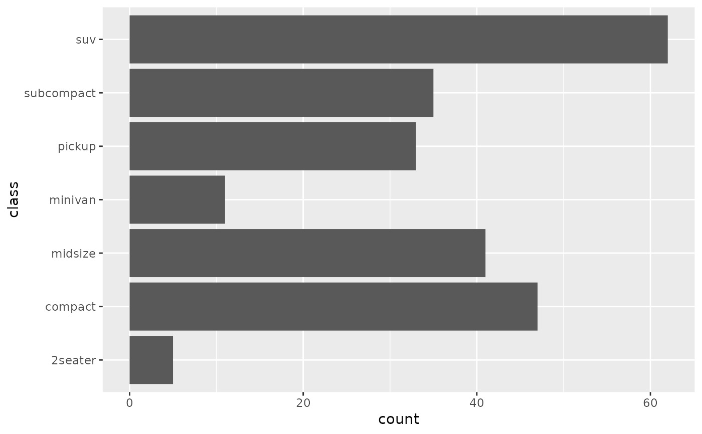
 # Map class to y instead to flip the orientation
ggplot(mpg) + geom_bar(aes(y = class))
# Map class to y instead to flip the orientation
ggplot(mpg) + geom_bar(aes(y = class))
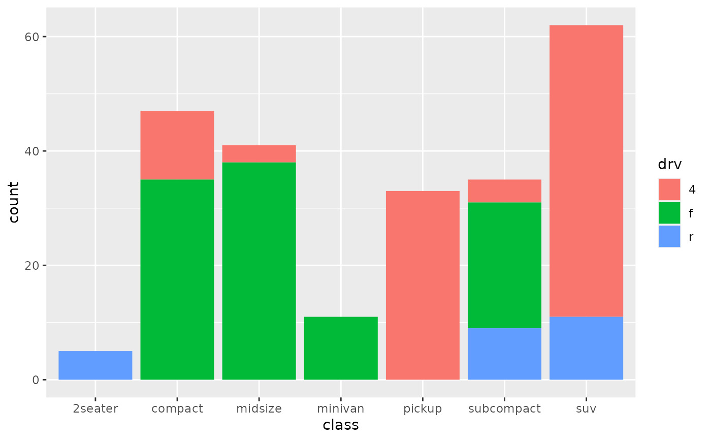
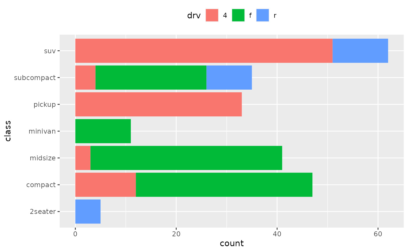
 # Bar charts are automatically stacked when multiple bars are placed
# at the same location. The order of the fill is designed to match
# the legend
g + geom_bar(aes(fill = drv))
# Bar charts are automatically stacked when multiple bars are placed
# at the same location. The order of the fill is designed to match
# the legend
g + geom_bar(aes(fill = drv))
 # If you need to flip the order (because you've flipped the orientation)
# call position_stack() explicitly:
ggplot(mpg, aes(y = class)) +
geom_bar(aes(fill = drv), position = position_stack(reverse = TRUE)) +
theme(legend.position = "top")
# If you need to flip the order (because you've flipped the orientation)
# call position_stack() explicitly:
ggplot(mpg, aes(y = class)) +
geom_bar(aes(fill = drv), position = position_stack(reverse = TRUE)) +
theme(legend.position = "top")
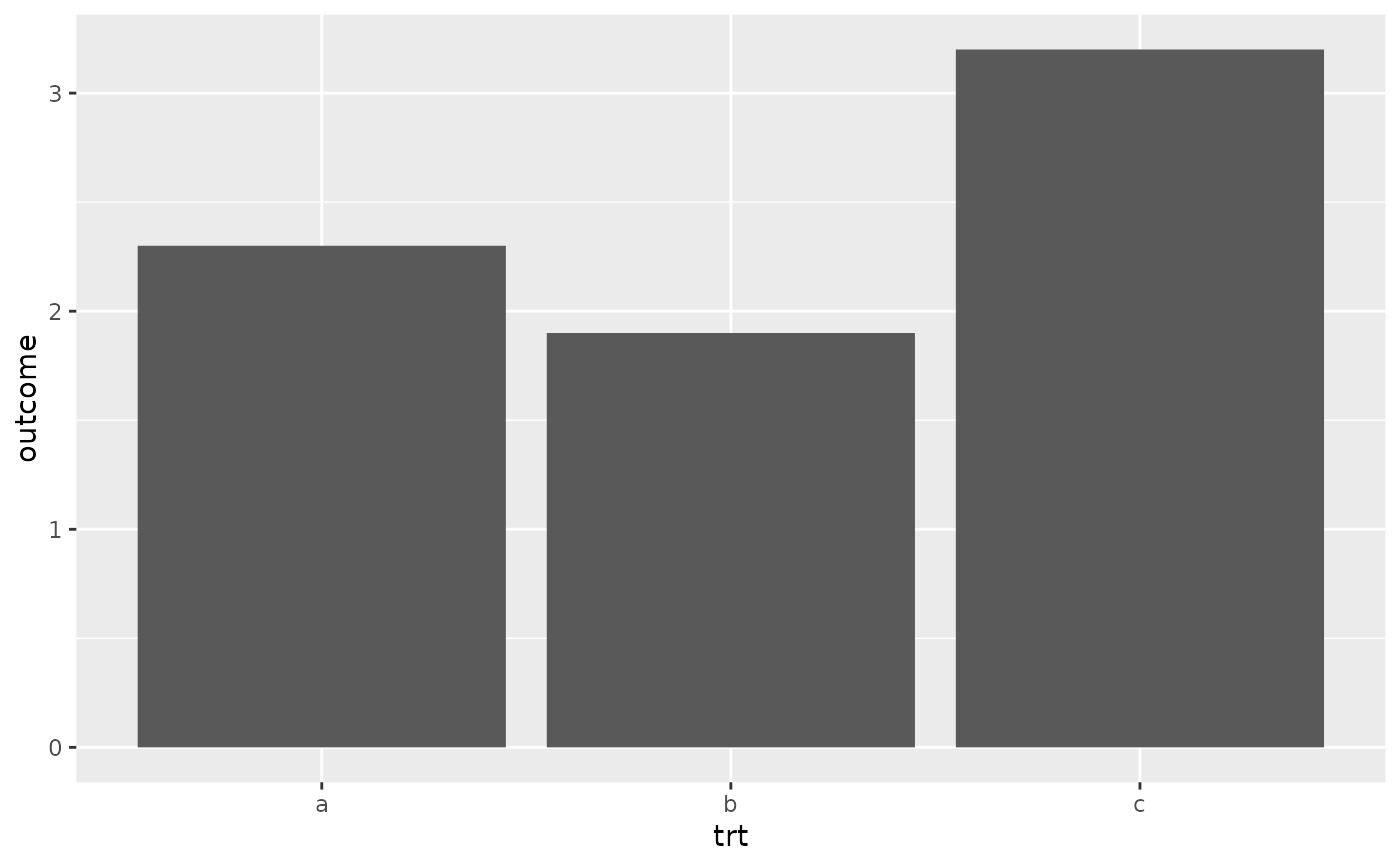
 # To show (e.g.) means, you need geom_col()
df <- data.frame(trt = c("a", "b", "c"), outcome = c(2.3, 1.9, 3.2))
ggplot(df, aes(trt, outcome)) +
geom_col()
# To show (e.g.) means, you need geom_col()
df <- data.frame(trt = c("a", "b", "c"), outcome = c(2.3, 1.9, 3.2))
ggplot(df, aes(trt, outcome)) +
geom_col()
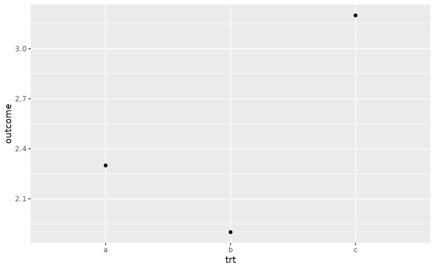
 # But geom_point() displays exactly the same information and doesn't
# require the y-axis to touch zero.
ggplot(df, aes(trt, outcome)) +
geom_point()
# But geom_point() displays exactly the same information and doesn't
# require the y-axis to touch zero.
ggplot(df, aes(trt, outcome)) +
geom_point()
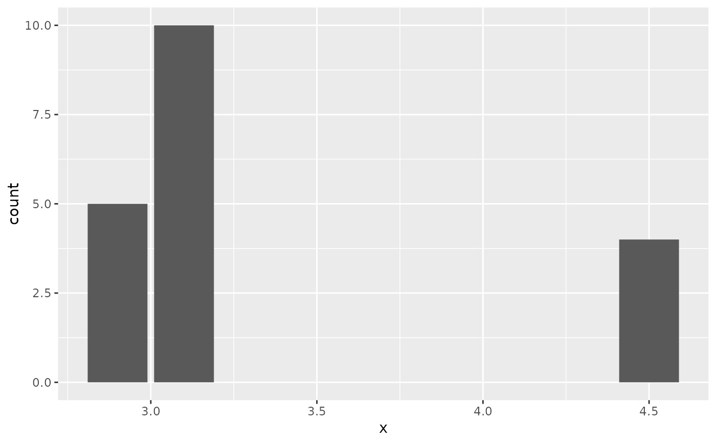
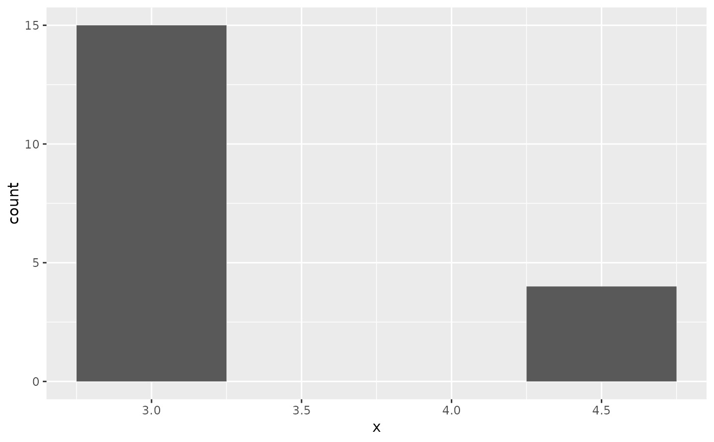
 # You can also use geom_bar() with continuous data, in which case
# it will show counts at unique locations
df <- data.frame(x = rep(c(2.9, 3.1, 4.5), c(5, 10, 4)))
ggplot(df, aes(x)) + geom_bar()
# You can also use geom_bar() with continuous data, in which case
# it will show counts at unique locations
df <- data.frame(x = rep(c(2.9, 3.1, 4.5), c(5, 10, 4)))
ggplot(df, aes(x)) + geom_bar()
 # cf. a histogram of the same data
ggplot(df, aes(x)) + geom_histogram(binwidth = 0.5)
# cf. a histogram of the same data
ggplot(df, aes(x)) + geom_histogram(binwidth = 0.5)
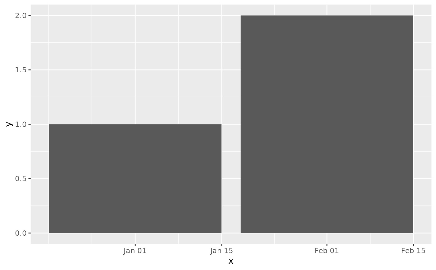
 # Use `just` to control how columns are aligned with axis breaks:
df <- data.frame(x = as.Date(c("2020-01-01", "2020-02-01")), y = 1:2)
# Columns centered on the first day of the month
ggplot(df, aes(x, y)) + geom_col(just = 0.5)
# Use `just` to control how columns are aligned with axis breaks:
df <- data.frame(x = as.Date(c("2020-01-01", "2020-02-01")), y = 1:2)
# Columns centered on the first day of the month
ggplot(df, aes(x, y)) + geom_col(just = 0.5)
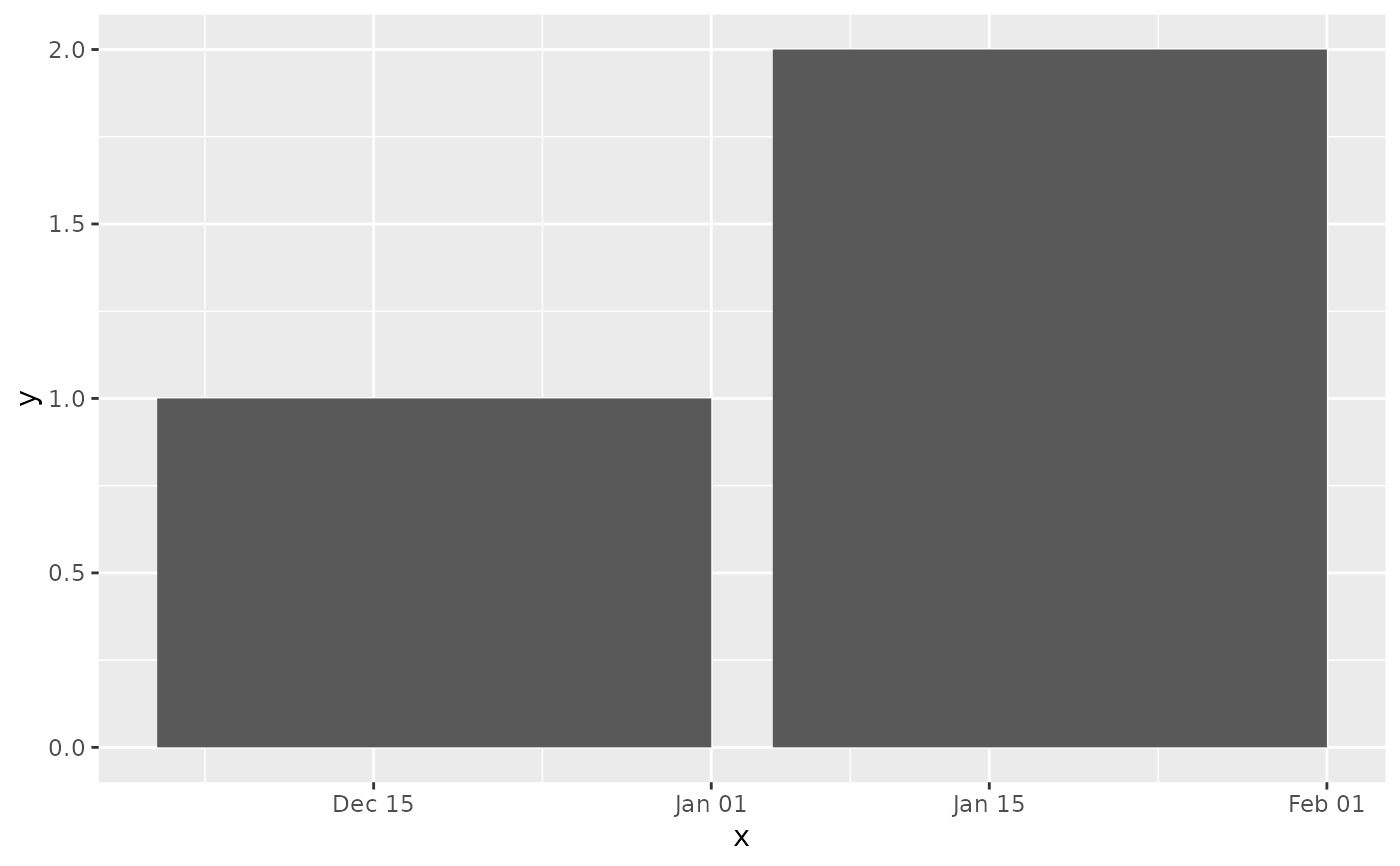
 # Columns begin on the first day of the month
ggplot(df, aes(x, y)) + geom_col(just = 1)
# Columns begin on the first day of the month
ggplot(df, aes(x, y)) + geom_col(just = 1)
相關用法
- R ggplot2 geom_boxplot 盒須圖(Tukey 風格)
- R ggplot2 geom_bin_2d 二維 bin 計數熱圖
- R ggplot2 geom_blank 什麽也不畫
- R ggplot2 geom_qq 分位數-分位數圖
- R ggplot2 geom_spoke 由位置、方向和距離參數化的線段
- R ggplot2 geom_quantile 分位數回歸
- R ggplot2 geom_text 文本
- R ggplot2 geom_ribbon 函數區和麵積圖
- R ggplot2 geom_hex 二維箱計數的六邊形熱圖
- R ggplot2 geom_jitter 抖動點
- R ggplot2 geom_point 積分
- R ggplot2 geom_linerange 垂直間隔:線、橫線和誤差線
- R ggplot2 geom_path 連接觀察結果
- R ggplot2 geom_violin 小提琴情節
- R ggplot2 geom_dotplot 點圖
- R ggplot2 geom_errorbarh 水平誤差線
- R ggplot2 geom_function 將函數繪製為連續曲線
- R ggplot2 geom_polygon 多邊形
- R ggplot2 geom_histogram 直方圖和頻數多邊形
- R ggplot2 geom_tile 矩形
- R ggplot2 geom_segment 線段和曲線
- R ggplot2 geom_density_2d 二維密度估計的等值線
- R ggplot2 geom_map 參考Map中的多邊形
- R ggplot2 geom_density 平滑密度估計
- R ggplot2 geom_abline 參考線:水平、垂直和對角線
注:本文由純淨天空篩選整理自Hadley Wickham等大神的英文原創作品 Bar charts。非經特殊聲明,原始代碼版權歸原作者所有,本譯文未經允許或授權,請勿轉載或複製。