此 CSS 属性指定 flex 项的初始大小。它只对 flex-items 起作用,所以如果容器的物品不是 flex-item,则 flex-basis 属性不会影响对应的物品。通常,此 CSS 属性与 flex-shrink 和 flex-grow 等其他 flex 属性一起使用,通常由 flex 简写定义,以确保设置所有值。
用法
flex-basis:auto | width | initial | inherit;值
auto:它是默认值。如果已定义,此值将项目的宽度设置为等于其宽度属性的值。但是如果flex-item 没有指定width 属性,它会根据内容设置宽度。
width:该值是使用相对或绝对单位定义的。它定义了 flex-item 的初始长度。它不允许负值。
initial:它将属性设置为其默认值。
inherit:它从其父元素继承属性。
现在,让我们通过一些例子来理解这个属性。
示例
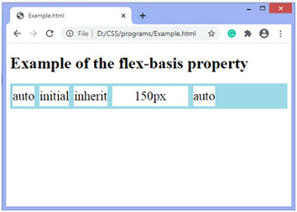
在这个例子中,有一个容器有五个 flex-items。在这里,我们设置项目的不同值,例如 auto、initial、inherit 和 150px。我们没有定义宽度属性,所以像auto、initial、inherit这样的值根据内容设置宽度,但是有一个项目是flex-basis:150px;所以相应项目的宽度将为 150px。
<!DOCTYPE html>
<html>
<head>
<style>
.container {
display:flex;
background-color:lightblue;
}
.flex-item {
background-color:white;
text-align:center;
line-height:40px;
font-size:25px;
margin:5px;
}
</style>
</head>
<body>
<h1> Example of the flex-basis property </h1>
<div class = "container">
<div class = "flex-item" style = "flex-basis:auto;"> auto </div>
<div class = "flex-item" style = "flex-basis:initial;"> initial </div>
<div class = "flex-item" style = "flex-basis:inherit;"> inherit </div>
 <div class = "flex-item" style = "flex-basis:150px;"> 150px </div>
<div class = "flex-item" style = "flex-basis:auto"> auto </div>
</div>
</body>
</html>
输出
示例
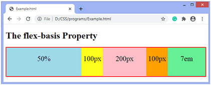
这是 flex-basis 属性的另一个示例。
<!DOCTYPE html>
<html>
<head>
<style>
.container {
height:100px;
border:2px solid red;
display:flex;
background-color:blue;

}
.container div{
padding-top:25px;
flex-basis:100px;
}
.flex-item{
text-align:center;
font-size:25px;
}
.container div:nth-of-type(1) {
flex-basis:50%;
}
.container div:nth-of-type(3) {
flex-basis:200px;
}
.container div:nth-of-type(5) {
flex-basis:7em;
}

</style>
</head>

<body>
<h1>
The flex-basis Property
</h1>

<div class = "container">
<div class = "flex-item" style= "background-color:lightblue;">
50%
</div>

<div class = "flex-item" style= "background-color:yellow;">
100px
</div>

<div class = "flex-item" style= "background-color:pink;">
200px
</div>

<div class = "flex-item" style= "background-color:orange;">
100px
</div>

<div class = "flex-item" style= "background-color:lightgreen;">
7em
</div>
</div>
</body>
</html>
输出
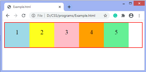
让我们看看如何使用 flex 速记属性定义 flex-basis 属性。
示例
在此示例中,我们使用速记 flex 属性设置 flex-basis 属性。 flex 属性是 flex-grow、flex-shrink 和 flex-basis 的简写。这里我们给flex-basis定义了100px的值,另外两个用0来指定。
<!DOCTYPE html>
<html>

<head>
<style>
.container {
height:100px;
border:2px solid red;
display:flex;

}
.container div{
padding-top:25px;
flex:0 0 100px;
}
.flex-item{
text-align:center;
font-size:25px;
}

</style>
</head>

<body>

<div class = "container">
<div class = "flex-item" style= "background-color:lightblue;">
1
</div>

<div class = "flex-item" style= "background-color:yellow;">
2
</div>

<div class = "flex-item" style= "background-color:pink;">
3
</div>

<div class = "flex-item" style= "background-color:orange;">
4
</div>

<div class = "flex-item" style= "background-color:lightgreen;">
5
</div>
</div>
</body>
</html>
输出
相关用法
- CSS flex-basis用法及代码示例
- CSS flex-grow用法及代码示例
- CSS flex-shrink属性用法及代码示例
- CSS flex-flow属性用法及代码示例
- CSS flex-wrap用法及代码示例
- CSS flex-shrink用法及代码示例
- CSS flex-flow用法及代码示例
- CSS flex-direction用法及代码示例
- CSS flex-grow属性用法及代码示例
- CSS flex属性用法及代码示例
- CSS font-size-adjust用法及代码示例
- CSS font-weight用法及代码示例
- CSS font-stretch用法及代码示例
- CSS filter属性用法及代码示例
- CSS font-size用法及代码示例
- CSS fill属性用法及代码示例
- CSS font-family用法及代码示例
- CSS font-variant-caps属性用法及代码示例
- CSS font-stretch属性用法及代码示例
- CSS font-feature-settings属性用法及代码示例
注:本文由纯净天空筛选整理自 CSS flex-basis property。非经特殊声明,原始代码版权归原作者所有,本译文未经允许或授权,请勿转载或复制。