flex-direction属性是柔性盒布局模块的sub-property。它确定了柔性物品的主轴。 flex项目的主轴是主轴。它不一定总是在水平状态,它本质上取决于flex-direction属性。注意:当元素不是弹性项目时,flex属性是无用的。
用法:
flex-direction:row|row-reverse|column|column-reverse;
属性值:
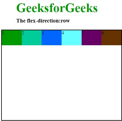
- row:排列与文本方向相同的行。flex-direction的默认值为row。用于指定项目具有正常的文本方向。它使项目遵循正常文本方向并排成一行。
用法:
flex-direction:row;
例:
<!DOCTYPE html>

<head>
    <title>flex-direction property</title>
    <style>
        #main {
            width:400px;
            height:300px;
            border:2px solid black;
            display:flex;
            flex-direction:row;
        }

        #main div {
            width:100px;
            height:50px;
        }

        h1 {
            color:#009900;
            font-size:42px;
            margin-left:50px;
        }

        h3 {
            margin-top:-20px;
            margin-left:50px;
        }
    </style>
</head>

<body>
    <h1>GeeksforGeeks</h1>
    <h3>The flex-direction:row</h3>
    <div id="main">
        <div style="background-color:#009900;">1</div>
        <div style="background-color:#00cc99;">2</div>
        <div style="background-color:#0066ff;">3</div>
        <div style="background-color:#66ffff;">4</div>
        <div style="background-color:#660066;">5</div>
        <div style="background-color:#663300;">6</div>
    </div>
</body>

</html>
输出:
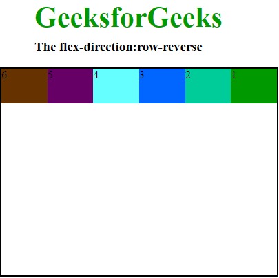
- row-reverse:此属性用于跟随文本方向的相反方向。就像我们在输出中看到的那样,它使弹性项目的顺序与文本方向相反。
用法:flex-direction:row-reverse;
例:
<!DOCTYPE html>

<head>
    <title>flex-direction property</title>
    <style>
        #main {
            width:400px;
            height:300px;
            border:2px solid black;
            display:flex;
            flex-direction:row-reverse;
        }

        #main div {
            width:100px;
            height:50px;
        }

        h1 {
            color:#009900;
            font-size:42px;
            margin-left:50px;
        }

        h3 {
            margin-top:-20px;
            margin-left:50px;
        }
    </style>
</head>

<body>
    <h1>GeeksforGeeks</h1>
    <h3>The flex-direction:row-reverse</h3>
    <div id="main">
        <div style="background-color:#009900;">1</div>
        <div style="background-color:#00cc99;">2</div>
        <div style="background-color:#0066ff;">3</div>
        <div style="background-color:#66ffff;">4</div>
        <div style="background-color:#660066;">5</div>
        <div style="background-color:#663300;">6</div>
    </div>
</body>

</html>
输出:
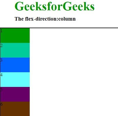
- column:它将行排列为与文本方向相同但从上至下的列。用于指定项目的上下方向正常。正如我们在“输出”中看到的,它使项目遵循正常的上下方向。
用法:flex-direction:column;
例:
<!DOCTYPE html>

<head>
    <title>flex-direction property</title>
    <style>
        #main {
            width:400px;
            height:300px;
            border:2px solid black;
            display:flex;
            flex-direction:column;
        }

        #main div {
            width:100px;
            height:50px;
        }

        h1 {
            color:#009900;
            font-size:42px;
            margin-left:50px;
        }

        h3 {
            margin-top:-20px;
            margin-left:50px;
        }
    </style>
</head>

<body>
    <h1>GeeksforGeeks</h1>
    <h3>The flex-direction:column</h3>
    <div id="main">
        <div style="background-color:#009900;">1</div>
        <div style="background-color:#00cc99;">2</div>
        <div style="background-color:#0066ff;">3</div>
        <div style="background-color:#66ffff;">4</div>
        <div style="background-color:#660066;">5</div>
        <div style="background-color:#663300;">6</div>
    </div>
</body>

</html>
输出:
- column-reverse:它与row-reverse的行排列为从下到上。它用于指定项目具有正常的底部到顶部方向。正如我们在“输出”中所看到的,它使项目遵循从底部到顶部的正常方向。
用法:flex-direction:column-reverse;
例:
<!DOCTYPE html>

<head>
    <title>flex-direction property</title>
    <style>
        #main {
            width:400px;
            height:300px;
            border:2px solid black;
            display:flex;
            flex-direction:column-reverse;
        }

        #main div {
            width:100px;
            height:50px;
        }

        h1 {
            color:#009900;
            font-size:42px;
            margin-left:50px;
        }

        h3 {
            margin-top:-20px;
            margin-left:50px;
        }
    </style>
</head>

<body>
    <h1>GeeksforGeeks</h1>
    <h3>The flex-direction:column-reverse</h3>
    <div id="main">
        <div style="background-color:#009900;">1</div>
        <div style="background-color:#00cc99;">2</div>
        <div style="background-color:#0066ff;">3</div>
        <div style="background-color:#66ffff;">4</div>
        <div style="background-color:#660066;">5</div>
        <div style="background-color:#663300;">6</div>
    </div>
</body>

</html>

<!DOCTYPE html>

<head>
    <title>flex-direction property</title>
    <style>
        #main {
            width:400px;
            height:300px;
            border:2px solid black;
            display:flex;
            flex-direction:column-reverse;
        }
输出:

- 谷歌浏览器29.0
- Internet Explorer 11.0
- Mozila Firefox 28.0
- Opera 17.0
- Safari 9.0
支持的浏览器:CSS |支持的浏览器。下面列出了flex-direction属性:
相关用法
- HTML Style flexDirection用法及代码示例
- CSS transition-property用法及代码示例
- CSS all属性用法及代码示例
- CSS top属性用法及代码示例
- CSS right属性用法及代码示例
- CSS nav-right用法及代码示例
- CSS nav-down用法及代码示例
- CSS nav-up用法及代码示例
- HTML DOMRectReadOnly x用法及代码示例
- HTML DOMRectReadOnly y用法及代码示例
- CSS fill属性用法及代码示例
- CSS shape-outside用法及代码示例
- HTML DOMRect top用法及代码示例
- CSS transform属性用法及代码示例
- CSS left属性用法及代码示例
注:本文由纯净天空筛选整理自Sabya_Samadder大神的英文原创作品 CSS | flex-direction Property。非经特殊声明,原始代码版权归原作者所有,本译文未经允许或授权,请勿转载或复制。