qplot() 現已棄用,以鼓勵用戶學習 ggplot(),因為它可以更輕鬆地創建複雜圖形。
用法
qplot(
  x,
  y,
  ...,
  data,
  facets = NULL,
  margins = FALSE,
  geom = "auto",
  xlim = c(NA, NA),
  ylim = c(NA, NA),
  log = "",
  main = NULL,
  xlab = NULL,
  ylab = NULL,
  asp = NA,
  stat = deprecated(),
  position = deprecated()
)

quickplot(
  x,
  y,
  ...,
  data,
  facets = NULL,
  margins = FALSE,
  geom = "auto",
  xlim = c(NA, NA),
  ylim = c(NA, NA),
  log = "",
  main = NULL,
  xlab = NULL,
  ylab = NULL,
  asp = NA,
  stat = deprecated(),
  position = deprecated()
)
參數
- x, y, ...
-
美學滲透到每一層
- data
-
要使用的 DataFrame (可選)。如果未指定,將創建一個,從當前環境中提取向量。
- facets
-
要使用的分麵公式。根據公式是單麵還是雙麵選擇
facet_wrap()或facet_grid() - margins
-
請參閱
facet_grid():顯示邊麵? - geom
-
指定要繪製的幾何圖形的字符向量。如果指定了 x 和 y,則默認為"point";如果僅指定了 x,則默認為"histogram"。
- xlim, ylim
-
X 軸和 y 軸限製
- log
-
要記錄哪些變量轉換("x"、"y" 或 "xy")
- main, xlab, ylab
-
分別給出繪圖標題、x 軸標簽和 y 軸標簽的字符向量(或表達式)。
- asp
-
y/x 縱橫比
- stat, position
-
![[Deprecated]](https://vimsky.com/wp-content/uploads/2023/09/46380a3291bc52d4cbe8621c7e624b2c.svg)
例子
# Use data from data.frame
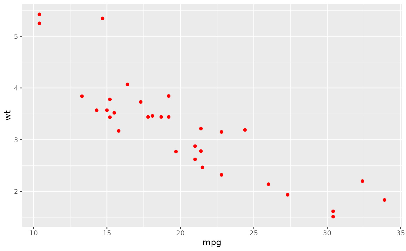
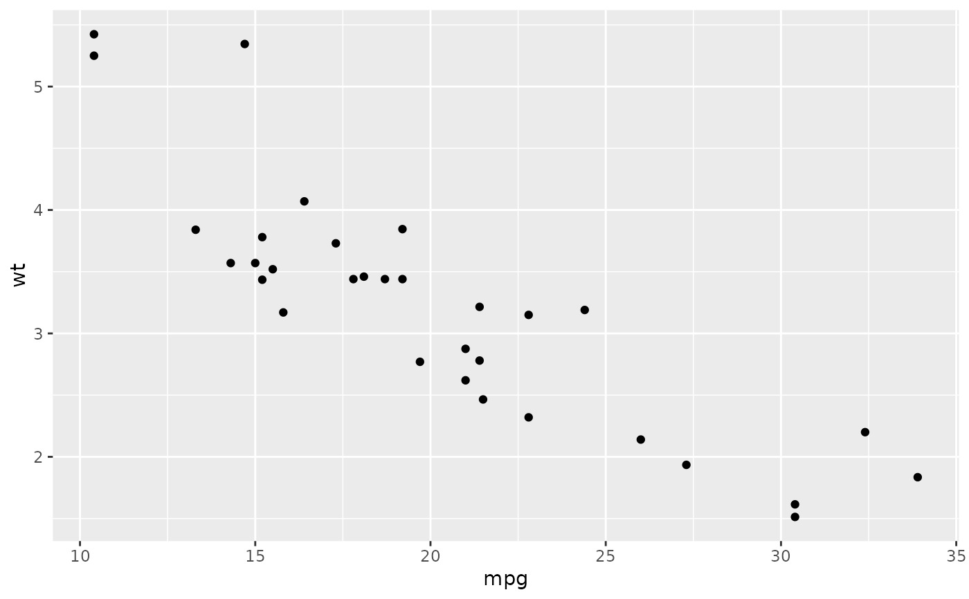
qplot(mpg, wt, data = mtcars)
#> Warning: `qplot()` was deprecated in ggplot2 3.4.0.
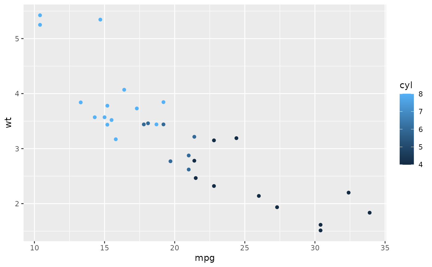
 qplot(mpg, wt, data = mtcars, colour = cyl)
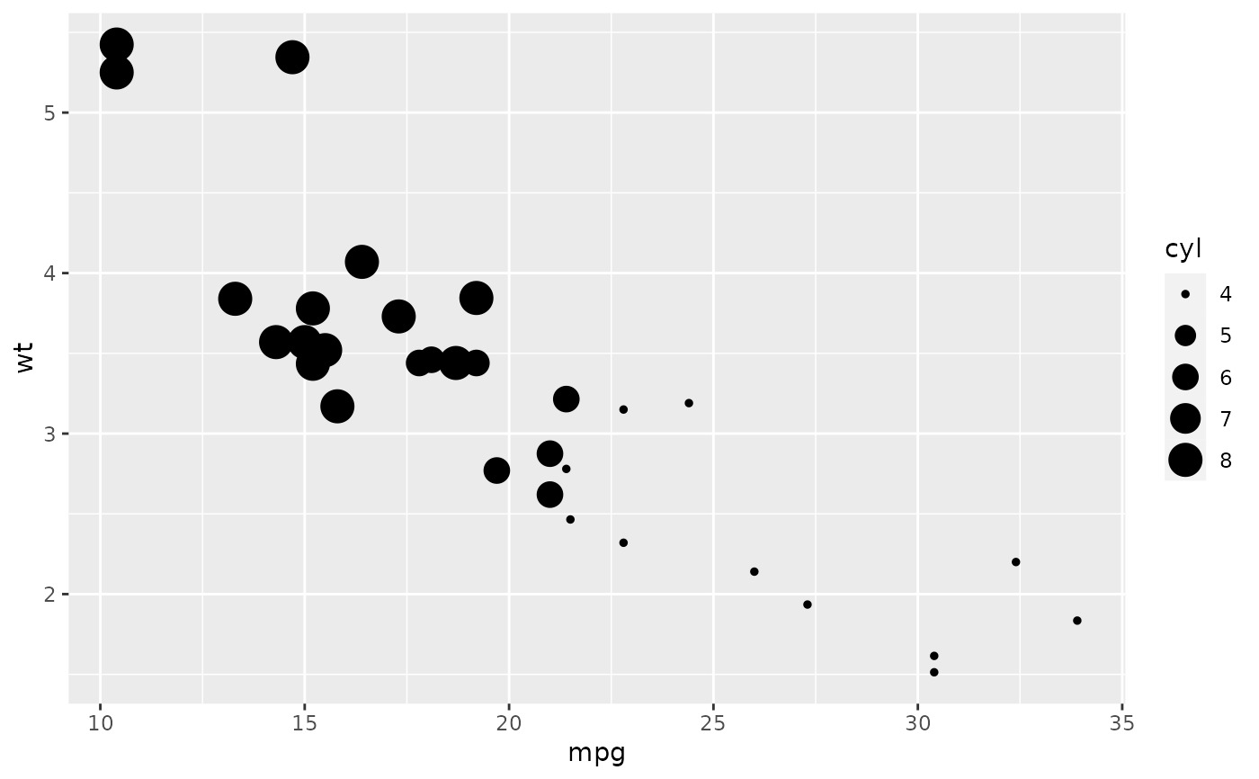
 qplot(mpg, wt, data = mtcars, size = cyl)
 qplot(mpg, wt, data = mtcars, facets = vs ~ am)
 # \donttest{
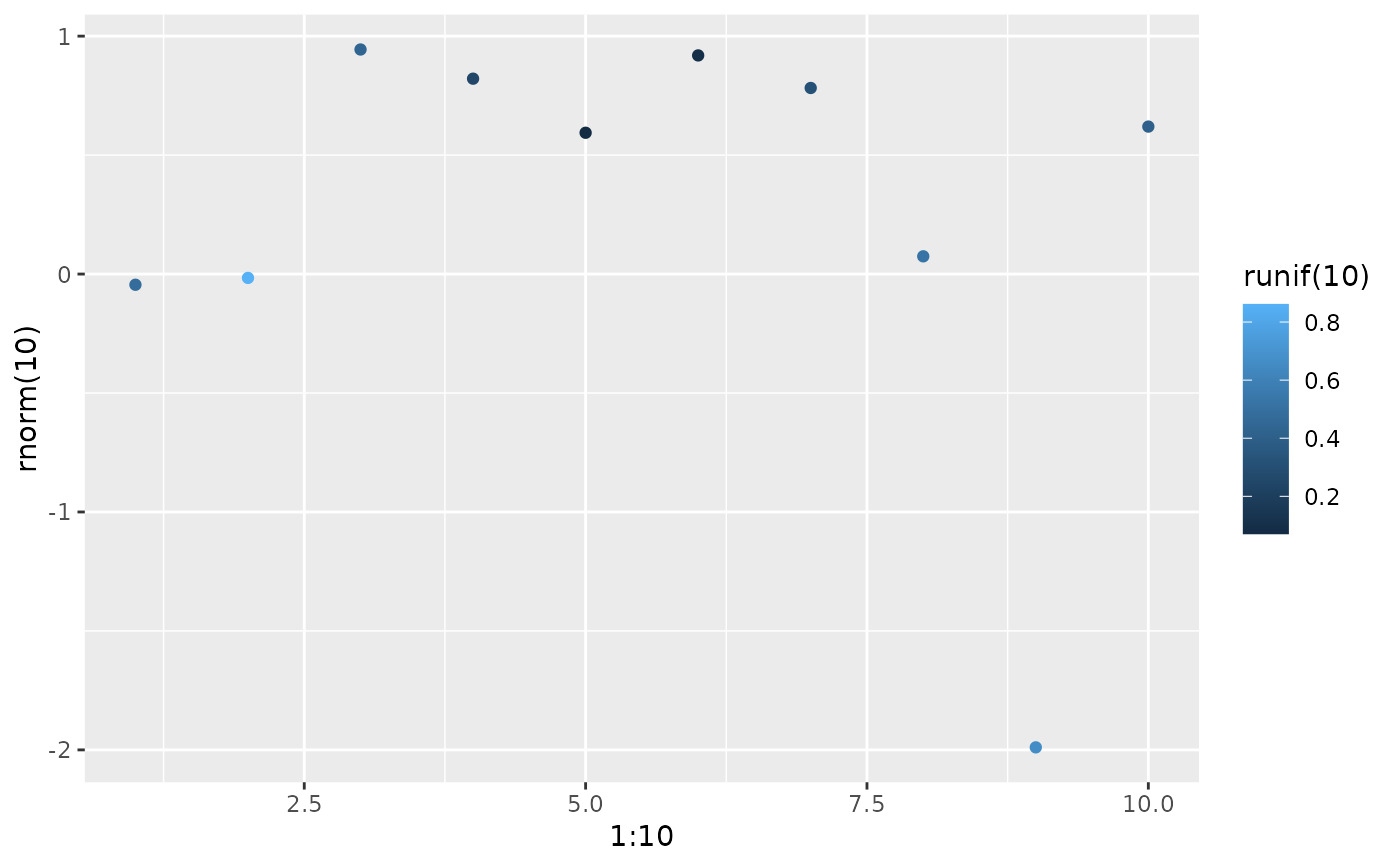
set.seed(1)
qplot(1:10, rnorm(10), colour = runif(10))
# \donttest{
set.seed(1)
qplot(1:10, rnorm(10), colour = runif(10))
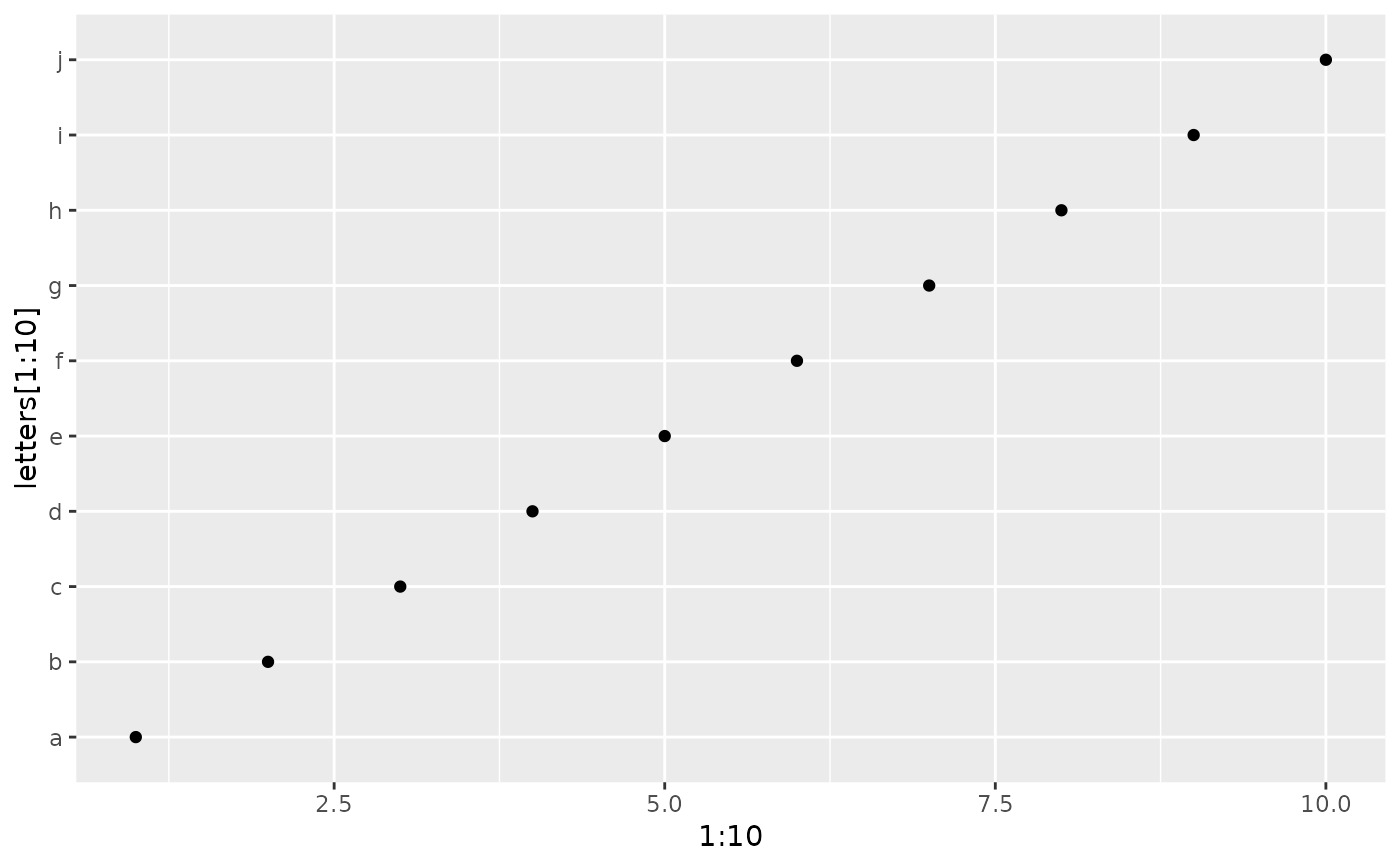
 qplot(1:10, letters[1:10])
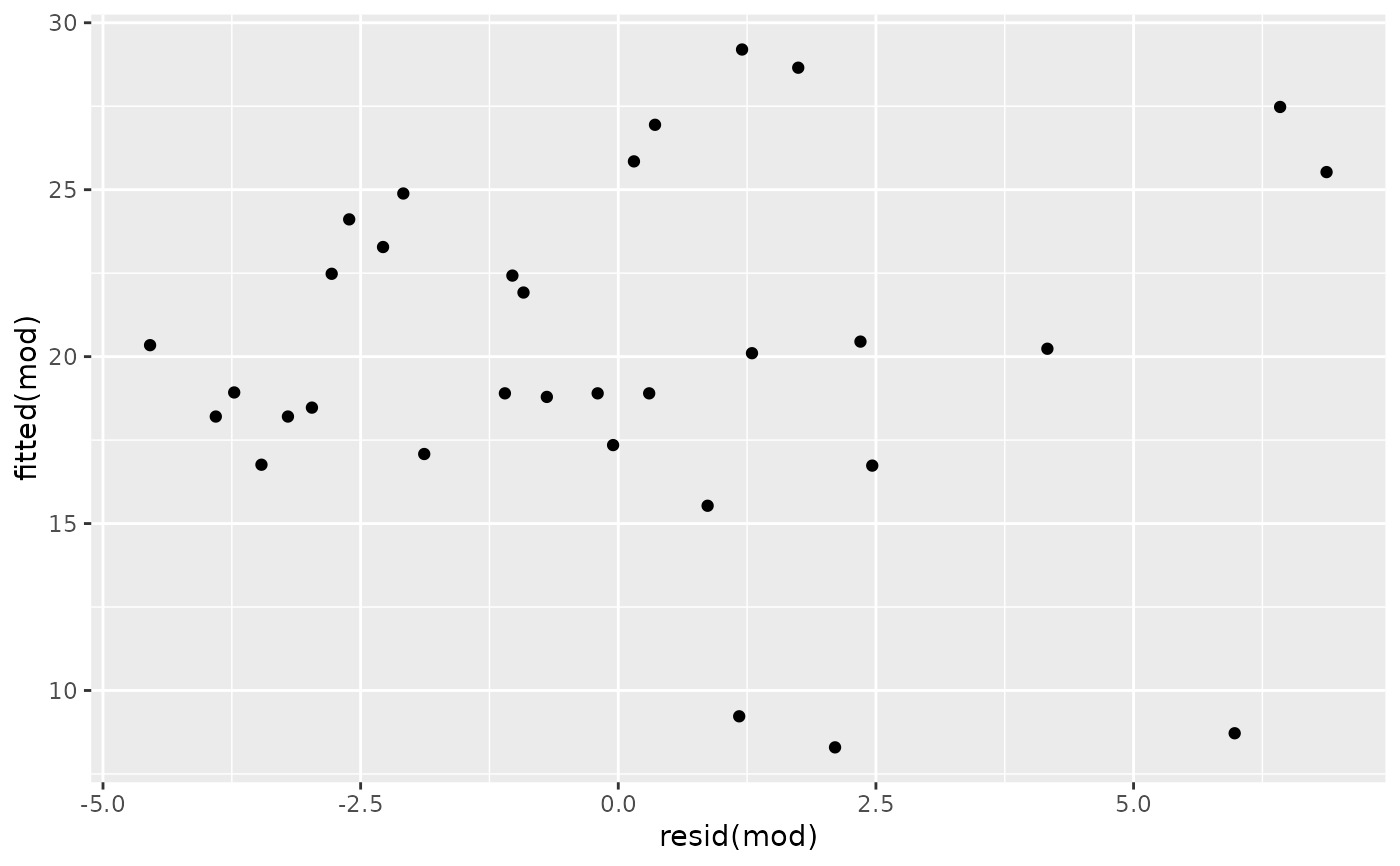
 mod <- lm(mpg ~ wt, data = mtcars)
qplot(resid(mod), fitted(mod))
mod <- lm(mpg ~ wt, data = mtcars)
qplot(resid(mod), fitted(mod))
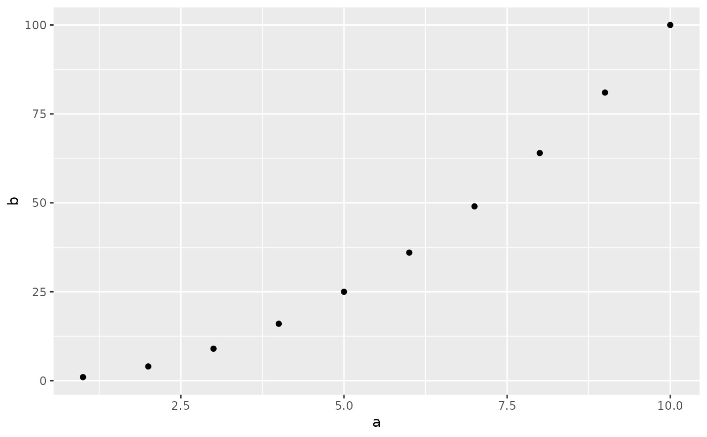
 f <- function() {
a <- 1:10
b <- a ^ 2
qplot(a, b)
}
f()
f <- function() {
a <- 1:10
b <- a ^ 2
qplot(a, b)
}
f()
 # To set aesthetics, wrap in I()
qplot(mpg, wt, data = mtcars, colour = I("red"))
# To set aesthetics, wrap in I()
qplot(mpg, wt, data = mtcars, colour = I("red"))
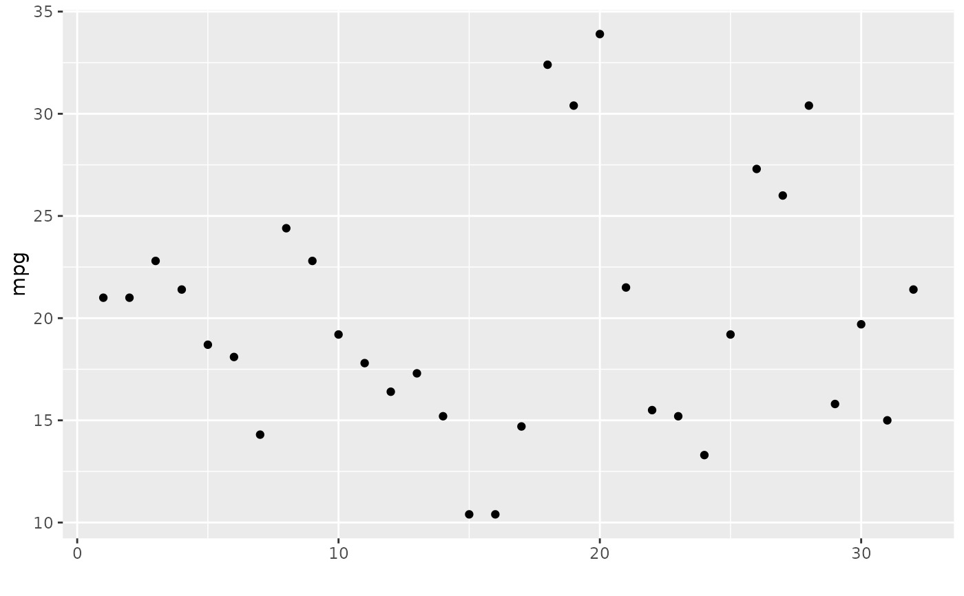
 # qplot will attempt to guess what geom you want depending on the input
# both x and y supplied = scatterplot
qplot(mpg, wt, data = mtcars)
# qplot will attempt to guess what geom you want depending on the input
# both x and y supplied = scatterplot
qplot(mpg, wt, data = mtcars)
 # just x supplied = histogram
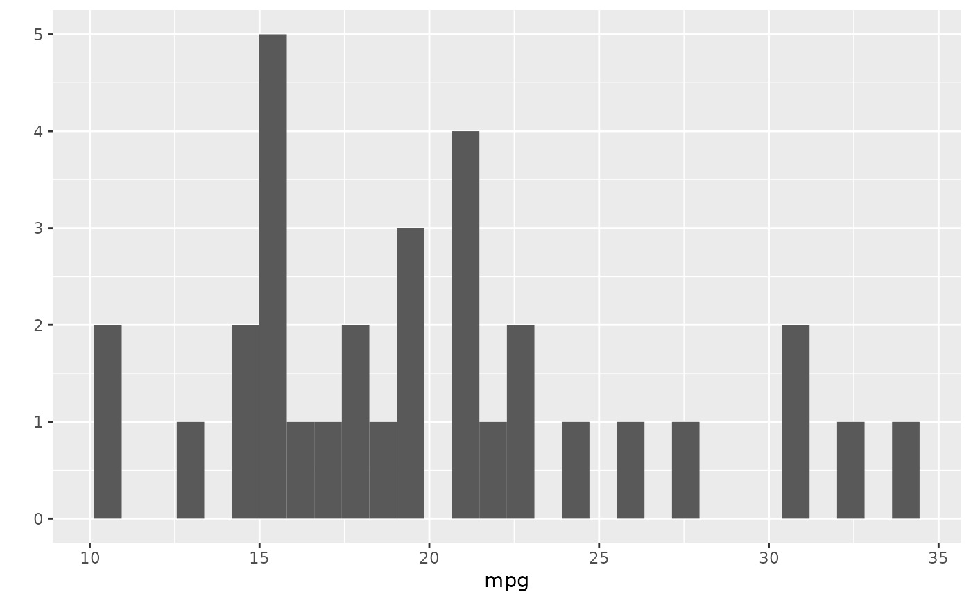
qplot(mpg, data = mtcars)
#> `stat_bin()` using `bins = 30`. Pick better value with `binwidth`.
# just x supplied = histogram
qplot(mpg, data = mtcars)
#> `stat_bin()` using `bins = 30`. Pick better value with `binwidth`.
 # just y supplied = scatterplot, with x = seq_along(y)
qplot(y = mpg, data = mtcars)
# just y supplied = scatterplot, with x = seq_along(y)
qplot(y = mpg, data = mtcars)
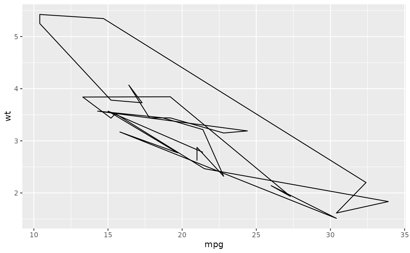
 # Use different geoms
qplot(mpg, wt, data = mtcars, geom = "path")
# Use different geoms
qplot(mpg, wt, data = mtcars, geom = "path")
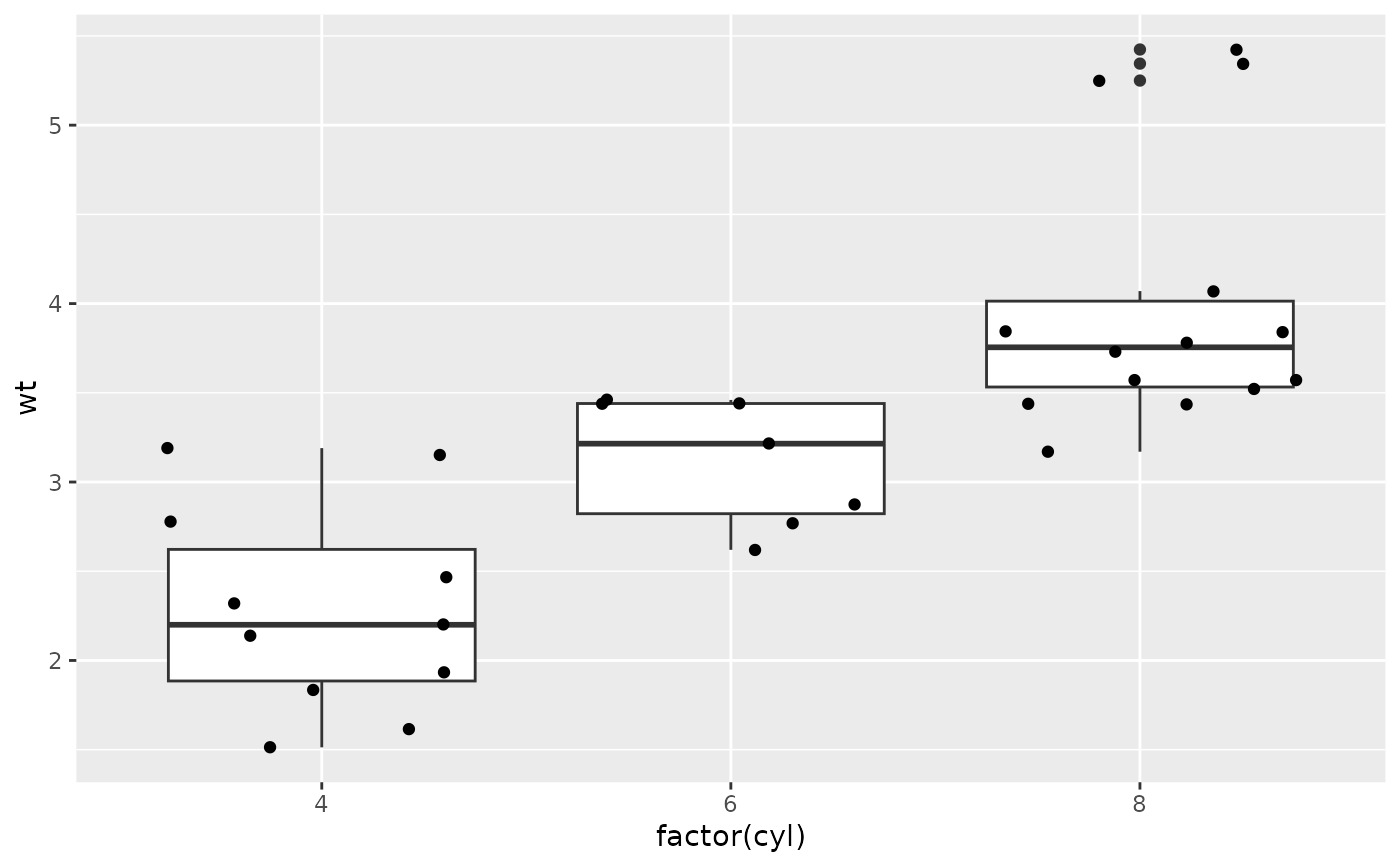
 qplot(factor(cyl), wt, data = mtcars, geom = c("boxplot", "jitter"))
 qplot(mpg, data = mtcars, geom = "dotplot")
#> Bin width defaults to 1/30 of the range of the data. Pick better value
#> with `binwidth`.
qplot(mpg, data = mtcars, geom = "dotplot")
#> Bin width defaults to 1/30 of the range of the data. Pick better value
#> with `binwidth`.
 # }
# }
相關用法
- R ggplot2 annotation_logticks 注釋:記錄刻度線
- R ggplot2 vars 引用分麵變量
- R ggplot2 position_stack 將重疊的對象堆疊在一起
- R ggplot2 geom_qq 分位數-分位數圖
- R ggplot2 geom_spoke 由位置、方向和距離參數化的線段
- R ggplot2 geom_quantile 分位數回歸
- R ggplot2 geom_text 文本
- R ggplot2 get_alt_text 從繪圖中提取替代文本
- R ggplot2 annotation_custom 注釋:自定義grob
- R ggplot2 geom_ribbon 函數區和麵積圖
- R ggplot2 stat_ellipse 計算法行數據橢圓
- R ggplot2 resolution 計算數值向量的“分辨率”
- R ggplot2 geom_boxplot 盒須圖(Tukey 風格)
- R ggplot2 lims 設置規模限製
- R ggplot2 geom_hex 二維箱計數的六邊形熱圖
- R ggplot2 scale_gradient 漸變色階
- R ggplot2 scale_shape 形狀比例,又稱字形
- R ggplot2 geom_bar 條形圖
- R ggplot2 draw_key 圖例的關鍵字形
- R ggplot2 annotate 創建注釋層
- R ggplot2 label_bquote 帶有數學表達式的標簽
- R ggplot2 annotation_map 注釋:Map
- R ggplot2 scale_viridis 來自 viridisLite 的 Viridis 色標
- R ggplot2 coord_fixed 具有固定“縱橫比”的笛卡爾坐標
- R ggplot2 map_data 創建Map數據的 DataFrame
注:本文由純淨天空篩選整理自Hadley Wickham等大神的英文原創作品 Quick plot。非經特殊聲明,原始代碼版權歸原作者所有,本譯文未經允許或授權,請勿轉載或複製。