用法:
pandas.plotting.andrews_curves(frame, class_column, ax=None, samples=200, color=None, colormap=None, **kwargs)生成 Andrews 曲线的 matplotlib 图,用于可视化多变量数据的集群。
安德鲁斯曲线具有函数形式:
x_4 sin(2t) + x_5 cos(2t) + …
f(t) = x_1/sqrt(2) + x_2 sin(t) + x_3 cos(t) +:
其中 x 系数对应于每个维度的值,并且 t 在 -pi 和 +pi 之间呈线性间隔。然后每一行框架对应于一条曲线。
- frame: DataFrame
要绘制的数据,最好归一化为 (0.0, 1.0)。
- class_column:包含类名的列名
- ax:matplotlib 轴对象,默认无
- samples:在每条曲线中绘制的点数
- color:列表或元组,可选
用于不同类别的颜色。
- colormap:str 或 matplotlib 颜色图对象,默认无
从中选择颜色的颜色图。如果是字符串,则从 matplotlib 加载具有该名称的颜色图。
- **kwargs:
传递给 matplotlib 绘图方法的选项。
- 类:
matplotlip.axis.Axes
- 类:
参数:
返回:
例子:
>>> df = pd.read_csv(
...     'https://raw.github.com/pandas-dev/'
...     'pandas/main/pandas/tests/io/data/csv/iris.csv'
... )
>>> pd.plotting.andrews_curves(df, 'Name')
<AxesSubplot:title={'center':'width'}>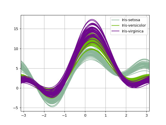
相关用法
- Python pandas.plotting.autocorrelation_plot用法及代码示例
- Python pandas.plotting.bootstrap_plot用法及代码示例
- Python pandas.plotting.scatter_matrix用法及代码示例
- Python pandas.plotting.radviz用法及代码示例
- Python pandas.plotting.parallel_coordinates用法及代码示例
- Python pandas.plotting.lag_plot用法及代码示例
- Python pandas.plotting.boxplot用法及代码示例
- Python pandas.pivot用法及代码示例
- Python pandas.period_range用法及代码示例
- Python pandas.period_range()用法及代码示例
- Python pandas.pivot_table用法及代码示例
- Python pandas.arrays.IntervalArray.is_empty用法及代码示例
- Python pandas.DataFrame.ewm用法及代码示例
- Python pandas.api.types.is_timedelta64_ns_dtype用法及代码示例
- Python pandas.DataFrame.dot用法及代码示例
- Python pandas.DataFrame.apply用法及代码示例
- Python pandas.DataFrame.combine_first用法及代码示例
- Python pandas.read_pickle用法及代码示例
- Python pandas.Index.value_counts用法及代码示例
- Python pandas.DatetimeTZDtype用法及代码示例
注:本文由纯净天空筛选整理自pandas.pydata.org大神的英文原创作品 pandas.plotting.andrews_curves。非经特殊声明,原始代码版权归原作者所有,本译文未经允许或授权,请勿转载或复制。