TensorBoard直方图仪表板用于显示Tensor的分布,这些分布对应到TensorFlow图计算的不同时刻。它通过在不同的时间点显示张量的直方图可视化来实现这一点。
一个基本的例子
让我们从一个简单的例子开始:一个正态分布变量,其中平均值随时间变化。 TensorFlow有一个操作:tf.random_normal,可以完美的用于这个目的。与TensorBoard通常情况一样,我们将使用‘tf.summary.histogram’摘要操作来获取数据。有关summary如何工作的初步介绍,请参TensorBoard教程。
这是一个代码片段,它将生成一些包含正态分布数据的直方图摘要,其中分布的均值随时间而增加。
import tensorflow as tf

k = tf.placeholder(tf.float32)

# Make a normal distribution, with a shifting mean
mean_moving_normal = tf.random_normal(shape=[1000], mean=(5*k), stddev=1)
# Record that distribution into a histogram summary
tf.summary.histogram("normal/moving_mean", mean_moving_normal)

# Setup a session and summary writer
sess = tf.Session()
writer = tf.summary.FileWriter("/tmp/histogram_example")

summaries = tf.summary.merge_all()

# Setup a loop and write the summaries to disk
N = 400
for step in range(N):
  k_val = step/float(N)
  summ = sess.run(summaries, feed_dict={k: k_val})
  writer.add_summary(summ, global_step=step)
一旦代码运行,我们可以通过命令行将数据加载到TensorBoard中:
tensorboard --logdir=/tmp/histogram_example
一旦TensorBoard正在运行,在Chrome或Firefox中打开localhost:6006,然后导航到“柱状图”控制面板。然后我们可以看到正态分布数据的直方图。
tf.summary.histogram以一个任意大小和形状的张量作为参数,将其压缩成一个由宽度和数量组成的直方图数据结构。例如,假设我们要把数字[0.5, 1.1, 1.3, 2.2, 2.9, 2.99]分配到bin中。可以设计三个bin:一个bin包含从0到1的所有内容(它将包含一个元素,0.5),一个包含1-2(包含两个元素,1.1和1.3)的所有内容的bin,*一个包含2-3的所有内容的bin(它将包含三个元素:2.2,2.9和2.99)。
TensorFlow使用类似的方法来创建分档,但与我们的例子不同,它不会创建整数分档。对于大而稀疏的数据集,可能会导致数千个分档。替代方案:bins呈指数分布,许多bins接近于0,对于较大数字的bins比较少。然而,可视化指数分布的bins是棘手的;如果使用高度来编码计数,那么即使具有相同数量的元素,较宽的bins也需要更多的空间。相反,在该区域的编码计数也不能用高度比较。因此,直方图重新采样数据到统一的bins。
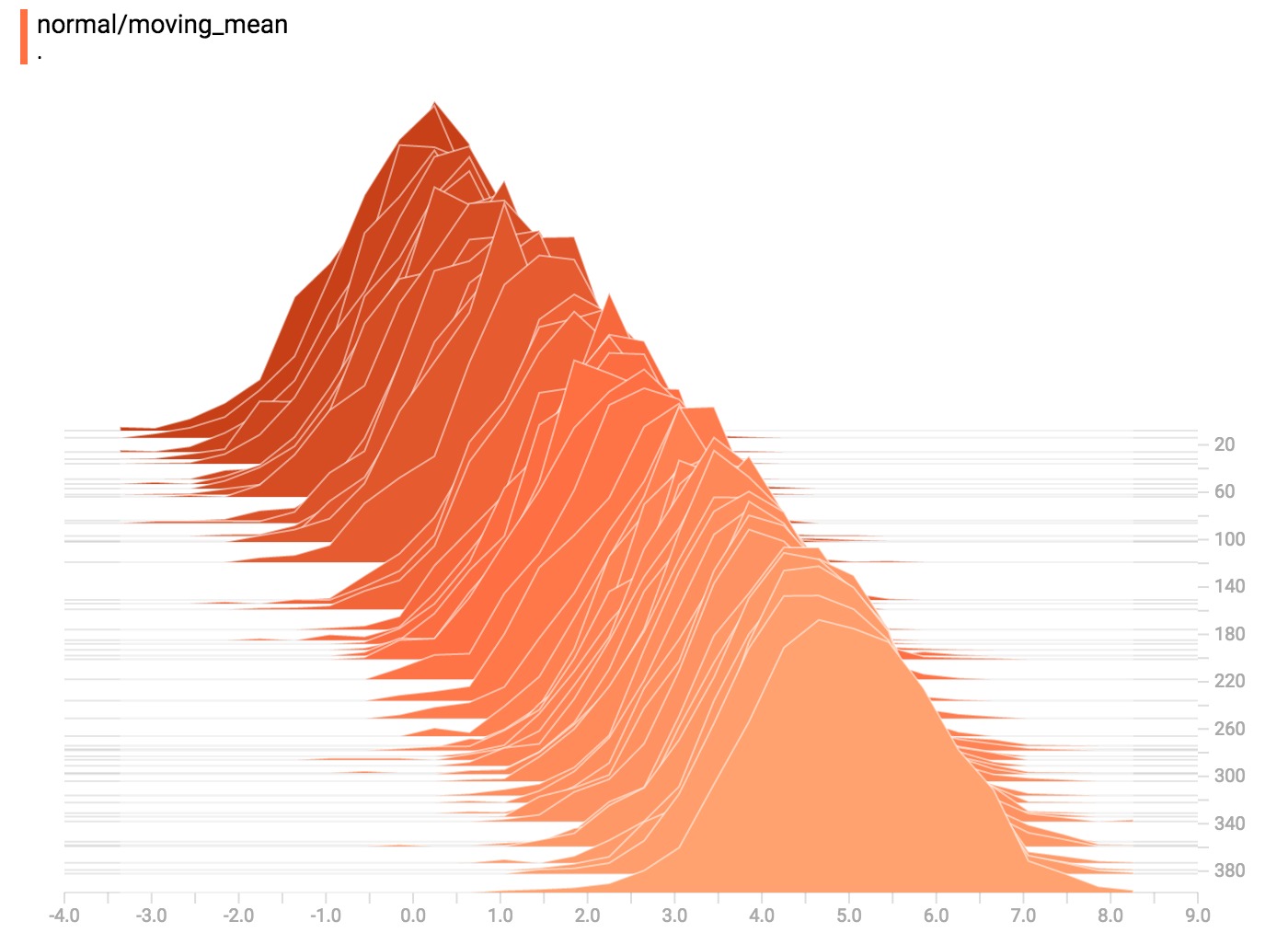
直方图可视化器中的每个切片显示单个直方图。切片按步骤组织;较旧的切片(例如步骤0)靠后且较暗,而较新的切片(例如,步骤400)靠前且颜色较浅。右侧的y-axis显示步骤编号。
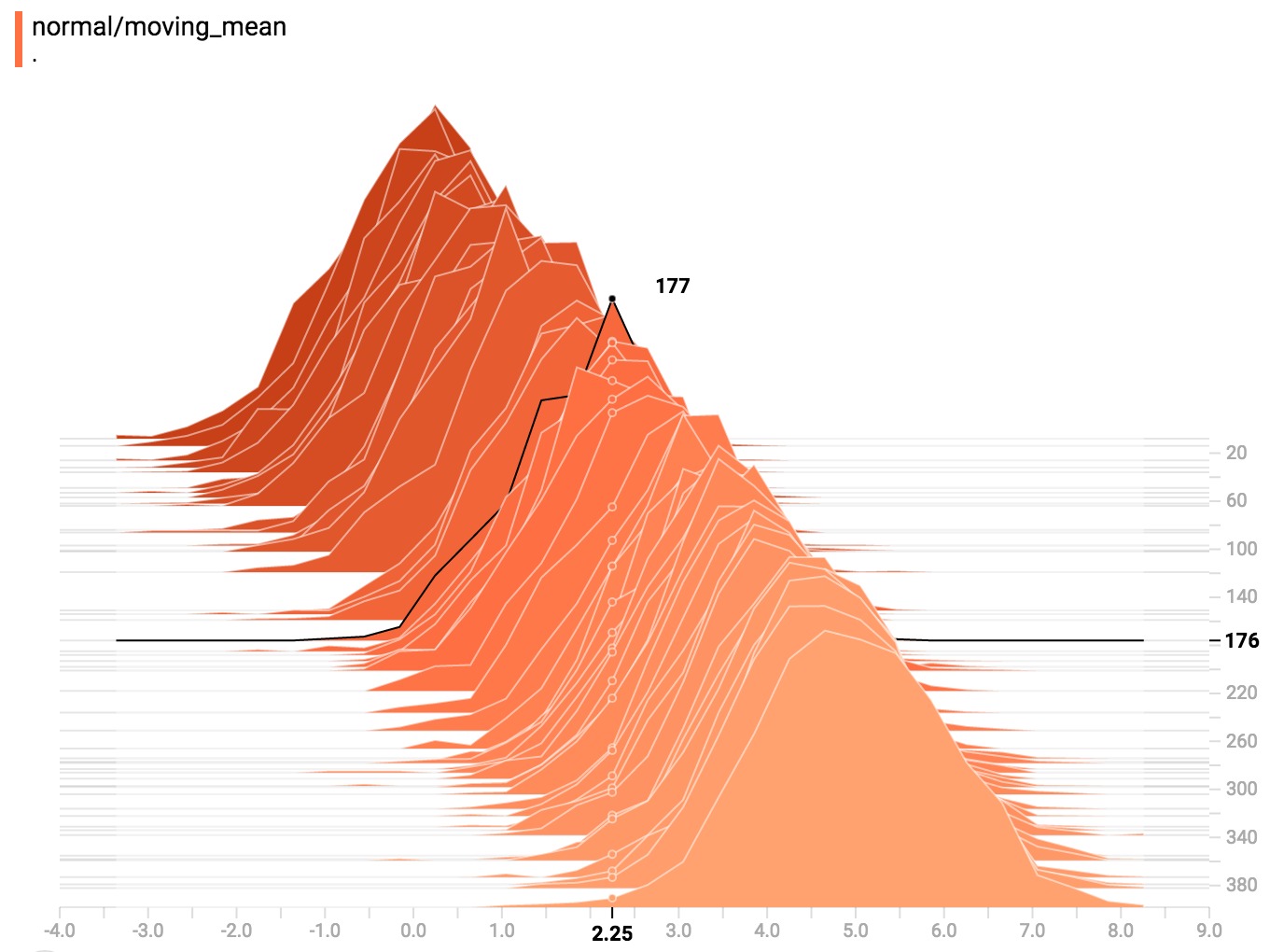
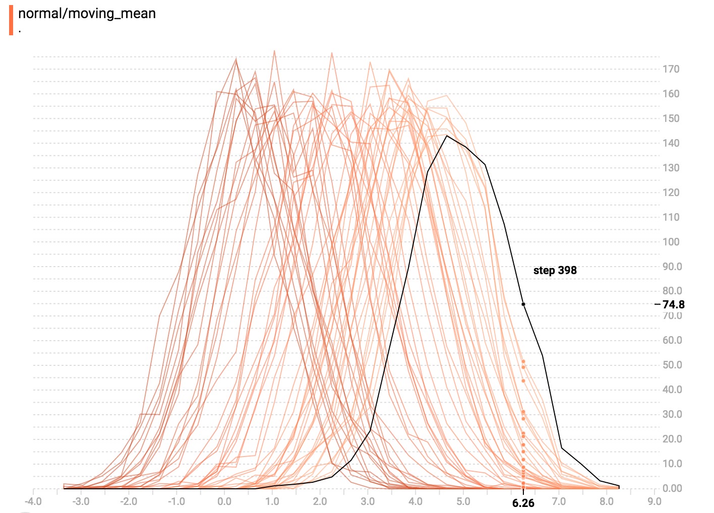
您可以将鼠标悬停在直方图上,查看更多详细信息。例如,在下面的图像中,我们可以看到步骤176中的直方图具有以2.25为中心的bin,该bin中有177个元素。
此外,您可能会注意到,直方图切片并不总是以步骤计数或时间间隔均匀分布。这是因为TensorBoard使用蓄水池采样保留所有直方图的一个子集,以节省内存。蓄水池采样保证每个样本都有相同的被包含的可能性,但是因为它是一个随机算法,选择的样本不会在每一步中出现。
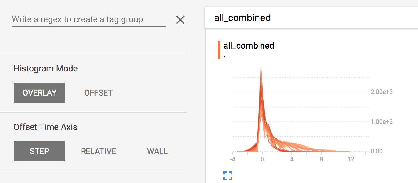
覆盖模式
仪表板左侧有一个控件,可以将直方图模式从”offset”切换到”overlay”:
在”offset”模式下,可视化旋转45度,以便各个直方图切片不再按时间展开,而是全部绘制在相同的y-axis上。
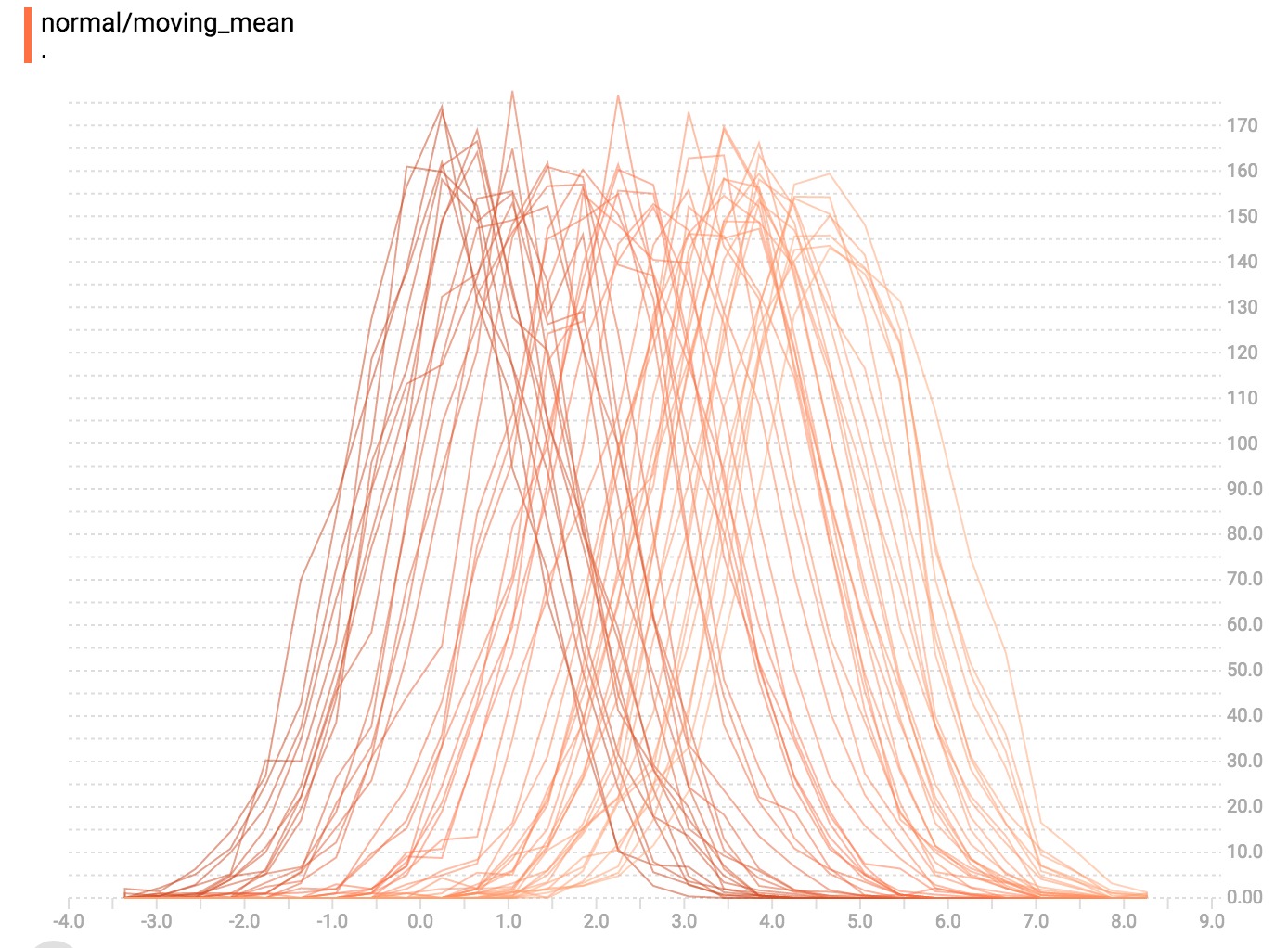 现在,每个切片都是图表上的一个单独的行,y-axis显示每个桶内的项目数。较深的线条对应较旧、较早的步骤,较轻,较浅的线条对应较近、刚刚的步骤,您可以将鼠标悬停在图表上以查看其他信息。
一般来说,如果要直接比较不同直方图的计数,覆盖模式的可视化将非常有用。
多峰分配
直方图仪表板非常适合可视化多峰分布。让我们通过连接两个不同的正态分布的输出来构造一个简单的双峰分布。代码将如下所示:
import tensorflow as tf

k = tf.placeholder(tf.float32)

# Make a normal distribution, with a shifting mean
mean_moving_normal = tf.random_normal(shape=[1000], mean=(5*k), stddev=1)
# Record that distribution into a histogram summary
tf.summary.histogram("normal/moving_mean", mean_moving_normal)

# Make a normal distribution with shrinking variance
variance_shrinking_normal = tf.random_normal(shape=[1000], mean=0, stddev=1-(k))
# Record that distribution too
tf.summary.histogram("normal/shrinking_variance", variance_shrinking_normal)

# Let's combine both of those distributions into one dataset
normal_combined = tf.concat([mean_moving_normal, variance_shrinking_normal], 0)
# We add another histogram summary to record the combined distribution
tf.summary.histogram("normal/bimodal", normal_combined)

summaries = tf.summary.merge_all()

# Setup a session and summary writer
sess = tf.Session()
writer = tf.summary.FileWriter("/tmp/histogram_example")

# Setup a loop and write the summaries to disk
N = 400
for step in range(N):
  k_val = step/float(N)
  summ = sess.run(summaries, feed_dict={k: k_val})
  writer.add_summary(summ, global_step=step)
从上面的例子,可以想到之前的”moving mean”正态分布。现在我们有一个”shrinking variance”(改变方差)发行版本。他们并列看起来像这样: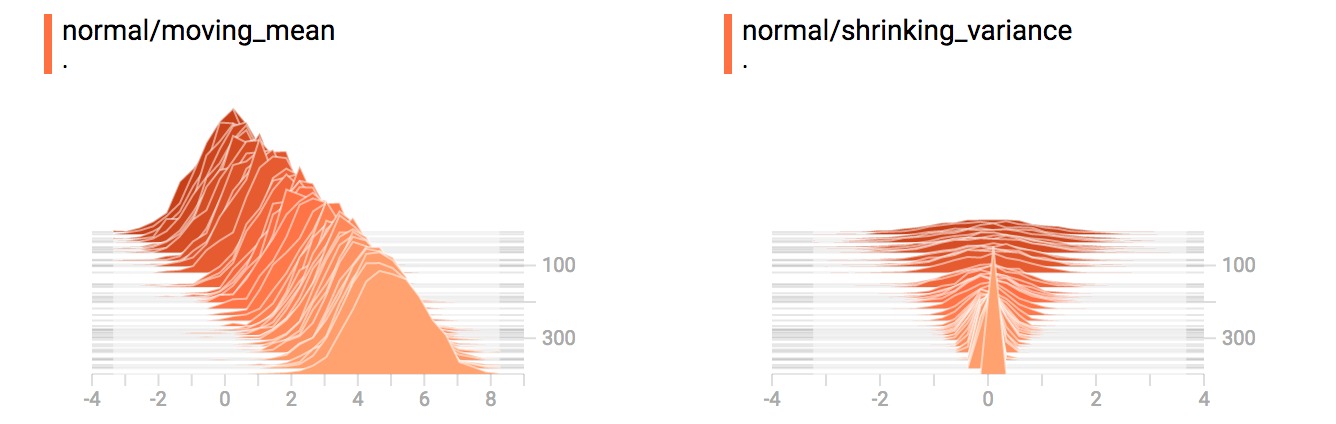
当我们把它们连接起来的时候,我们得到一个清楚地显示出不同的双峰结构的图表: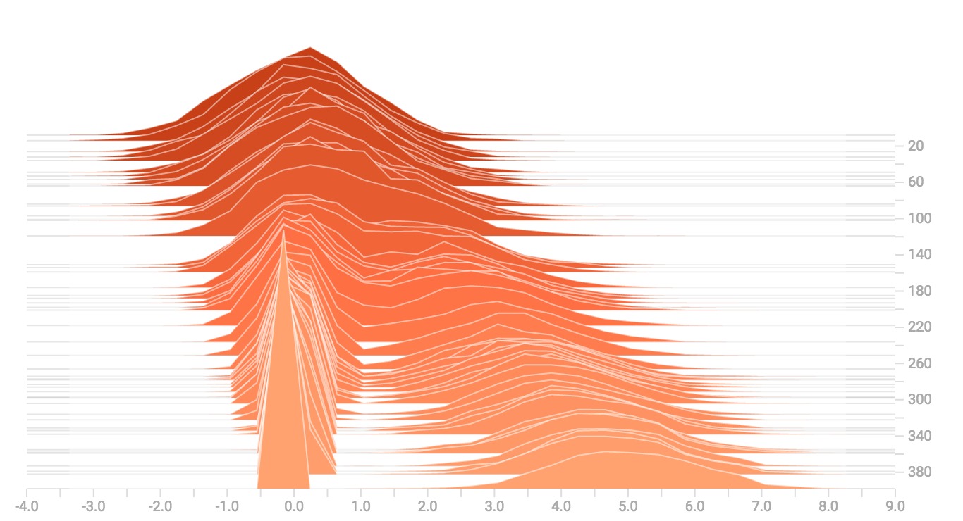
更多的分布
为了好玩,让我们生成和可视化更多的分布,然后将它们合并成一个图表。以下是我们将使用的代码:
import tensorflow as tf

k = tf.placeholder(tf.float32)

# Make a normal distribution, with a shifting mean
mean_moving_normal = tf.random_normal(shape=[1000], mean=(5*k), stddev=1)
# Record that distribution into a histogram summary
tf.summary.histogram("normal/moving_mean", mean_moving_normal)

# Make a normal distribution with shrinking variance
variance_shrinking_normal = tf.random_normal(shape=[1000], mean=0, stddev=1-(k))
# Record that distribution too
tf.summary.histogram("normal/shrinking_variance", variance_shrinking_normal)

# Let's combine both of those distributions into one dataset
normal_combined = tf.concat([mean_moving_normal, variance_shrinking_normal], 0)
# We add another histogram summary to record the combined distribution
tf.summary.histogram("normal/bimodal", normal_combined)

# Add a gamma distribution
gamma = tf.random_gamma(shape=[1000], alpha=k)
tf.summary.histogram("gamma", gamma)

# And a poisson distribution
poisson = tf.random_poisson(shape=[1000], lam=k)
tf.summary.histogram("poisson", poisson)

# And a uniform distribution
uniform = tf.random_uniform(shape=[1000], maxval=k*10)
tf.summary.histogram("uniform", uniform)

# Finally, combine everything together!
all_distributions = [mean_moving_normal, variance_shrinking_normal,
                     gamma, poisson, uniform]
all_combined = tf.concat(all_distributions, 0)
tf.summary.histogram("all_combined", all_combined)

summaries = tf.summary.merge_all()

# Setup a session and summary writer
sess = tf.Session()
writer = tf.summary.FileWriter("/tmp/histogram_example")

# Setup a loop and write the summaries to disk
N = 400
for step in range(N):
  k_val = step/float(N)
  summ = sess.run(summaries, feed_dict={k: k_val})
  writer.add_summary(summ, global_step=step)
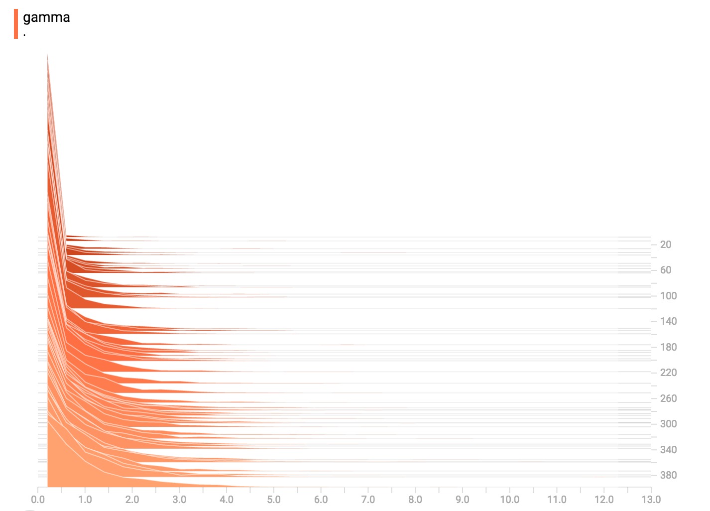
伽玛分布
均匀分配

泊松分布
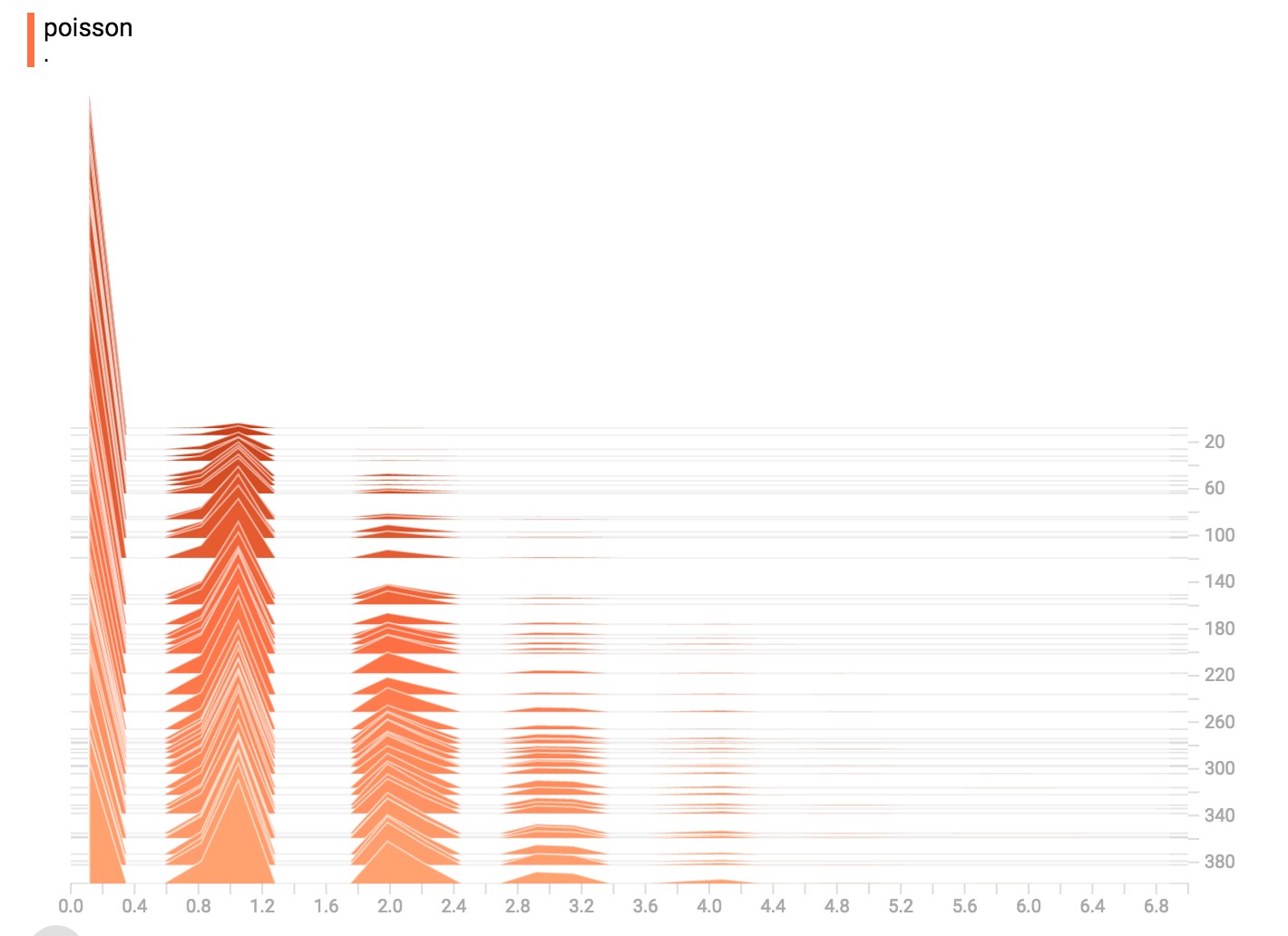 泊松分布是在整数上定义的。所以,所有生成的值都是完美的整数。直方图压缩将数据移动到浮点数分割的bin中,导致可视化在整数值上显示出很小的隆起,而不是完美的尖峰。
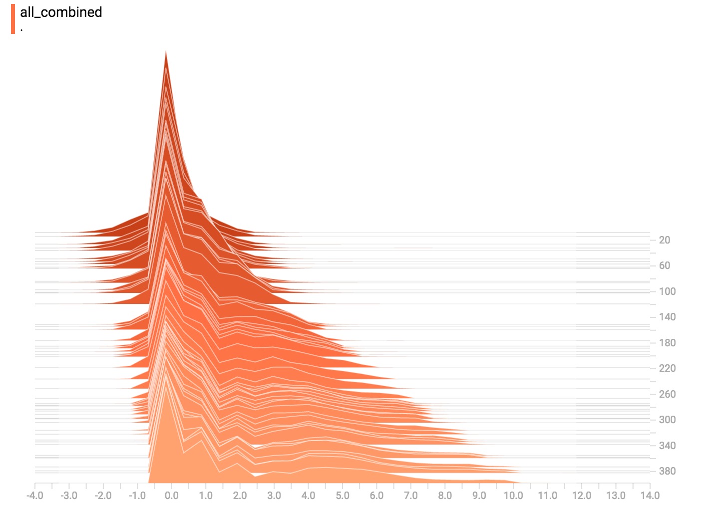
现在都在一起了
最后,我们可以将所有的数据连接成一个好玩的曲线。