此 CSS 屬性指定開始過渡效果的持續時間。此屬性的值定義為秒 (s) 或毫秒 (ms)。 CSS 過渡是添加的效果,用於將元素逐漸從一種樣式更改為另一種樣式,無需使用 Flash 或 JavaScript。
如果不使用 transition-delay,動畫將從元素上的懸停開始,但使用此 CSS 屬性,我們可以將動畫延遲一段時間。
用法
transition-delay:time | initial | inherit;transition-delay 屬性的默認值為 0,這意味著轉換將立即開始發生,沒有任何延遲。
屬性值
time:它指定在轉換開始之前等待的時間量(以秒或毫秒為單位)。
initial:它將此屬性設置為其默認值。
inherit:它從其父元素繼承此屬性。
延遲可以是負數、正數或零。
transition-delay 屬性的負值將立即啟動過渡效果,即效果將被動畫化,就好像它已經開始一樣。此屬性的正值會導致過渡效果在給定時間內開始。
我們可以指定在轉換多個屬性時有用的多個延遲。每個延遲都將應用於相關屬性,如 transition-property 屬性所定義。例如,假設我們提供兩個 transition-delay 值。第一個值影響 transition-property 屬性給出的第一個屬性。第二個 transition-delay 影響過渡屬性給出的屬性名稱列表中的第二個屬性。
讓我們看看 transition-delay 屬性的一些示例。
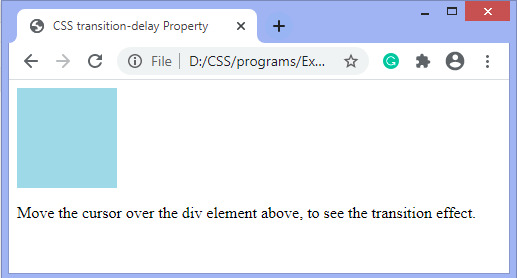
示例 1
在此示例中,我們使用 transition-property、transition-duration 和 transition-delay 屬性。啟動過渡效果有0.5s的延遲,即在給定的時間後div元素的背景顏色將發生變化。
<!DOCTYPE html>
<html>
<head>
<title>
CSS transition-delay Property
</title>
<style>
div{
width:100px;
height:100px;
background:lightblue;
transition-property:background-color;
transition-duration:1s;
transition-delay:0.5s;

/* For Safari browser */
-webkit-transition-property:background-color;
-webkit-transition-duration:1s;
-webkit-transition-delay:0.5s;
}
div:hover {
background-color:brown;
}
</style>
</head>
<body>
<div></div>
<p> Move the cursor over the div element above, to see the transition effect. </p>
</body>
</html>
輸出
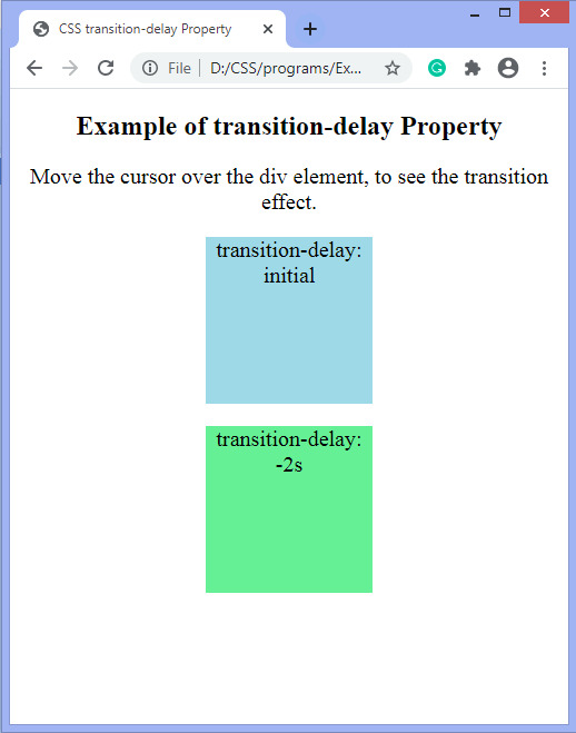
例2
在這個例子中,有兩個 div 元素。在第一個 div 中,我們使用 transition-delay 屬性的初始值。在第二個 div 中,我們應用了 transition-delay 屬性的負值,即 -2s。我們必須將光標移動到 div 元素上才能看到過渡效果。
<!DOCTYPE html>
<html>
<head>
<title>
CSS transition-delay Property
</title>

<style>
p{
font-size:20px;
}
.first{
width:150px;
height:150px;
background-color:lightblue;
transition-property:width;
transition-duration:1s;
transition-delay:initial;

/* For Safari browser */
-webkit-transition-property:width;
-webkit-transition-duration:1s;
-webkit-transition-delay:initial;

}
.second{
width:150px;
height:150px;
background-color:lightgreen;
transition:width 1s, height 2s, background-color 2s;
transition-delay:-2s;
}

.first:hover {
width:300px;
}
.second:hover{
width:250px;
height:250px;
background-color:brown;
}
</style>
</head>

<body>
<center>
<h2> Example of transition-delay Property </h2>
<p> Move the cursor over the div element, to see the transition effect. </p>
<div class = "first">
<p> transition-delay:initial </p>
</div>
<div class = "second">
<p> transition-delay:-2s </p>
</div>
</center>
</body>
</html>
輸出
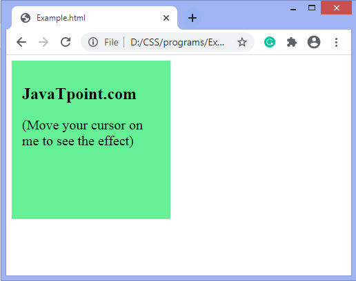
示例
現在,還有另一個例子,其中有多重過渡效果。在這裏,過渡影響寬度、高度和變換。還有一個transition-delay的單位是毫秒(ms),即2.5ms。
<!DOCTYPE html>
<html>
<head>
<style>
div {
padding:15px;
width:200px;
height:200px;
background:lightgreen;
transition:background-color 1s, width 2s, height 2s, transform 2s;
transition-delay:1.5ms;
}
p{
font-size:20px;
}
div:hover {
width:300px;
height:300px;
-webkit-transform:rotate(360deg); /* Chrome, Safari, Opera */
transform:rotate(360deg);
background-color:orange;
}
</style>
</head>
<body>
<div>
<h2>JavaTpoint.com</h2>
<p> (Move your cursor on me to see the effect)</p></div>
</body>
</html>
輸出
相關用法
- CSS transition-delay用法及代碼示例
- CSS transition-duration用法及代碼示例
- CSS transition-property用法及代碼示例
- CSS transition-timing-function用法及代碼示例
- CSS transition屬性用法及代碼示例
- CSS translate()用法及代碼示例
- CSS translateY()用法及代碼示例
- CSS translate3d()用法及代碼示例
- CSS translateX()用法及代碼示例
- CSS transform屬性用法及代碼示例
- CSS transform-style用法及代碼示例
- CSS translateZ()用法及代碼示例
- CSS transform-origin屬性用法及代碼示例
- CSS transform-origin用法及代碼示例
- CSS text-overflow用法及代碼示例
- CSS text-decoration-skip-ink屬性用法及代碼示例
- CSS text-decoration-style用法及代碼示例
- CSS table-layout用法及代碼示例
- CSS text-justify用法及代碼示例
- CSS text-orientation用法及代碼示例
注:本文由純淨天空篩選整理自 CSS transition-delay property。非經特殊聲明,原始代碼版權歸原作者所有,本譯文未經允許或授權,請勿轉載或複製。