CSS中的transform屬性用於更改視覺格式模型的坐標空間。這用於在元素上添加傾斜,旋轉,平移等效果。
注意:轉換可以是2-D或3-D類型。
用法:
transform:none|transform-functions|initial|inherit;
值:
| 值 | 描述 |
|---|---|
| none | 不進行任何轉換。 |
| matrix(x, x, x, x, x, x) | 指定二維類型的矩陣轉換。它需要6個值。 |
| matrix3d(x, x, x, x, x, x, x, x, x) | 指定3-D類型的矩陣轉換。它需要9個值。 |
| translate(x, y) | 指定X和Y軸上的平移。 |
| translate3d(x, y, z) | 指定在X,Y和Z軸上的平移。 |
| translateX(x) | 僅指定X軸上的平移。 |
| translateY(y) | 僅指定沿Y軸的平移。 |
| translateZ(z) | 僅指定沿Z軸的平移。 |
| rotate(angle) | 指定旋轉角度。 |
| rotateX(angle) | 指定對應於旋轉角度的沿X軸的旋轉。 |
| roatateY(angle) | 指定對應於旋轉角度的沿Y軸的旋轉。 |
| roteteZ(angle) | 指定對應於旋轉角度的沿Z軸的旋轉。 |
| scale(x, y) | 指定沿X和Y軸的比例轉換。 |
| scale3d(x, y, z) | 指定沿X,Y和Z軸的比例轉換。 |
| scaleX(x) | 指定沿X軸的比例轉換。 |
| scaleY(y) | 指定沿Y軸的比例轉換。 |
| scaleZ(z) | 指定沿Z軸的比例轉換。 |
| scale3d(x, y, z) | 指定沿X,Y和Z軸的比例轉換。 |
| skew(angle, angle) | 指定沿與傾斜角相對應的X和Y軸的傾斜變換。 |
| skewX(angle) | 指定對應於偏斜角的沿X軸的偏斜變換。 |
| skewY(angle) | 指定對應於偏斜角的沿Y軸的偏斜變換。 |
| skewZ(angle) | 指定對應於傾斜角的沿Z軸的傾斜變換。 |
| perspective(x) | 指定元素的透視圖。參考:透視屬性 |
| initial | 將元素初始化為其默認值。 |
| inherit | 從其父元素繼承值。 |
範例1:沒有轉換屬性。
<!DOCTYPE html>
<html>
    <head>
        <title>
            CSS Transform Property
        </title>

        <style>
            .main {
                display:grid;
                padding:30px;
                background-color:green;

            }
            .GFG {
                text-align:center;
                font-size:35px;
                background-color:white;
                color:green;
            }
        </style>
    </head>

    <body>
        <div class = "main">
            <div class = "GFG">GeeksForGeeks</div>
        </div>
    </body>
</html>
輸出:

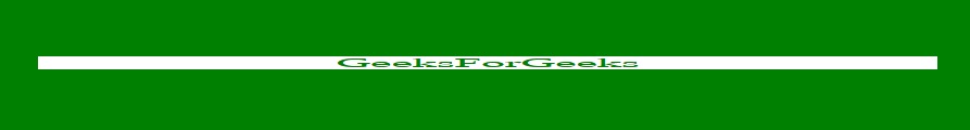
範例2:本示例描述Matrix()屬性值。
<!DOCTYPE html>
<html>
    <head>
        <title>
            CSS Transform Property
        </title>

        <style>
            .main {
                display:grid;
                padding:30px;
                background-color:green;

            }
            .GFG {
                text-align:center;
                font-size:35px;
                background-color:white;
                color:green;
                transform:matrix(1, 0, -1, 1, 1, 0);
            }
        </style>
    </head>

    <body>
        <div class = "main">
            <div class = "GFG">GeeksForGeeks</div>
        </div>
    </body>
</html>
輸出:

範例3:本示例描述Matrix3d()屬性值。
<!DOCTYPE html>
<html>
    <head>
        <title>
            CSS Transform Property
        </title>

        <style>
            .main {
                display:grid;
                padding:30px;
                background-color:green;
                transform-style:preserve-3d;

            }
            .GFG {
                text-align:center;
                font-size:35px;
                background-color:white;
                color:green;
                transform-style:preserve-3d;
                position:absolute;
                transform:translate(150px, 75%, 5em)
            }
        </style>
    </head>

    <body>
        <div class = "main">
            <div class = "GFG">GeeksForGeeks</div>
        </div>
    </body>
</html>
輸出:

範例4:本示例描述translate()屬性值。
<!DOCTYPE html>
<html>
    <head>
        <title>
            CSS Transform Property
        </title>

        <style>
            .main {
                display:grid;
                padding:30px;
                background-color:green;

            }
            .GFG {
                text-align:center;
                font-size:35px;
                background-color:white;
                color:green;
                transform:translate(150px, 65%);
            }
        </style>
    </head>

    <body>
        <div class = "main">
            <div class = "GFG">GeeksForGeeks</div>
        </div>
    </body>
</html>
輸出:
範例5:本示例描述了translate3d()屬性值。
<!DOCTYPE html>
<html>
    <head>
        <title>
            CSS Transform Property
        </title>

        <style>
            .main {
                display:grid;
                padding:30px;
                background-color:green;

            }
            .GFG {
                text-align:center;
                font-size:35px;
                background-color:white;
                color:green;
                transform:translate(150px, 65%, 5em);
            }
        </style>
    </head>

    <body>
        <div class = "main">
            <div class = "GFG">GeeksForGeeks</div>
        </div>
    </body>
</html>
輸出:
範例6:本示例描述translateX()屬性值。
<!DOCTYPE html>
<html>
    <head>
        <title>
            CSS Transform Property
        </title>

        <style>
            .main {
                display:grid;
                padding:30px;
                background-color:green;

            }
            .GFG {
                text-align:center;
                font-size:35px;
                background-color:white;
                color:green;
                transform:translateX(150px);
            }
        </style>
    </head>

    <body>
        <div class = "main">
            <div class = "GFG">GeeksForGeeks</div>
        </div>
    </body>
</html>
輸出:

範例7:本示例描述translateY()屬性值。
<!DOCTYPE html>
<html>
    <head>
        <title>
            CSS Transform Property
        </title>

        <style>
            .main {
                display:grid;
                padding:30px;
                background-color:green;

            }
            .GFG {
                text-align:center;
                font-size:35px;
                background-color:white;
                color:green;
                transform:translateY(150px);
            }
        </style>
    </head>

    <body>
        <div class = "main">
            <div class = "GFG">GeeksForGeeks</div>
        </div>
    </body>
</html>
輸出:
範例8:本示例描述translateZ()屬性值。
<!DOCTYPE html>
<html>
    <head>
        <title>
            CSS Transform Property
        </title>

        <style>
            .main {
                display:grid;
                padding:30px;
                background-color:green;

            }
            .GFG {
                text-align:center;
                font-size:35px;
                background-color:white;
                color:green;
                transform:translateZ(150px);
            }
        </style>
    </head>

    <body>
        <div class = "main">
            <div class = "GFG">GeeksForGeeks</div>
        </div>
    </body>
</html>
輸出:
範例9:本示例描述rotate()屬性值。
<!DOCTYPE html>
<html>
    <head>
        <title>
            CSS Transform Property
        </title>

        <style>
            .main {
                display:grid;
                padding:30px;
                background-color:green;

            }
            .GFG {
                text-align:center;
                font-size:35px;
                background-color:white;
                color:green;
                transform:rotate(45deg);
            }
        </style>
    </head>

    <body>
        <div class = "main">
            <div class = "GFG">GeeksForGeeks</div>
        </div>
    </body>
</html>
輸出:

範例10:本示例描述rotateX()屬性值。
<!DOCTYPE html>
<html>
    <head>
        <title>
            CSS Transform Property
        </title>

        <style>
            .main {
                display:grid;
                padding:30px;
                background-color:green;

            }
            .GFG {
                text-align:center;
                font-size:35px;
                background-color:white;
                color:green;
                transform:rotateX(75deg);
            }
        </style>
    </head>

    <body>
        <div class = "main">
            <div class = "GFG">GeeksForGeeks</div>
        </div>
    </body>
</html>
輸出:
示例11:本示例描述rotateY()屬性值。
<!DOCTYPE html>
<html>
    <head>
        <title>
            CSS Transform Property
        </title>

        <style>
            .main {
                display:grid;
                padding:30px;
                background-color:green;

            }
            .GFG {
                text-align:center;
                font-size:35px;
                background-color:white;
                color:green;
                transform:rotateY(75deg);
            }
        </style>
    </head>

    <body>
        <div class = "main">
            <div class = "GFG">GeeksForGeeks</div>
        </div>
    </body>
</html>
輸出:

範例12:本示例描述rotateZ()屬性值。
<!DOCTYPE html>
<html>
    <head>
        <title>
            CSS Transform Property
        </title>

        <style>
            .main {
                display:grid;
                padding:30px;
                background-color:green;

            }
            .GFG {
                text-align:center;
                font-size:35px;
                background-color:white;
                color:green;
                transform:rotateZ(75deg);
            }
        </style>
    </head>

    <body>
        <div class = "main">
            <div class = "GFG">GeeksForGeeks</div>
        </div>
    </body>
</html>
輸出:

示例13:本示例描述scale()屬性值。
<!DOCTYPE html>
<html>
    <head>
        <title>
            CSS Transform Property
        </title>

        <style>
            .main {
                display:grid;
                padding:30px;
                background-color:green;

            }
            .GFG {
                text-align:center;
                font-size:35px;
                background-color:white;
                color:green;
                transform:scale(1, 2);
            }
        </style>
    </head>

    <body>
        <div class = "main">
            <div class = "GFG">GeeksForGeeks</div>
        </div>
    </body>
</html>
輸出:

示例14:本示例描述scale3d()屬性值。
<!DOCTYPE html>
<html>
    <head>
        <title>
            CSS Transform Property
        </title>

        <style>
            .main {
                display:grid;
                padding:30px;
                background-color:green;

            }
            .GFG {
                text-align:center;
                font-size:35px;
                background-color:white;
                color:green;
                transform:scale3d(2, 1, 5);
            }
        </style>
    </head>

    <body>
        <div class = "main">
            <div class = "GFG">GeeksForGeeks</div>
        </div>
    </body>
</html>
輸出:

示例15:本示例描述scaleX()屬性值。
<!DOCTYPE html>
<html>
    <head>
        <title>
            CSS Transform Property
        </title>

        <style>
            .main {
                display:grid;
                padding:30px;
                background-color:green;

            }
            .GFG {
                text-align:center;
                font-size:35px;
                background-color:white;
                color:green;
                transform:scaleX(2);
            }
        </style>
    </head>

    <body>
        <div class = "main">
            <div class = "GFG">GeeksForGeeks</div>
        </div>
    </body>
</html>
輸出:

範例16:本示例描述scaleY()屬性值。
<!DOCTYPE html>
<html>
    <head>
        <title>
            CSS Transform Property
        </title>

        <style>
            .main {
                display:grid;
                padding:30px;
                background-color:green;

            }
            .GFG {
                text-align:center;
                font-size:35px;
                background-color:white;
                color:green;
                transform:scaleY(2);
            }
        </style>
    </head>

    <body>
        <div class = "main">
            <div class = "GFG">GeeksForGeeks</div>
        </div>
    </body>
</html>
輸出:

示例17:本示例描述scaleZ()屬性值。
<!DOCTYPE html>
<html>
    <head>
        <title>
            CSS Transform Property
        </title>

        <style>
            .main {
                display:grid;
                padding:30px;
                background-color:green;

            }
            .GFG {
                text-align:center;
                font-size:35px;
                background-color:white;
                color:green;
                transform:scaleZ(2);
            }
        </style>
    </head>

    <body>
        <div class = "main">
            <div class = "GFG">GeeksForGeeks</div>
        </div>
    </body>
</html>
輸出:
示例18:本示例描述skew()屬性值。
<!DOCTYPE html>
<html>
    <head>
        <title>
            CSS Transform Property
        </title>

        <style>
            .main {
                display:grid;
                padding:30px;
                background-color:green;

            }
            .GFG {
                text-align:center;
                font-size:35px;
                background-color:white;
                color:green;
                transform:skew(30deg, 30deg);
            }
        </style>
    </head>

    <body>
        <div class = "main">
            <div class = "GFG">GeeksForGeeks</div>
        </div>
    </body>
</html>
輸出:

示例19:本示例描述skewX()屬性值。
<!DOCTYPE html>
<html>
    <head>
        <title>
            CSS Transform Property
        </title>

        <style>
            .main {
                display:grid;
                padding:30px;
                background-color:green;

            }
            .GFG {
                text-align:center;
                font-size:35px;
                background-color:white;
                color:green;
                transform:skewX(30deg);
            }
        </style>
    </head>

    <body>
        <div class = "main">
            <div class = "GFG">GeeksForGeeks</div>
        </div>
    </body>
</html>
輸出:

示例20:本示例描述skewY()屬性值。
<!DOCTYPE html>
<html>
    <head>
        <title>
            CSS Transform Property
        </title>

        <style>
            .main {
                display:grid;
                padding:30px;
                background-color:green;

            }
            .GFG {
                text-align:center;
                font-size:35px;
                background-color:white;
                color:green;
                transform:skewY(30deg);
            }
        </style>
    </head>

    <body>
        <div class = "main">
            <div class = "GFG">GeeksForGeeks</div>
        </div>
    </body>
</html>
輸出:

示例21:本示例描述perspective()屬性值。
<!DOCTYPE html>
<html>
    <head>
        <title>
            CSS Transform Property
        </title>

        <style>
            .main {
                display:grid;
                padding:30px;
                background-color:green;

            }
            .GFG {
                text-align:center;
                font-size:35px;
                background-color:white;
                color:green;
                transform:perspective(30px);
            }
        </style>
    </head>

    <body>
        <div class = "main">
            <div class = "GFG">GeeksForGeeks</div>
        </div>
    </body>
</html>
輸出:
示例22:本示例描述初始屬性值。
<!DOCTYPE html>
<html>
    <head>
        <title>
            CSS Transform Property
        </title>

        <style>
            .main {
                display:grid;
                padding:30px;
                background-color:green;

            }
            .GFG {
                text-align:center;
                font-size:35px;
                background-color:white;
                color:green;
                transform:initial;
            }
        </style>
    </head>

    <body>
        <div class = "main">
            <div class = "GFG">GeeksForGeeks</div>
        </div>
    </body>
</html>
輸出:
示例23:本示例描述繼承屬性值。
<!DOCTYPE html>
<html>
    <head>
        <title>
            CSS Transform Property
        </title>

        <style>
            .main {
                display:grid;
                padding:30px;
                background-color:green;
                    transform:rotateX(45deg);
            }
            .GFG {
                text-align:center;
                font-size:35px;
                background-color:white;
                color:green;
                transform:inherit;
            }
        </style>
    </head>

    <body>
        <div class = "main">
            <div class = "GFG">GeeksForGeeks</div>
        </div>
    </body>
</html>
輸出:

注意:有時3D值在2D元素上使用時無法提供正確的輸出,因此,不建議對2D元素使用3D值。
支持的瀏覽器:下麵列出了transform屬性支持的瀏覽器:
- 2D轉換:
- Chrome 36.0、4.0 -webkit-
- 邊10.0,9.0 -ms-
- Firefox 16.0、3.5 -moz-
- Safari 9.0、3.2 -webkit-
- Opera 23.0、15.0 -webkit-,10.5 -o-
- 3-D轉換:
- Chrome 36.0、12.0 -webkit-
- 邊12.0
- Firefox 10.0
- Safari 9.0、4.0 -webkit-
- Opera 23.0、15.0 -webkit-
相關用法
- CSS transform-origin用法及代碼示例
- CSS text-transform屬性用法及代碼示例
- CSS transform-style用法及代碼示例
- HTML Style transform用法及代碼示例
- HTML canvas transform()用法及代碼示例
- node.js Stream transform.destroy()用法及代碼示例
- Collect.js transform()用法及代碼示例
- d3.js zoom.transform()用法及代碼示例
- d3.js transform.toString()用法及代碼示例
- Lodash _.transform()用法及代碼示例
- d3.js transform.invert()用法及代碼示例
- d3.js transform.invertY()用法及代碼示例
- d3.js transform.translate()用法及代碼示例
- d3.js transform.scale()用法及代碼示例
- d3.js transform.invertX()用法及代碼示例
- SVG transform屬性用法及代碼示例
- CSS transition-property用法及代碼示例
注:本文由純淨天空篩選整理自DannanaManoj大神的英文原創作品 CSS | transform Property。非經特殊聲明,原始代碼版權歸原作者所有,本譯文未經允許或授權,請勿轉載或複製。