CSS flex-grow 屬性指定如果有可用空間,彈性項目應該占用多少空間。剩餘空間可以定義為 flex 容器大小減去所有 flex 項目加在一起的大小。
此屬性定義與其他項目相比,項目在容器內的增長程度。它可以定義為與容器中的其他項目相比,項目增長的能力。
例如,如果我們將所有項目的 flex-grow 設置為 1,則每個項目將在容器中設置為相同的大小。但是如果我們給任何一個項賦值為 2,那麽相應的項將比其他項占用兩倍的空間。
它設置 flex-item 的彈性增長因子(一個決定 flex-item 將增長多少的數字)。此 CSS 屬性用於增加 flex-item 的大小。它隻對 flex-items 起作用,所以如果容器的物品不是 flex-item,則 flex-grow 屬性不會影響對應的物品。通常,此 CSS 屬性與 flex-shrink 和 flex-basis 等其他 flex 屬性一起使用,通常由 flex 簡寫定義以確保設置所有值。
用法
flex-grow:number| initial | inherit;值
number:它是確定 flex-grow 因子的正數。它的默認值是 0 並且不允許負值。當它設置為零時,即使有可用空間,項目也不會增長。該元素將占用它所需的空間。
initial:它將此屬性設置為其默認值。
inherit:它從其父元素繼承此屬性。
示例
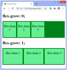
在這個例子中,有兩個容器,我們設置了 flex-grow:0;對於第一個容器和 flex-grow:1 的所有項目;對於第二個容器的所有項目。我們可以看到帶有 flex-grow:0 的項目;占用他們需要的空間,以及帶有 flex-grow:1 的項目;占用相同大小的剩餘空間。
<!DOCTYPE html>
<html>
<head>
<style>
.container {
display:-webkit-flex;
display:flex;
background-color:green;
}
.flex-item {
background-color:lightgreen;
text-align:center;
font-size:25px;
width:100px;
height:100px;
padding-top:20px;
margin:5px;
}
</style>
</head>
<body>
<h1> flex-grow:0; </h1>

<div class="container">
<div class="flex-item" style = "flex-grow:0;"> flex-item 1 </div>
<div class="flex-item" style = "flex-grow:0;"> flex-item 2 </div>
<div class="flex-item" style = "flex-grow:0;"> flex-item 3 </div>
</div>
<h1> flex-grow:1; </h1>
<div class="container">
<div class="flex-item" style = "flex-grow:1;"> flex-item 1 </div>
<div class="flex-item" style = "flex-grow:1;"> flex-item 2 </div>
<div class="flex-item" style = "flex-grow:1;"> flex-item 3 </div>
</div>

</div>
</body>
</html>
輸出
示例
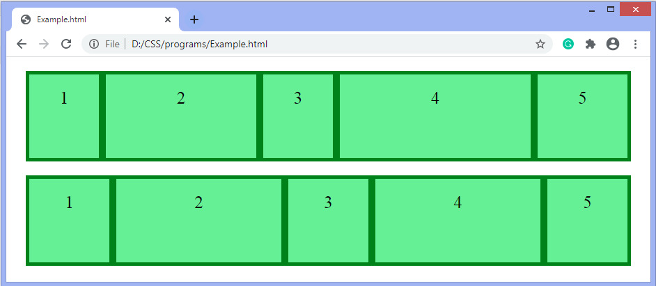
在本例中,我們在 flex-items 上設置了不同的 flex-grow 值。有兩個容器,每個容器有五個彈性項目。在這裏,一些彈性項目比其他彈性項目大。
<!DOCTYPE html>
<html>
<head>
<style>
.container {
display:-webkit-flex;
display:flex;
background-color:green;
margin:20px;
}
.flex-item {
background-color:lightgreen;
text-align:center;
font-size:25px;
width:100px;
height:100px;
padding-top:20px;
margin:5px;
}
</style>
</head>
<body>

<div class="container">
<div class="flex-item" style = "flex-grow:0;"> 1 </div>
<div class="flex-item" style = "flex-grow:4;"> 2 </div>
<div class="flex-item" style = "flex-grow:0;"> 3 </div>
<div class="flex-item" style = "flex-grow:6;"> 4 </div>
<div class="flex-item" style = "flex-grow:1;"> 5 </div>
</div>
<div class="container">
<div class="flex-item" style = "flex-grow:1;"> 1 </div>
<div class="flex-item" style = "flex-grow:9;"> 2 </div>
<div class="flex-item" style = "flex-grow:1;"> 3 </div>
<div class="flex-item" style = "flex-grow:9;"> 4 </div>
<div class="flex-item" style = "flex-grow:1;"> 5 </div>
</div>

</div>
</body>
</html>
輸出
相關用法
- CSS flex-grow用法及代碼示例
- CSS flex-shrink屬性用法及代碼示例
- CSS flex-flow屬性用法及代碼示例
- CSS flex-wrap用法及代碼示例
- CSS flex-shrink用法及代碼示例
- CSS flex-basis屬性用法及代碼示例
- CSS flex-flow用法及代碼示例
- CSS flex-basis用法及代碼示例
- CSS flex-direction用法及代碼示例
- CSS flex屬性用法及代碼示例
- CSS font-size-adjust用法及代碼示例
- CSS font-weight用法及代碼示例
- CSS font-stretch用法及代碼示例
- CSS filter屬性用法及代碼示例
- CSS font-size用法及代碼示例
- CSS fill屬性用法及代碼示例
- CSS font-family用法及代碼示例
- CSS font-variant-caps屬性用法及代碼示例
- CSS font-stretch屬性用法及代碼示例
- CSS font-feature-settings屬性用法及代碼示例
注:本文由純淨天空篩選整理自 CSS flex-grow property。非經特殊聲明,原始代碼版權歸原作者所有,本譯文未經允許或授權,請勿轉載或複製。