grid-auto-flow属性精确指定auto-placed项目如何流入网格。
用法:
grid-auto-flow:row|column|row dense|column dense;
- 行:auto-placement算法通过依次填充每一行并根据需要添加新行来放置项目。
用法:
grid-auto-flow:row;
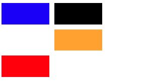
示例1:
<!DOCTYPE html>
<html>

<head>
    <title>
        CSS grid-auto-flow Property
    </title>

    <style>
        .main {
            height:200px;
            width:200px;
            display:grid;
            grid-gap:10px;
            grid-template:repeat(4, 1fr) / repeat(2, 1fr);

            /* grid-auto-flow property used here */
            grid-auto-flow:row;
        }

        .Geeks1 {
            background-color:red;
            grid-row-start:3;
        }

        .Geeks2 {
            background-color:blue;
        }

        .Geeks3 {
            background-color:black;
        }

        .Geeks4 {
            grid-column-start:2;
            background-color:orange;
        }
    </style>
</head>

<body>
    <div class = "main">
        <div class = "Geeks1"></div>
        <div class = "Geeks2"></div>
        <div class = "Geeks3"></div>
        <div class = "Geeks4"></div>
    </div>
</body>

</html>
输出:
- 柱:auto-placement算法通过依次填充每一列并根据需要添加新列来放置项目。
用法:
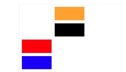
grid-auto-flow:column;示例2:
<!DOCTYPE html>
<html>

<head>
    <title>
        CSS grid-auto-flow Property
    </title>

    <style>
        .main {
            height:200px;
            width:200px;
            display:grid;
            grid-gap:10px;
            grid-template:repeat(4, 1fr) / repeat(2, 1fr);

            /* grid-auto-flow property used here */
            grid-auto-flow:column;
        }

        .Geeks1 {
            background-color:red;
            grid-row-start:3;
        }

        .Geeks2 {
            background-color:blue;
        }

        .Geeks3 {
            background-color:black;
        }

        .Geeks4 {
            grid-column-start:2;
            background-color:orange;
        }
    </style>
</head>

<body>
    <div class = "main">
        <div class = "Geeks1"></div>
        <div class = "Geeks2"></div>
        <div class = "Geeks3"></div>
        <div class = "Geeks4"></div>
    </div>
</body>

</html>
输出:
- 列密度:指定auto-placement算法对列使用“dense”打包算法。
用法:
grid-auto-flow:column dense;
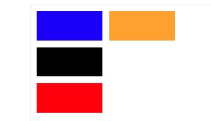
示例3:
<!DOCTYPE html>
<html>

<head>
    <title>
        CSS grid-auto-flow Property
    </title>

    <style>
        .main {
            height:200px;
            width:200px;
            display:grid;
            grid-gap:10px;
            grid-template:repeat(4, 1fr) / repeat(2, 1fr);

            /* grid-auto-flow property used here */
            grid-auto-flow:column dense;
        }

        .Geeks1 {
            background-color:red;
            grid-row-start:3;
        }

        .Geeks2 {
            background-color:blue;
        }

        .Geeks3 {
            background-color:black;
        }

        .Geeks4 {
            grid-column-start:2;
            background-color:orange;
        }
    </style>
</head>

<body>
    <div class = "main">
        <div class = "Geeks1"></div>
        <div class = "Geeks2"></div>
        <div class = "Geeks3"></div>
        <div class = "Geeks4"></div>
    </div>
</body>

</html>
输出:
- 行密集:指定auto-placement算法对行使用“dense”打包算法。
用法:grid-auto-flow:row dense;
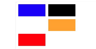
示例4:
<!DOCTYPE html>
<html>

<head>
    <title>
        CSS grid-auto-flow Property
    </title>

    <style>
        .main {
            height:200px;
            width:200px;
            display:grid;
            grid-gap:10px;
            grid-template:repeat(4, 1fr) / repeat(2, 1fr);

            /* grid-auto-flow property used here */
            grid-auto-flow:row dense;
        }

        .Geeks1 {
            background-color:red;
            grid-row-start:3;
        }

        .Geeks2 {
            background-color:blue;
        }

        .Geeks3 {
            background-color:black;
        }

        .Geeks4 {
            grid-column-start:2;
            background-color:orange;
        }
    </style>
</head>

<body>
    <div class = "main">
        <div class = "Geeks1"></div>
        <div class = "Geeks2"></div>
        <div class = "Geeks3"></div>
        <div class = "Geeks4"></div>
    </div>
</body>

</html>
输出:
支持的浏览器:CSS | grid-auto-flow属性列出如下:
- 谷歌浏览器57
- Mozilla Firefox 52
- 边16
- Safari 10
- Opera 44
相关用法
- CSS transition-property用法及代码示例
- CSS right属性用法及代码示例
- CSS all属性用法及代码示例
- CSS nav-right用法及代码示例
- CSS nav-down用法及代码示例
- CSS top属性用法及代码示例
- CSS nav-up用法及代码示例
- HTML li value用法及代码示例
- CSS will-change用法及代码示例
- CSS resize属性用法及代码示例
- CSS bleed属性用法及代码示例
- CSS columns属性用法及代码示例
- CSS clear属性用法及代码示例
- CSS nav-left用法及代码示例
- CSS clip属性用法及代码示例
注:本文由纯净天空筛选整理自A_K_Mishra大神的英文原创作品 CSS | grid-auto-flow Property。非经特殊声明,原始代码版权归原作者所有,本译文未经允许或授权,请勿转载或复制。