CSS backdrop-filter属性用于将效果应用于元素后面的区域。这与filter属性不同,后者将效果应用于整个元素。它可以用于消除使用额外元素单独设置背景样式的情况。
用法:
backdrop-filter:blur() | brightness() | contrast() | drop-shadow() | grayscale() | hue-rotate() | invert() | opacity() | saturate() | sepia() | none | initial | inherit
属性值:
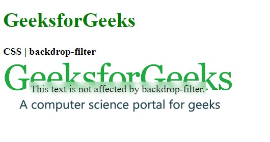
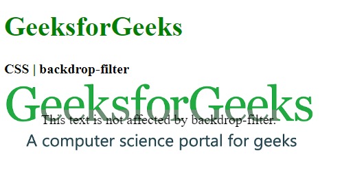
- blur():用于将高斯模糊应用于图像。此函数的默认值为0,不应用任何模糊效果。
例:
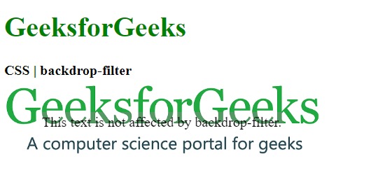
<!DOCTYPE html>
<html>

<head>
    <title>CSS | backdrop-filter</title>

    <style>
        .container {
            background-image:url(
"https://media.geeksforgeeks.org/wp-content/uploads/geeksforgeeks-25.png");
            background-size:cover;
            display:flex;
            align-items:center;
            justify-content:center;
            height:100px;
            width:360px;
        }
        .foreground {
            backdrop-filter:blur(5px);
            padding:2px;
        }
    </style>
</head>

<body>
    <h1 style="color:green">
        GeeksforGeeks
    </h1>

    <b>CSS | backdrop-filter</b>

    <div class="container">
        <div class="foreground">
            This text is not affected
            by backdrop-filter.
        </div>
    </div>
</body>

</html>
输出:
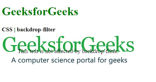
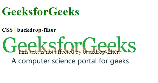
- brightness():用于使图像更亮或更暗。值超过100%将使图像变亮,而值低于100%将使图像变暗。如果亮度变为0%,它将完全使图像变黑。
例:
<!DOCTYPE html>
<html>

<head>
    <title>CSS | backdrop-filter</title>

    <style>
        .container {
            background-image:url(
"https://media.geeksforgeeks.org/wp-content/uploads/geeksforgeeks-25.png");
            background-size:cover;
            display:flex;
            align-items:center;
            justify-content:center;
            height:100px;
            width:360px;
        }
        .foreground {
            backdrop-filter:brightness(25%);
            padding:2px;
        }
    </style>
</head>

<body>
    <h1 style="color:green">
        GeeksforGeeks
    </h1>

    <b>CSS | backdrop-filter</b>

    <div class="container">
        <div class="foreground">
            This text is not affected
            by backdrop-filter.
        </div>
    </div>
</body>

</html>
输出:
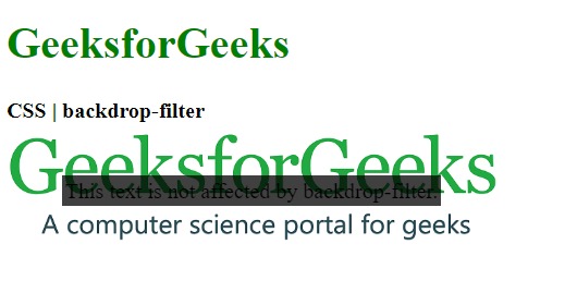
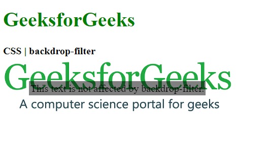
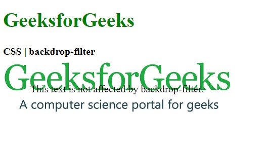
- contrast():它用于设置图像的对比度。原始图像的对比度为100%。如果对比度低于0%,将使图像完全变黑。
例:
<!DOCTYPE html>
<html>

<head>
    <title>CSS | backdrop-filter</title>

    <style>
        .container {
            background-image:url(
"https://media.geeksforgeeks.org/wp-content/uploads/geeksforgeeks-25.png");
            background-size:cover;
            display:flex;
            align-items:center;
            justify-content:center;
            height:100px;
            width:360px;
        }
        .foreground {
            backdrop-filter:contrast(20%);
            padding:2px;
        }
    </style>
</head>

<body>
    <h1 style="color:green">
        GeeksforGeeks
    </h1>

    <b>CSS | backdrop-filter</b>

    <div class="container">
        <div class="foreground">
            This text is not affected by
            backdrop-filter.
        </div>
    </div>
</body>

</html>
输出:
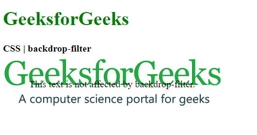
- drop-shadow():用于对元素应用阴影效果。它接受水平和垂直阴影量以及散布和颜色值。
例:
<!DOCTYPE html>
<html>

<head>
    <title>CSS | backdrop-filter</title>

    <style>
        .container {
            background-image:url(
"https://media.geeksforgeeks.org/wp-content/uploads/geeksforgeeks-25.png");
            background-size:cover;
            display:flex;
            align-items:center;
            justify-content:center;
            height:100px;
            width:360px;
        }
        .foreground {
            backdrop-filter:drop-shadow(20px 10px red);
            padding:2px;
        }
    </style>
</head>

<body>
    <h1 style="color:green">
        GeeksforGeeks
    </h1>

    <b>CSS | backdrop-filter</b>

    <div class="container">
        <div class="foreground">
            This text is not affected by
            backdrop-filter.
        </div>
    </div>
</body>

</html>
输出:
- grayscale():用于将图像的颜色转换为黑白。值为0%表示原始图像,值为100%表示完全黑白图像。
例:
<!DOCTYPE html>
<html>

<head>
    <title>CSS | backdrop-filter</title>

    <style>
        .container {
            background-image:url(
"https://media.geeksforgeeks.org/wp-content/uploads/geeksforgeeks-25.png");
            background-size:cover;
            display:flex;
            align-items:center;
            justify-content:center;
            height:100px;
            width:360px;
        }
        .foreground {
            backdrop-filter:grayscale(75%);
            padding:2px;
        }
    </style>
</head>

<body>
    <h1 style="color:green">
        GeeksforGeeks
    </h1>

    <b>CSS | backdrop-filter</b>

    <div class="container">
        <div class="foreground">
            This text is not affected by
            backdrop-filter.
        </div>
    </div>
</body>

</html>
输出:
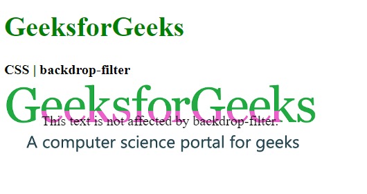
- hue-rotate():用于将色调旋转应用于图像。函数值表示将调整图像圆的色环周围的度数。默认值为0,表示原始图像。
例:
<!DOCTYPE html>
<html>

<head>
    <title>CSS | backdrop-filter</title>

    <style>
        .container {
            background-image:url(
"https://media.geeksforgeeks.org/wp-content/uploads/geeksforgeeks-25.png");
            background-size:cover;
            display:flex;
            align-items:center;
            justify-content:center;
            height:100px;
            width:360px;
        }
        .foreground {
            backdrop-filter:hue-rotate(180deg);
            padding:2px;
        }
    </style>
</head>

<body>
    <h1 style="color:green">
        GeeksforGeeks
    </h1>

    <b>CSS | backdrop-filter</b>

    <div class="container">
        <div class="foreground">
            This text is not affected by
            backdrop-filter.
        </div>
    </div>
</body>

</html>
输出:
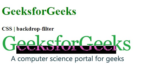
- invert():用于反转图像。默认值是0%,代表原始图像,而100%将使图像完全反转。
例:
<!DOCTYPE html>
<html>

<head>
    <title>CSS | backdrop-filter</title>

    <style>
        .container {
            background-image:url(
"https://media.geeksforgeeks.org/wp-content/uploads/geeksforgeeks-25.png");
            background-size:cover;
            display:flex;
            align-items:center;
            justify-content:center;
            height:100px;
            width:360px;
        }
        .foreground {
            backdrop-filter:invert(100%);
            padding:2px;
        }
    </style>
</head>

<body>
    <h1 style="color:green">
        GeeksforGeeks
    </h1>

    <b>CSS | backdrop-filter</b>

    <div class="container">
        <div class="foreground">
            This text is not affected by
            backdrop-filter.
        </div>
    </div>
</body>

</html>
输出:
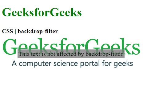
- opacity():它用于设置图像的不透明度。默认值为0%,表示图像是完全透明的,而100%的值表示原始图像是完全不透明的。
例:
<!DOCTYPE html>
<html>

<head>
    <title>CSS | backdrop-filter</title>

    <style>
        .container {
            background-image:url(
"https://media.geeksforgeeks.org/wp-content/uploads/geeksforgeeks-25.png");
            background-size:cover;
            display:flex;
            align-items:center;
            justify-content:center;
            height:100px;
            width:360px;
        }
        .foreground {
            backdrop-filter:opacity(50%);
            padding:2px;
        }
    </style>
</head>

<body>
    <h1 style="color:green">
        GeeksforGeeks
    </h1>

    <b>CSS | backdrop-filter</b>

    <div class="container">
        <div class="foreground">
            This text is not affected by
            backdrop-filter.
        </div>
    </div>
</body>

</html>
输出:
- saturate():用于设置元素的饱和度。默认值为100%,表示原始图像。 0%的值表示完全不饱和的图像,而100%以上的值表示super-saturated图像。
例:
<!DOCTYPE html>
<html>

<head>
    <title>CSS | backdrop-filter</title>

    <style>
        .container {
            background-image:url(
"https://media.geeksforgeeks.org/wp-content/uploads/geeksforgeeks-25.png");
            background-size:cover;
            display:flex;
            align-items:center;
            justify-content:center;
            height:100px;
            width:360px;
        }
        .foreground {
            backdrop-filter:saturate(50%);
            padding:2px;
        }
    </style>
</head>

<body>
    <h1 style="color:green">
        GeeksforGeeks
    </h1>

    <b>CSS | backdrop-filter</b>

    <div class="container">
        <div class="foreground">
            This text is not affected by
            backdrop-filter.
        </div>
    </div>
</body>

</html>
输出:
- sepia():它用于将图像转换为棕褐色,使图像看起来更温暖。 0%的值表示原始图像,而100%的值表示完整的棕褐色图像。
例:
<!DOCTYPE html>
<html>

<head>
    <title>CSS | backdrop-filter</title>

    <style>
        .container {
            background-image:url(
"https://media.geeksforgeeks.org/wp-content/uploads/geeksforgeeks-25.png");
            background-size:cover;
            display:flex;
            align-items:center;
            justify-content:center;
            height:100px;
            width:360px;
        }
        .foreground {
            backdrop-filter:sepia(100%);
            padding:2px;
        }
    </style>
</head>

<body>
    <h1 style="color:green">
        GeeksforGeeks
    </h1>

    <b>CSS | backdrop-filter</b>

    <div class="container">
        <div class="foreground">
            This text is not affected by
            backdrop-filter.
        </div>
    </div>
</body>

</html>
输出:
- none:它是默认值,不会对图像产生任何影响。
例:
<!DOCTYPE html>
<html>

<head>
    <title>CSS | backdrop-filter</title>

    <style>
        .container {
            background-image:url(
"https://media.geeksforgeeks.org/wp-content/uploads/geeksforgeeks-25.png");
            background-size:cover;
            display:flex;
            align-items:center;
            justify-content:center;
            height:100px;
            width:360px;
        }
        .foreground {
            backdrop-filter:none;
            padding:2px;
        }
    </style>
</head>

<body>
    <h1 style="color:green">
        GeeksforGeeks
    </h1>

    <b>CSS | backdrop-filter</b>

    <div class="container">
        <div class="foreground">
            This text is not affected by
            backdrop-filter.
        </div>
    </div>
</body>

</html>
输出:
- initial:它用于将此属性设置为其默认值。
例:
<!DOCTYPE html>
<html>

<head>
    <title>CSS | backdrop-filter</title>

    <style>
        .container {
            background-image:url(
"https://media.geeksforgeeks.org/wp-content/uploads/geeksforgeeks-25.png");
            background-size:cover;
            display:flex;
            align-items:center;
            justify-content:center;
            height:100px;
            width:360px;
        }
        .foreground {
            backdrop-filter:initial;
            padding:2px;
        }
    </style>
</head>

<body>
    <h1 style="color:green">
        GeeksforGeeks
    </h1>

    <b>CSS | backdrop-filter</b>

    <div class="container">
        <div class="foreground">
            This text is not affected by
            backdrop-filter.
        </div>
    </div>
</body>

</html>
输出:
- inherit:它从其父元素继承属性。
支持的浏览器:backdrop-filter属性支持的浏览器如下所示:
- 谷歌浏览器76.0
- 边17.0
- Safari 9.0
- Opera 34.0
相关用法
- CSS transition-property用法及代码示例
- CSS top属性用法及代码示例
- CSS right属性用法及代码示例
- CSS all属性用法及代码示例
- CSS nav-right用法及代码示例
- CSS nav-up用法及代码示例
- CSS nav-down用法及代码示例
- CSS bleed属性用法及代码示例
- HTML li value用法及代码示例
- CSS clear属性用法及代码示例
- CSS columns属性用法及代码示例
- CSS resize属性用法及代码示例
- CSS clip属性用法及代码示例
- CSS will-change用法及代码示例
- CSS nav-left用法及代码示例
注:本文由纯净天空筛选整理自sayantanm19大神的英文原创作品 CSS | backdrop-filter Property。非经特殊声明,原始代码版权归原作者所有,本译文未经允许或授权,请勿转载或复制。