HTML DOM中的Style animationTimingFunction属性定义了样式之间的过渡时间,以使过渡平滑。它指定动画的速度曲线。
用法:
animation-timing-function:cubic-bezier(n1, n2, n3, n4)|linear
|ease|ease-in|ease-out|initial|inherit;
属性值:
- cubic-bezier(n1,n2,n3,n4):动画时间是使用三次方贝塞尔函数指定的。 n1,n2,n3和n4的值介于0到1之间。
- linear:动画从头到尾以相同的速度播放。
- ease:动画开始缓慢,然后快速,然后最终结束。它是默认值。
- ease-in:如果指定此值,则动画将从慢速开始开始。
- ease-out:动画正常播放,但播放缓慢。这类似于ease-in。
- ease-in-out:动画缓慢地开始和结束。
- initial:它将animationTimingFunction属性设置为其默认值。
- inherit:animationTimingFunction属性是从其父元素继承的。
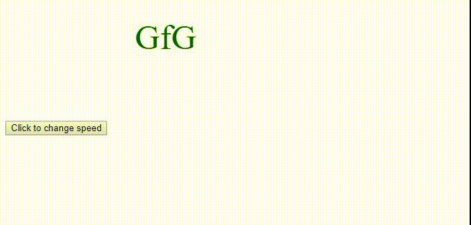
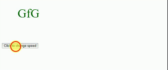
例:cubic-bezier(n1,n2,n3,n4)
<!DOCTYPE html>
<html>

<head>
    <style>
        div {
            font-size:50px;
            color:darkgreen;
            position:relative;
            height:150px;
            width:150px;
            animation:movement 5s infinite;
            -webkit-animation:movement 5s infinite;
        }

        @-webkit-keyframes movement {
            from {left:50px;}
            to {left:500px;}
        }

        @keyframes movement {
            from {left:50px;}
            to {left:500px;}
        }
    </style>
</head>

<body>
    <div id = "geeks">
        GfG
    </div>

    <button onclick = "myText()">
        Click to change speed
    </button>

    <script>
    function myText() {
    document.getElementById("geeks").style.WebkitAnimationTimingFunction
            = "cubic-bezier(0.7,0.1,0.3,0.2)";

    document.getElementById("geeks").style.animationTimingFunction
            = "cubic-bezier(0.7,0.1,0.3,0.2)";
    }
    </script>
</body>

</html>
输出:
- 之前单击按钮:
- 单击按钮后:
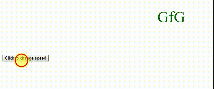
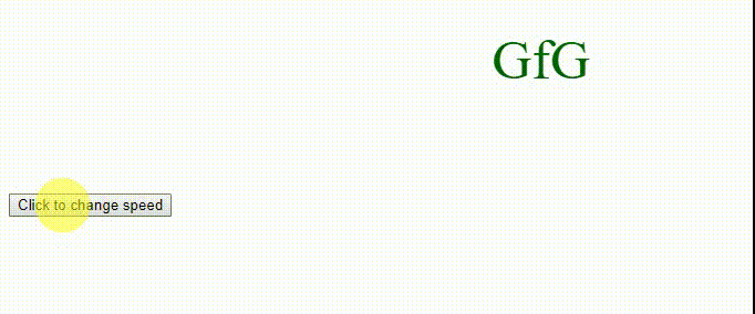
例:线性的
<!DOCTYPE html>
<html>

<head>
    <style>
        div {
            font-size:50px;
            color:darkgreen;
            position:relative;
            height:150px;
            width:150px;
            animation:movement 5s infinite;
            -webkit-animation:movement 5s infinite;
        }

        @-webkit-keyframes movement {
            from {left:50px;}
            to {left:500px;}
        }

        @keyframes movement {
            from {left:50px;}
            to {left:500px;}
        }
    </style>
</head>

<body>
    <div id = "geeks">
        GfG
    </div>

    <button onclick="myText()">
        Click to change speed
    </button>

    <script>
    function myText() {
    document.getElementById("geeks").style.WebkitAnimationTimingFunction
            = "linear";

    document.getElementById("geeks").style.animationTimingFunction
            = "linear";
    }
    </script>
</body>

</html>
输出:
- 之前单击按钮:
- 单击按钮后:
例:缓解
<!DOCTYPE html>
<html>

<head>
    <style>
        div {
            font-size:50px;
            color:darkgreen;
            position:relative;
            height:150px;
            width:150px;
            animation:movement 5s infinite;
            -webkit-animation:movement 5s infinite;
        }

        @-webkit-keyframes movement {
            from {left:50px;}
            to {left:500px;}
        }

        @keyframes movement {
            from {left:50px;}
            to {left:500px;}
        }
    </style>
</head>

<body>
    <div id = "geeks">
        GfG
    </div>

    <button onclick = "myText()">
        Click to change speed
    </button>

    <script>
    function myText() {
    document.getElementById("geeks").style.WebkitAnimationTimingFunction
            = "ease";

    document.getElementById("geeks").style.
            = "ease";
    }
    </script>
</body>

</html>
输出:
- 之前单击按钮:
- 单击按钮后:
例:ease-in
<!DOCTYPE html>
<html>

<head>
    <style>
        div {
            font-size:50px;
            color:darkgreen;
            position:relative;
            height:150px;
            width:150px;
            animation:movement 5s infinite;
            -webkit-animation:movement 5s infinite;
        }

        @-webkit-keyframes movement {
            from {left:50px;}
            to {left:500px;}
        }

        @keyframes movement {
            from {left:50px;}
            to {left:500px;}
        }
    </style>
</head>

<body>
    <div id = "geeks">
        GfG
    </div>

    <button onclick = "myText()">
        Click to change speed
    </button>

    <script>
    function myText() {
    document.getElementById("geeks").style.WebkitAnimationTimingFunction
            = "ease-in";

    document.getElementById("geeks").style.animationTimingFunction
            = "ease-in";
    }
    </script>
</body>

</html>
输出:
- 之前单击按钮:
- 单击按钮后:

例:ease-out
<!DOCTYPE html>
<html>

<head>
    <style>
        div {
            font-size:50px;
            color:darkgreen;
            position:relative;
            height:150px;
            width:150px;
            animation:movement 5s infinite;
            -webkit-animation:movement 5s infinite;
        }

        @-webkit-keyframes movement {
            from {left:50px;}
            to {left:500px;}
        }

        @keyframes movement {
            from {left:50px;}
            to {left:500px;}
        }
    </style>
</head>

<body>
    <div id = "geeks">
        GfG
    </div>

    <button onclick = "myText()">
        Click to change speed
    </button>

    <script>
    function myText() {
    document.getElementById("geeks").style.WebkitAnimationTimingFunction
            = "ease-out";

    document.getElementById("geeks").style.animationTimingFunction
            = "ease-out";
    }
    </script>
</body>

</html>
输出:
- 之前单击按钮:
- 单击按钮后:
例:ease-in-out
<!DOCTYPE html>
<html>

<head>
    <style>
        div {
            font-size:50px;
            color:darkgreen;
            position:relative;
            height:150px;
            width:150px;
            animation:movement 5s infinite;
            -webkit-animation:movement 5s infinite;
        }

        @-webkit-keyframes movement {
            from {left:50px;}
            to {left:500px;}
        }

        @keyframes movement {
            from {left:50px;}
            to {left:500px;}
        }
    </style>
</head>

<body>
    <div id = "geeks">
        GfG
    </div>

    <button onclick = "myText()">
        Click to change speed
    </button>

    <script>
    function myText() {
    document.getElementById("geeks").style.WebkitAnimationTimingFunction
            = "ease-in-out";

    document.getElementById("geeks").style.animationTimingFunction
            = "ease-in-out";
    }
    </script>
</body>

</html>
输出:
- 在点击按钮之前:
- 单击按钮后:

支持的浏览器:下面列出了DOM样式animationTimingFunction属性支持的浏览器:
- chrome 43.0
- Firefox 16.0、5.0 -moz-
- Safari 9.0
- Opera 30
相关用法
- HTML Style right用法及代码示例
- HTML Style top用法及代码示例
- HTML Style textAlign用法及代码示例
- HTML Style wordSpacing用法及代码示例
- HTML Style borderRight用法及代码示例
- HTML Style borderLeft用法及代码示例
- HTML Style textDecorationLine用法及代码示例
- HTML Style height用法及代码示例
- HTML Style whiteSpace用法及代码示例
- HTML Style opacity用法及代码示例
- HTML Style columnRuleStyle用法及代码示例
- HTML Style display用法及代码示例
- HTML Style transformStyle用法及代码示例
- HTML Style visibility用法及代码示例
- HTML Style animationDirection用法及代码示例
注:本文由纯净天空筛选整理自roshalmoraes大神的英文原创作品 HTML | DOM Style animationTimingFunction Property。非经特殊声明,原始代码版权归原作者所有,本译文未经允许或授权,请勿转载或复制。