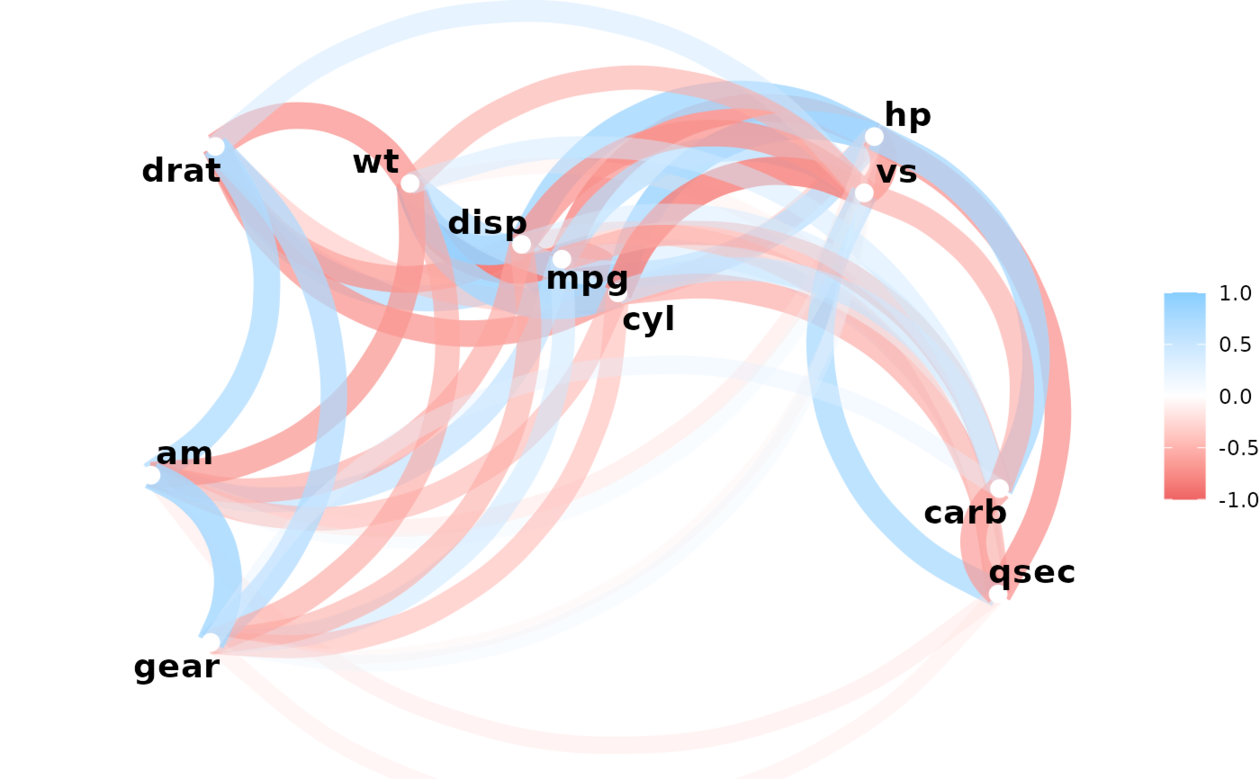
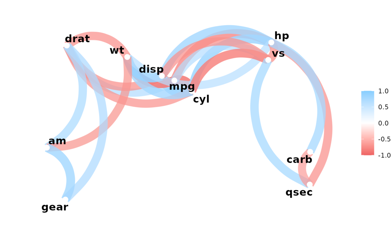
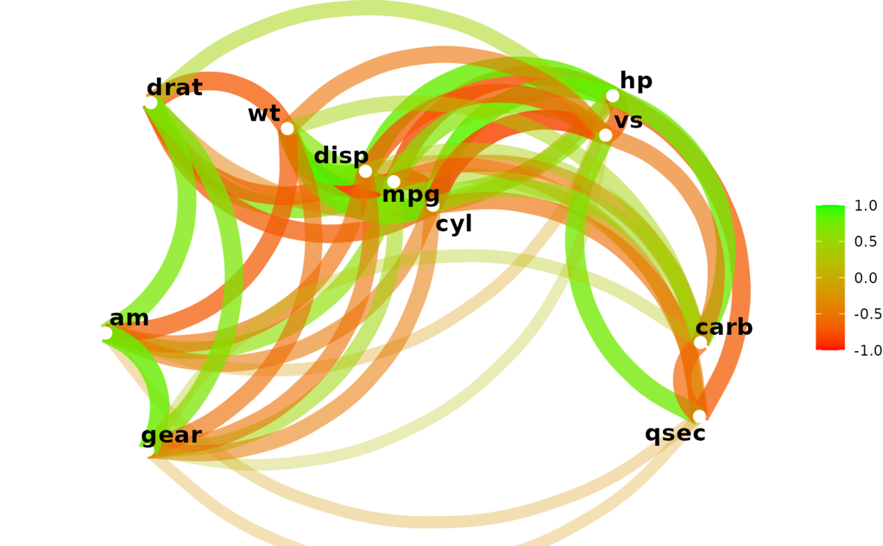
输出相关数据帧的网络图,其中相关性较高的变量看起来更接近,并通过更强的路径连接。路径也按其符号着色(蓝色表示正,红色表示负)。使用多维聚类来确定点的邻近度。
用法
network_plot(
  rdf,
  min_cor = 0.3,
  legend = c("full", "range", "none"),
  colours = c("indianred2", "white", "skyblue1"),
  repel = TRUE,
  curved = TRUE,
  colors
)
参数
- rdf
- min_cor
-
从 0 到 1 的数字,表示要绘制的相关性(绝对值)的最小值。
- legend
-
相关值的颜色和图例应如何显示?选项为"full"(默认值),表示 -1 到 1,带图例;"range",表示
rdf中的相关值范围,带图例;"none",表示 -1 到 1 之间的颜色,不带图例。显示。 - colours, colors
-
用于 n-color 渐变的颜色向量。
- repel
-
变量标签应该互相排斥吗?如果为 TRUE,则通过
geom_text_repel而不是geom_text添加文本 - curved
-
路径应该是弯曲的吗?如果为 TRUE,则通过
geom_curve添加路径;如果为 FALSE,则通过geom_segment
例子
x <- correlate(mtcars)
#> Correlation computed with
#> • Method: 'pearson'
#> • Missing treated using: 'pairwise.complete.obs'
network_plot(x)
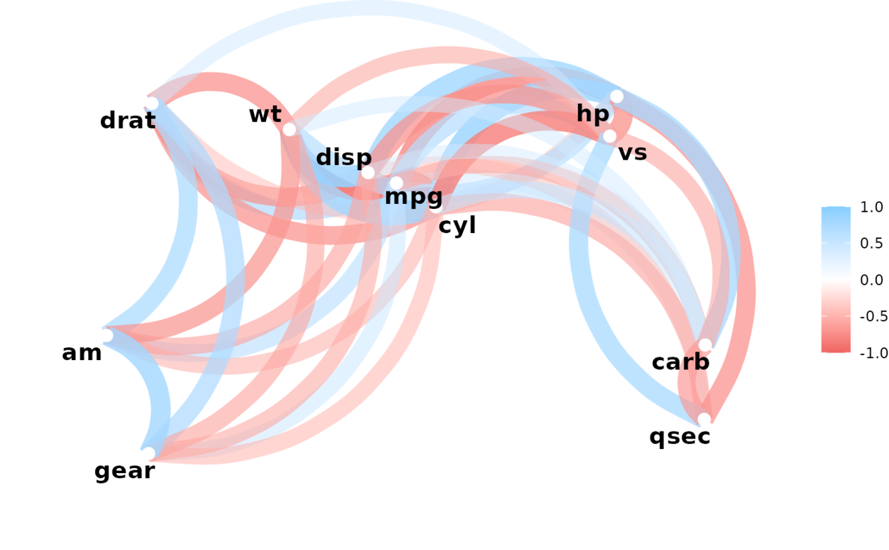 network_plot(x, min_cor = .1)
 network_plot(x, min_cor = .6)
 network_plot(x, min_cor = .2, colors = c("red", "green"), legend = "full")
 network_plot(x, min_cor = .2, colors = c("red", "green"), legend = "range")

相关用法
- R corrr retract 从拉伸的相关表创建 DataFrame
- R corrr as_cordf 强制列表和矩阵关联数据帧
- R corrr rearrange 重新排列相关 DataFrame
- R corrr correlate 相关 DataFrame
- R corrr pair_n 成对完整案例的数量。
- R corrr dice 返回仅包含选定字段的关联表
- R corrr stretch 将相关数据帧拉伸为长格式。
- R corrr colpair_map 将函数应用于 DataFrame 中的所有列对
- R corrr autoplot.cor_df 从 cor_df 对象创建相关矩阵
- R corrr as_matrix 将相关数据帧转换为矩阵格式
- R corrr focus_if 有条件地聚焦相关 DataFrame
- R corrr rplot 绘制相关 DataFrame 。
- R corrr first_col 将第一列添加到 data.frame
- R corrr focus 关注相关 DataFrame 架的部分。
- R corrr shave 剃掉上/下三角形。
- R corrr fashion 设计用于打印的相关 DataFrame 架。
- R SparkR corr用法及代码示例
- R findGlobals 查找闭包使用的全局函数和变量
- R SparkR count用法及代码示例
- R SparkR column用法及代码示例
- R SparkR columns用法及代码示例
- R checkUsage 检查 R 代码是否存在可能的问题
- R showTree R 表达式的打印 Lisp 风格表示
- R compile 字节码编译器
- R SparkR cov用法及代码示例
注:本文由纯净天空筛选整理自Max Kuhn等大神的英文原创作品 Network plot of a correlation data frame。非经特殊声明,原始代码版权归原作者所有,本译文未经允许或授权,请勿转载或复制。