使用 ggplot2 绘制相关 DataFrame 。
用法
rplot(
  rdf,
  legend = TRUE,
  shape = 16,
  colours = c("indianred2", "white", "skyblue1"),
  print_cor = FALSE,
  colors,
  .order = c("default", "alphabet")
)例子
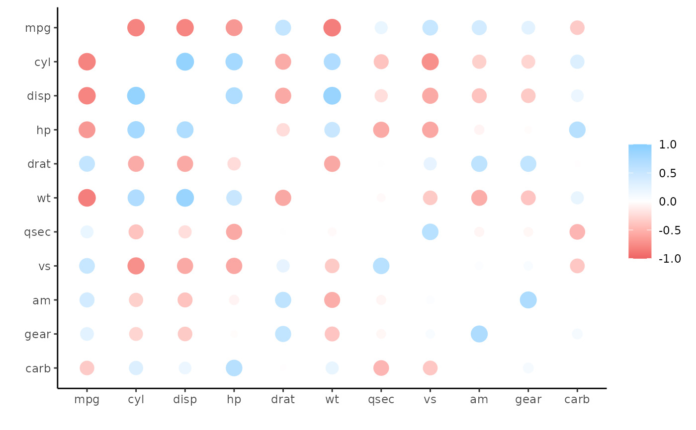
x <- correlate(mtcars)
#> Correlation computed with
#> • Method: 'pearson'
#> • Missing treated using: 'pairwise.complete.obs'
rplot(x)
 # Common use is following rearrange and shave
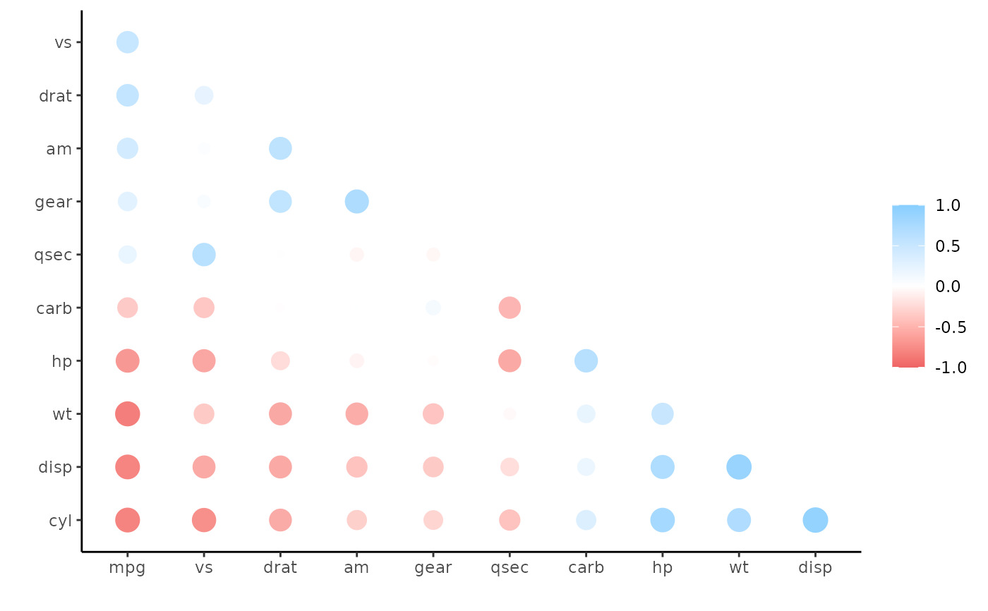
x <- rearrange(x, absolute = FALSE)
x <- shave(x)
rplot(x)
# Common use is following rearrange and shave
x <- rearrange(x, absolute = FALSE)
x <- shave(x)
rplot(x)
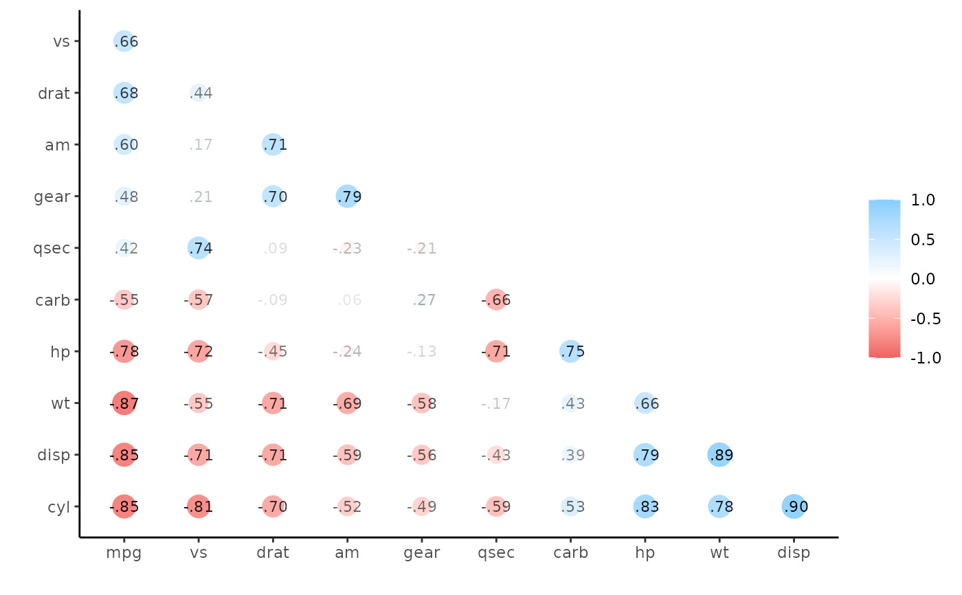
 rplot(x, print_cor = TRUE)
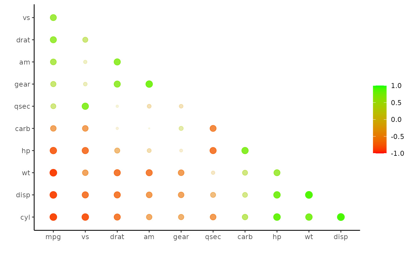
 rplot(x, shape = 20, colors = c("red", "green"), legend = TRUE)
相关用法
- R corrr retract 从拉伸的相关表创建 DataFrame
- R corrr rearrange 重新排列相关 DataFrame
- R corrr as_cordf 强制列表和矩阵关联数据帧
- R corrr correlate 相关 DataFrame
- R corrr pair_n 成对完整案例的数量。
- R corrr dice 返回仅包含选定字段的关联表
- R corrr stretch 将相关数据帧拉伸为长格式。
- R corrr colpair_map 将函数应用于 DataFrame 中的所有列对
- R corrr autoplot.cor_df 从 cor_df 对象创建相关矩阵
- R corrr as_matrix 将相关数据帧转换为矩阵格式
- R corrr focus_if 有条件地聚焦相关 DataFrame
- R corrr first_col 将第一列添加到 data.frame
- R corrr focus 关注相关 DataFrame 架的部分。
- R corrr shave 剃掉上/下三角形。
- R corrr fashion 设计用于打印的相关 DataFrame 架。
- R corrr network_plot 相关 DataFrame 的网络图
- R SparkR corr用法及代码示例
- R findGlobals 查找闭包使用的全局函数和变量
- R SparkR count用法及代码示例
- R SparkR column用法及代码示例
- R SparkR columns用法及代码示例
- R checkUsage 检查 R 代码是否存在可能的问题
- R showTree R 表达式的打印 Lisp 风格表示
- R compile 字节码编译器
- R SparkR cov用法及代码示例
注:本文由纯净天空筛选整理自Max Kuhn等大神的英文原创作品 Plot a correlation data frame.。非经特殊声明,原始代码版权归原作者所有,本译文未经允许或授权,请勿转载或复制。