shape-image-threshold屬性用於設置將圖像用於shape-outside時用於提取形狀的alpha通道的閾值。
用法:
shape-image-threshold:<alpha-value>
屬性值:
- alpha-value:用於設置提取形狀的閾值。對於該形狀,將考慮大於閾值的像素。十進製值0.0到1.0可用於將閾值從完全透明設置為完全不透明。如果值超出範圍,則將其限製在該範圍內。
下麵的示例說明shape-image-threshold屬性:
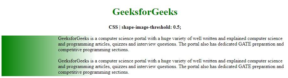
範例1:在此示例中,我們將閾值設置為0.5
<!DOCTYPE html>
<html>

<head>
    <title>
        CSS | shape-image-threshold
    </title>
    <style>
        .outline {
            shape-outside:linear-gradient(
                    to right, green, transparent);

            /* shape-image-threshold effect */
            shape-image-threshold:0.4;
            background-image:linear-gradient(
                    to right, green, transparent);
            width:300px;
            height:130px;
            float:left;
        }
    </style>
</head>

<body>
    <center>
        <h1 style="color:green">
            GeeksforGeeks
        </h1>

        <b>
            CSS | shape-image-threshold:0.5;
        </b>

        <br><br>
    </center>

    <div class="outline"></div>

    <div class="container">
        GeeksforGeeks is a computer science portal
        with a huge variety of well written and
        explained computer science and programming
        articles, quizzes and interview questions.
        The portal also has dedicated GATE preparation
        and competitive programming sections.
        <br><br>
        GeeksforGeeks is a computer science portal
        with a huge variety of well written and
        explained computer science and programming
        articles, quizzes and interview questions.
        The portal also has dedicated GATE preparation
        and competitive programming sections.
    </div>
</body>

</html>
輸出:
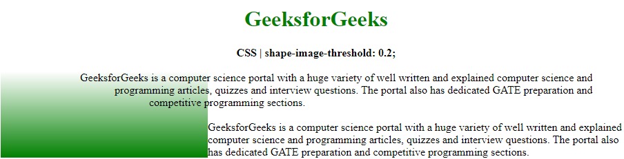
範例2:在此示例中,我們將閾值設置為0.2
<!DOCTYPE html>
<html>

<head>
    <title>
        CSS | shape-image-threshold
    </title>
    <style>
        .outline {
            shape-outside:linear-gradient(20deg,
                rgb(77, 26, 103), transparent 80%,
                transparent);

            /* shape-image-threshold effect */
            shape-image-threshold:0.2;
            background-image:linear-gradient(
                to top, green, transparent);
            width:300px;
            height:125px;
            float:left;
        }
    </style>
</head>

<body>
    <center>
        <h1 style="color:green">
            GeeksforGeeks
        </h1>

        <b>
            CSS | shape-image-threshold:0.2;
        </b>

        <br><br>
    </center>

    <div class="outline"></div>

    <div class="container">
        GeeksforGeeks is a computer science portal
        with a huge variety of well written and
        explained computer science and programming
        articles, quizzes and interview questions.
        The portal also has dedicated GATE preparation
        and competitive programming sections.
        <br><br>
        GeeksforGeeks is a computer science portal
        with a huge variety of well written and
        explained computer science and programming
        articles, quizzes and interview questions.
        The portal also has dedicated GATE preparation
        and competitive programming sections.
    </div>
</body>

</html>
輸出:
支持的瀏覽器:shape-image-threshold屬性支持的瀏覽器如下所示:
- 穀歌瀏覽器
- Internet Explorer 9
- Firefox
- Safari
- Opera
相關用法
- CSS transition-property用法及代碼示例
- CSS top屬性用法及代碼示例
- CSS nav-down用法及代碼示例
- CSS nav-up用法及代碼示例
- CSS all屬性用法及代碼示例
- CSS right屬性用法及代碼示例
- CSS nav-right用法及代碼示例
- CSS zoom屬性用法及代碼示例
- CSS columns屬性用法及代碼示例
- CSS nav-left用法及代碼示例
- CSS will-change用法及代碼示例
- CSS nav-index用法及代碼示例
- CSS clear屬性用法及代碼示例
- CSS clip屬性用法及代碼示例
- CSS resize屬性用法及代碼示例
注:本文由純淨天空篩選整理自sayantanm19大神的英文原創作品 CSS | shape-image-threshold Property。非經特殊聲明,原始代碼版權歸原作者所有,本譯文未經允許或授權,請勿轉載或複製。