此 CSS 属性设置圆角边框并在元素、标签或 div 周围提供圆角。它定义了元素角的半径。
它是边界 top-left-radius、border-top-right-radius、border-bottom-right-radius 和 border-bottom-left-radius 的简写。它为元素边框的角提供圆形形状。我们可以使用 border-radius 在单个声明中为框的所有四个角指定边框。此属性的值可以以百分比或长度单位定义。
此 CSS 属性包括如下列表所示的属性:
| 属性 | 描述 |
|---|---|
| border-top-left-半径 | 用于设置左上角的 border-radius |
| border-top-right-半径 | 用于设置右上角的 border-radius |
| border-bottom-right-半径 | 用于设置右下角的 border-radius |
| border-bottom-left-半径 | 用于设置左下角的 border-radius |
如果省略左下角的值,则它将与右上角相同。如果去掉右下角的值,则和左上角相同。同理,如果去掉右上角,则与左上角相同。
让我们看看当我们为该属性提供一个值、两个值、三个值和四个值时会发生什么。
- 如果我们为此属性提供单个值(例如 border-radius:30px;),它会将所有角设置为相同的值。
- 当我们指定两个值时(例如 border-radius:20% 10% ;),那么第一个值将用于左上角和右下角,第二个值将用于右上角和下角-左角。
- 当我们使用三个值(例如 border-radius:10% 30% 20%;)时,第一个值将用于左上角,第二个值将用于右上角,左下角和第三个值将应用于右下角。
- 同样,当这个属性有四个值 (border-radius:10% 30% 20% 40%;) 那么第一个值将是左上角的半径,第二个值将用于右上角,第三个值将应用于右下角,第四个值用于左下角。
用法
border-radius:1-4 length | % / 1-4 length | % | inherit | initial;属性值
length:它定义了角的形状。它使用长度值表示半径的大小。它的默认值是 0。它不允许负值。
percentage:它以百分比表示半径的大小。它也不允许负值。
示例
<!DOCTYPE html>
<html>

<head>
<title> CSS border-radius </title>
<style>
div {
padding:50px;
margin:20px;
border:6px ridge red;
width:300px;
float:left;
height:150px;
}
p{
font-size:25px;
}
#one {
border-radius:90px;
background:lightgreen;
}
#two {
border-radius:25% 10%;
background:orange;
}
#three {
border-radius:35px 10em 10%;
background:cyan;
}
#four {
border-radius:50px 50% 50cm 50em;
background:lightblue;
}

</style>
</head>

<body>
<div id = "one">
<h2> Welcome to the javaTpoint.com </h2>
<p> border-radius:90px; </p>
</div>
<div id = "two">
<h2> Welcome to the javaTpoint.com </h2>
<p> border-radius:25% 10%; </p>
</div>
<div id = "three">
<h2> Welcome to the javaTpoint.com </h2>
<p> border-radius:35px 10em 10%; </p>
</div>
<div id = "four">
<h2>Welcome to the javaTpoint.com</h2>
<p>border-radius:50px 50% 50cm 50em;</p>
</div>
</body>
</html>
输出

现在,让我们看看特定角落的 border-radius。
示例- border-top-left-半径
它设置左上角的边框半径。
<!DOCTYPE html>
<html>

<head>
<title> CSS border-radius </title>
<style>
#left {
border-top-left-radius:250px;
background:lightgreen;
padding:50px;
border:6px ridge red;
width:300px;
height:200px;
font-size:25px;
}
</style>
</head>

<body>
<center>
<div id = "left">
<h2>Welcome to the javaTpoint.com</h2>
<p>border-top-left-radius:250px;</p>
</div>
</center>
</body>
</html>
输出

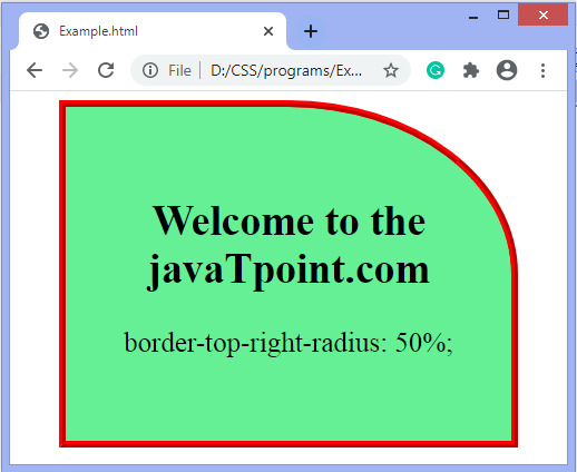
示例- border-top-right-半径
它为右上角设置 border-radius。
<!DOCTYPE html>
<html>
<head>
<style>
#left {
border-top-right-radius:50%;
background:lightgreen;
padding:50px;
border:6px ridge red;
width:300px;
height:200px;
font-size:25px;
}
</style>
</head>

<body>
<center>
<div id = "left">
<h2>Welcome to the javaTpoint.com</h2>
<p>border-top-right-radius:50%;</p>
</div>
</center>
</body>
</html>
输出
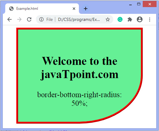
示例- border-bottom-right-半径
它为右下角设置 border-radius。
<!DOCTYPE html>
<html>
<head>
<style>
#left {
border-bottom-right-radius:50%;
background:lightgreen;
padding:50px;
border:6px ridge red;
width:300px;
height:200px;
font-size:25px;
}
</style>
</head>

<body>
<center>
<div id = "left">
<h2>Welcome to the javaTpoint.com</h2>
<p>border-bottom-right-radius:50%;</p>
</div>
</center>
</body>
</html>
输出
示例- border-bottom-left-半径
它为左下角设置 border-radius。
<!DOCTYPE html>
<html>
<head>
<style>
#left {
border-bottom-left-radius:50%;
background:lightgreen;
padding:50px;
border:6px ridge red;
width:300px;
height:200px;
font-size:25px;
}
</style>
</head>

<body>
<center>
<div id = "left">
<h2>Welcome to the javaTpoint.com</h2>
<p>border-bottom-left-radius:50%;</p>
</div>
</center>
</body>
</html>
输出

我们可以使用斜杠 (/) 符号指定单独的水平和垂直值。斜线 (/) 之前的值用于水平半径,斜线 (/) 之后的值用于垂直半径。
下面给出了一个使用斜杠 (/) 符号的示例。
示例<!DOCTYPE html>
<html>
<head>
<style>
div{
padding:50px;
border:6px ridge red;
width:300px;
margin:20px;
font-weight:bold;
height:175px;
float:left;
font-size:25px;
}
#one {
border-radius:10% / 50%;
background:lightgreen;
}
#two {
border-radius:120px / 100px 10px;
background:lightblue;
}
#three {
border-radius:50% 10em / 10% 20em;
background:lightpink;
}
#four {
border-radius:100px 10em 120px / 30%;
background:cyan;
}
</style>
</head>
<body>
<center>
<div id = "one">
<h2>Welcome to the javaTpoint.com</h2>
<p>border-radius:10% / 50%; </p>
</div>
<div id = "two">
<h2>Welcome to the javaTpoint.com</h2>
<p>border-radius:120px / 100px 10px; </p>
</div>
<div id = "three">
<h2>Welcome to the javaTpoint.com</h2>
<p>border-radius:50% 10em / 10% 20em; </p>
</div>
<div id = "four">
<h2>Welcome to the javaTpoint.com</h2>
<p>border-radius:100px 10em 120px / 30%; </p>
</div>
</center>
</body>
</html>
<!DOCTYPE html>
<html>
<head>
<style>
div{
padding:50px;
border:6px ridge red;
width:300px;
margin:20px;
font-weight:bold;
height:175px;
float:left;
font-size:25px;
}
#one {
border-radius:10% / 50%;
background:lightgreen;
}
#two {
border-radius:120px / 100px 10px;
background:lightblue;
}
#three {
border-radius:50% 10em / 10% 20em;
background:lightpink;
}
#four {
border-radius:100px 10em 120px / 30%;
background:cyan;
}
</style>
</head>

<body>
<center>
<div id = "one">
<h2>Welcome to the javaTpoint.com</h2>
<p>border-radius:10% / 50%; </p>
</div>
<div id = "two">
<h2>Welcome to the javaTpoint.com</h2>
<p>border-radius:120px / 100px 10px; </p>
</div>
<div id = "three">
<h2>Welcome to the javaTpoint.com</h2>
<p>border-radius:50% 10em / 10% 20em; </p>
</div>
<div id = "four">
<h2>Welcome to the javaTpoint.com</h2>
<p>border-radius:100px 10em 120px / 30%; </p>
</div>
</center>
</body>
</html>
输出

相关用法
- CSS border-right用法及代码示例
- CSS border-right-color用法及代码示例
- CSS border-right-width用法及代码示例
- CSS border-right-style用法及代码示例
- CSS - border-bottom-style用法及代码示例
- CSS border-end-start-radius属性用法及代码示例
- CSS border-left用法及代码示例
- CSS border-image-repeat用法及代码示例
- CSS border-inline-end-style属性用法及代码示例
- CSS border-block-width用法及代码示例
- CSS border-end-end-radius属性用法及代码示例
- CSS border-width用法及代码示例
- CSS border-start-end-radius属性用法及代码示例
- CSS border-block-start-width属性用法及代码示例
- CSS border-bottom-left-radius属性用法及代码示例
- CSS border-left-style用法及代码示例
- CSS border-inline用法及代码示例
- CSS border-color用法及代码示例
- CSS border-bottom-width用法及代码示例
注:本文由纯净天空筛选整理自 CSS border-radius property。非经特殊声明,原始代码版权归原作者所有,本译文未经允许或授权,请勿转载或复制。