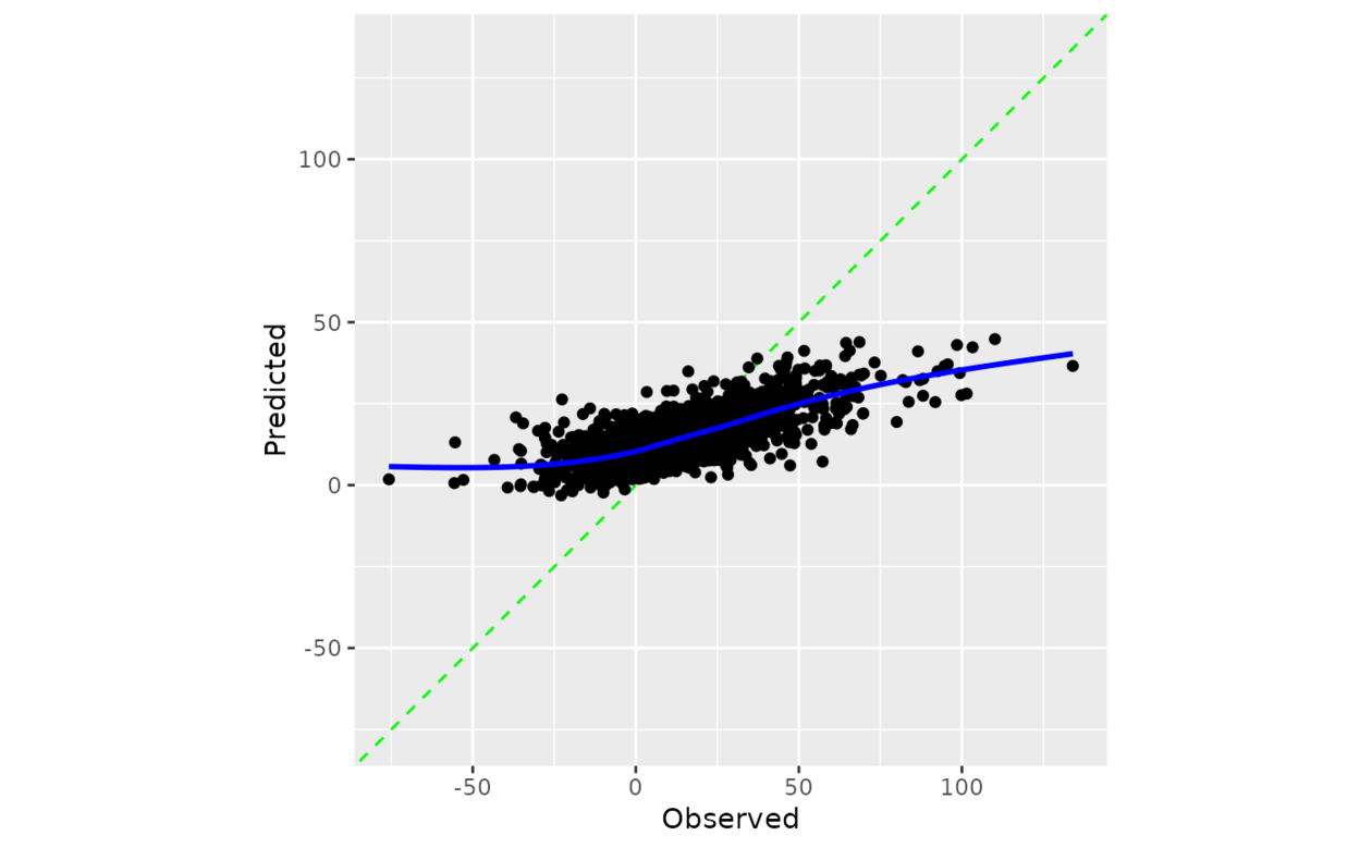
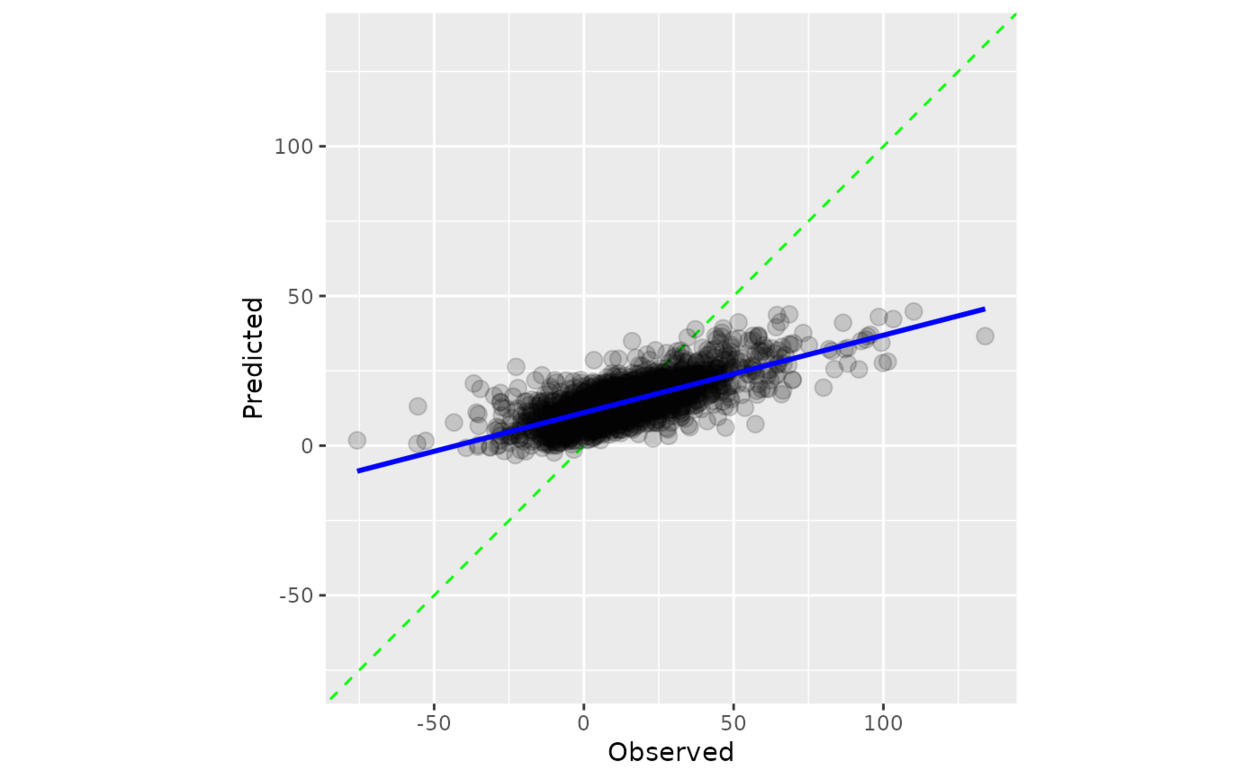
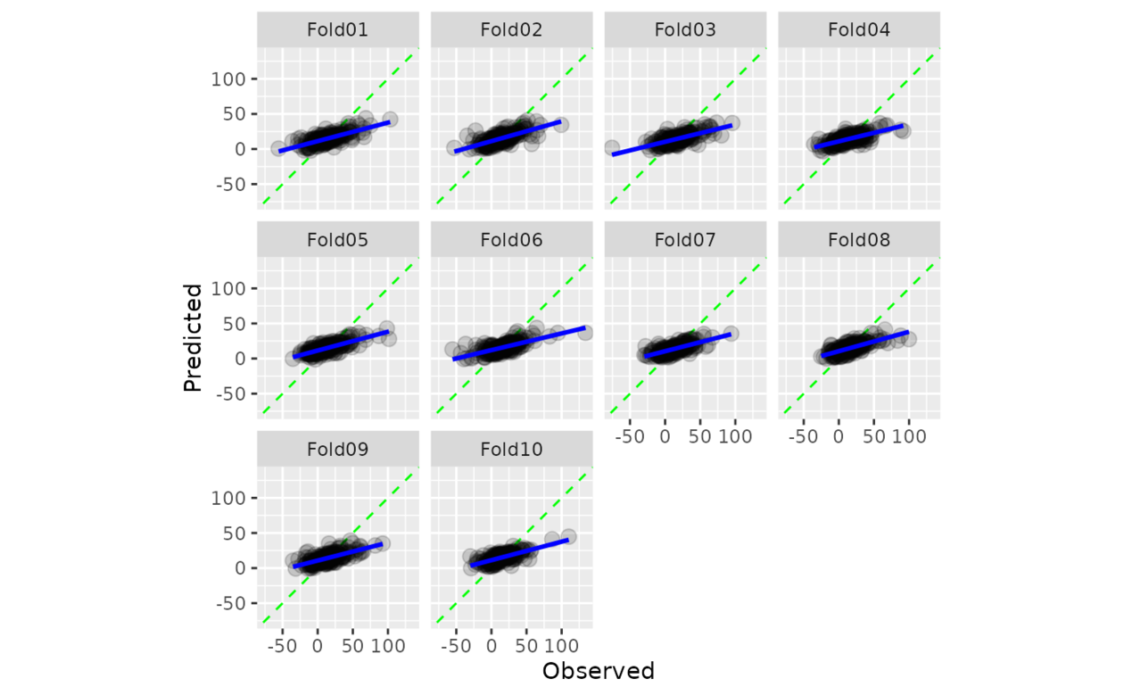
计算观测值和预测值的散点图,其中轴相同。当 smooth = TRUE 时,显示广义加性模型拟合。如果预测经过良好校准,拟合曲线应与对角线对齐。
用法
cal_plot_regression(.data, truth = NULL, estimate = NULL, smooth = TRUE, ...)

# S3 method for data.frame
cal_plot_regression(
  .data,
  truth = NULL,
  estimate = NULL,
  smooth = TRUE,
  ...,
  .by = NULL
)

# S3 method for tune_results
cal_plot_regression(.data, truth = NULL, estimate = NULL, smooth = TRUE, ...)

# S3 method for grouped_df
cal_plot_regression(.data, truth = NULL, estimate = NULL, smooth = TRUE, ...)
参数
- .data
-
包含预测列的未分组 DataFrame 对象。
- truth
-
真实结果的列标识符(数字)。这应该是一个不带引号的列名。
- estimate
-
预测的列标识符。这应该是一个不带引号的列名
- smooth
-
逻辑上:应该添加更平滑的曲线。
- ...
-
传递给
ggplot2::geom_point()的其他参数。 - .by
-
分组变量的列标识符。这应该是一个不带引号的列名称,用于选择用于分组的定性变量。默认为
NULL。当.by = NULL时,不会进行分组。
相关用法
- R probably cal_plot_logistic 通过逻辑回归绘制概率校准图
- R probably cal_plot_breaks 通过分箱绘制概率校准图
- R probably cal_plot_windowed 通过移动窗口绘制概率校准图
- R probably cal_estimate_multinomial 使用多项校准模型来计算新的概率
- R probably cal_validate_logistic 使用和不使用逻辑校准来测量性能
- R probably cal_validate_isotonic_boot 使用和不使用袋装等渗回归校准来测量性能
- R probably cal_estimate_beta 使用 Beta 校准模型来计算新概率
- R probably cal_estimate_isotonic 使用等渗回归模型来校准模型预测。
- R probably cal_estimate_logistic 使用逻辑回归模型来校准概率
- R probably cal_validate_multinomial 使用和不使用多项式校准来测量性能
- R probably cal_apply 对一组现有预测应用校准
- R probably cal_validate_linear 使用和不使用线性回归校准来测量性能
- R probably cal_estimate_isotonic_boot 使用引导等渗回归模型来校准概率
- R probably cal_validate_isotonic 使用和不使用等渗回归校准来测量性能
- R probably cal_estimate_linear 使用线性回归模型来校准数值预测
- R probably cal_validate_beta 使用和不使用 Beta 校准来测量性能
- R probably class_pred 创建类别预测对象
- R probably append_class_pred 添加 class_pred 列
- R probably threshold_perf 生成跨概率阈值的性能指标
- R probably as_class_pred 强制转换为 class_pred 对象
- R probably levels.class_pred 提取class_pred级别
- R probably locate-equivocal 找到模棱两可的值
- R probably int_conformal_quantile 通过保形推理和分位数回归预测区间
- R probably make_class_pred 根据类概率创建 class_pred 向量
- R probably reportable_rate 计算报告率
注:本文由纯净天空筛选整理自Max Kuhn等大神的英文原创作品 Regression calibration plots。非经特殊声明,原始代码版权归原作者所有,本译文未经允许或授权,请勿转载或复制。