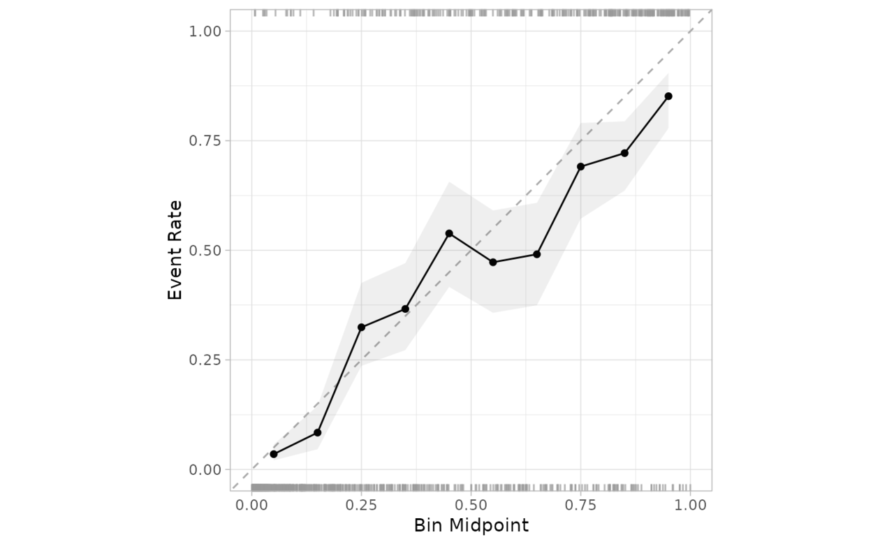
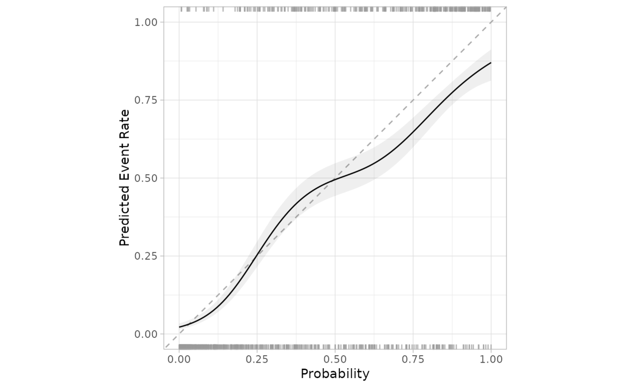
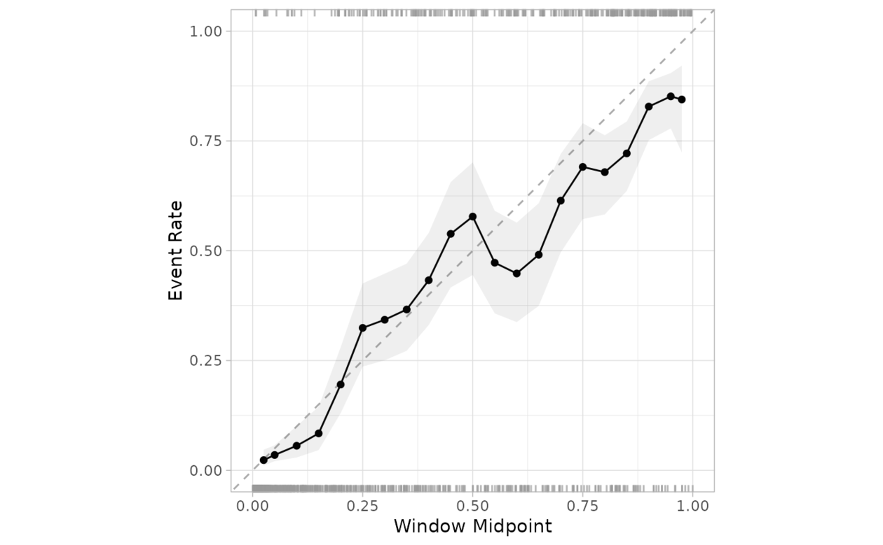
创建一个图来评估观察到的事件发生率是否与某个模型预测的事件概率大致相同。
从 0 到 1 创建一系列偶数、互斥的 bin。对于每个箱,预测概率落在箱范围内的数据用于计算观察到的事件率(以及事件率的置信区间)。如果预测经过良好校准,拟合曲线应与对角线对齐。
用法
cal_plot_breaks(
  .data,
  truth = NULL,
  estimate = dplyr::starts_with(".pred"),
  num_breaks = 10,
  conf_level = 0.9,
  include_ribbon = TRUE,
  include_rug = TRUE,
  include_points = TRUE,
  event_level = c("auto", "first", "second"),
  ...
)

# S3 method for data.frame
cal_plot_breaks(
  .data,
  truth = NULL,
  estimate = dplyr::starts_with(".pred"),
  num_breaks = 10,
  conf_level = 0.9,
  include_ribbon = TRUE,
  include_rug = TRUE,
  include_points = TRUE,
  event_level = c("auto", "first", "second"),
  ...,
  .by = NULL
)

# S3 method for tune_results
cal_plot_breaks(
  .data,
  truth = NULL,
  estimate = dplyr::starts_with(".pred"),
  num_breaks = 10,
  conf_level = 0.9,
  include_ribbon = TRUE,
  include_rug = TRUE,
  include_points = TRUE,
  event_level = c("auto", "first", "second"),
  ...
)

# S3 method for grouped_df
cal_plot_breaks(
  .data,
  truth = NULL,
  estimate = NULL,
  num_breaks = 10,
  conf_level = 0.9,
  include_ribbon = TRUE,
  include_rug = TRUE,
  include_points = TRUE,
  event_level = c("auto", "first", "second"),
  ...
)
参数
- .data
-
包含预测和概率列的未分组 DataFrame 对象。
- truth
-
真实类别结果的列标识符(即一个因子)。这应该是一个不带引号的列名。
- estimate
-
列标识符向量,或
dplyr选择器函数之一,用于选择哪些变量包含类概率。它默认为 tidymodels 使用的前缀 (.pred_)。标识符的顺序将被视为与truth变量的级别顺序相同。 - num_breaks
-
对概率进行分组的段数。默认为 10。
- conf_level
-
可视化中使用的置信度。默认为 0.9。
- include_ribbon
-
指示是否要包含函数区层的标志。默认为
TRUE。 - include_rug
-
指示是否要包括地毯层的标志。默认为
TRUE。在图中,顶部显示事件发生的频率,底部显示事件未发生的频率。 - include_points
-
指示是否要包含点图层的标志。
- event_level
-
单字符串。 "first" 或 "second" 指定将哪个真实级别视为 "event"。默认为"auto",它允许函数根据模型类型(二元、多类或线性)决定使用哪一个
- ...
-
传递给
tune_results对象的其他参数。 - .by
-
分组变量的列标识符。这应该是一个不带引号的列名称,用于选择用于分组的定性变量。默认为
NULL。当.by = NULL时,不会进行分组。
也可以看看
https://www.tidymodels.org/learn/models/calibration/, cal_plot_windowed(), cal_plot_logistic()
例子
library(ggplot2)
library(dplyr)
cal_plot_breaks(
segment_logistic,
Class,
.pred_good
)
 cal_plot_logistic(
segment_logistic,
Class,
.pred_good
)
cal_plot_logistic(
segment_logistic,
Class,
.pred_good
)
 cal_plot_windowed(
segment_logistic,
Class,
.pred_good
)
cal_plot_windowed(
segment_logistic,
Class,
.pred_good
)
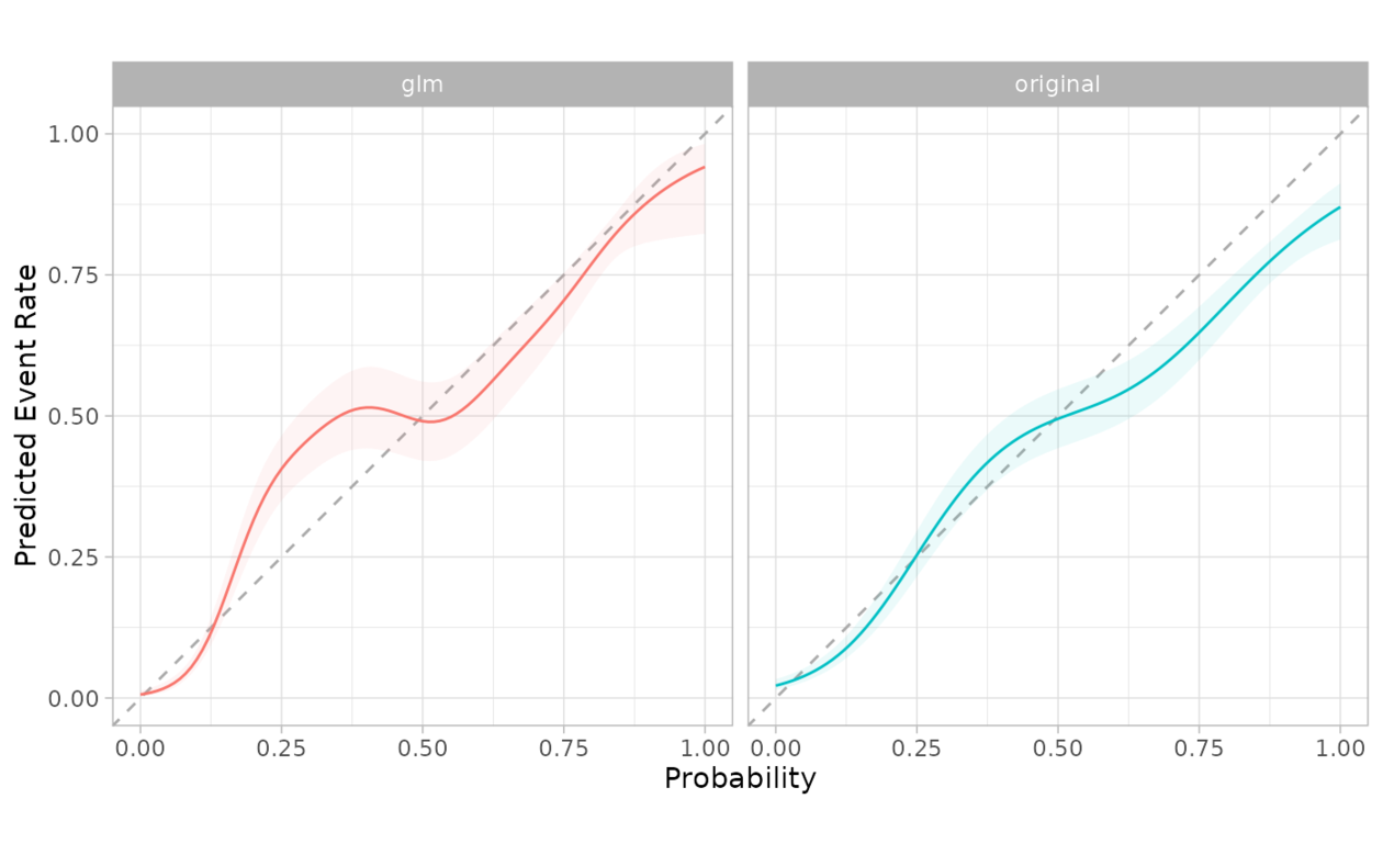
 # The functions support dplyr groups
model <- glm(Class ~ .pred_good, segment_logistic, family = "binomial")
preds <- predict(model, segment_logistic, type = "response")
gl <- segment_logistic %>%
mutate(.pred_good = 1 - preds, source = "glm")
combined <- bind_rows(mutate(segment_logistic, source = "original"), gl)
combined %>%
cal_plot_logistic(Class, .pred_good, .by = source)
# The functions support dplyr groups
model <- glm(Class ~ .pred_good, segment_logistic, family = "binomial")
preds <- predict(model, segment_logistic, type = "response")
gl <- segment_logistic %>%
mutate(.pred_good = 1 - preds, source = "glm")
combined <- bind_rows(mutate(segment_logistic, source = "original"), gl)
combined %>%
cal_plot_logistic(Class, .pred_good, .by = source)
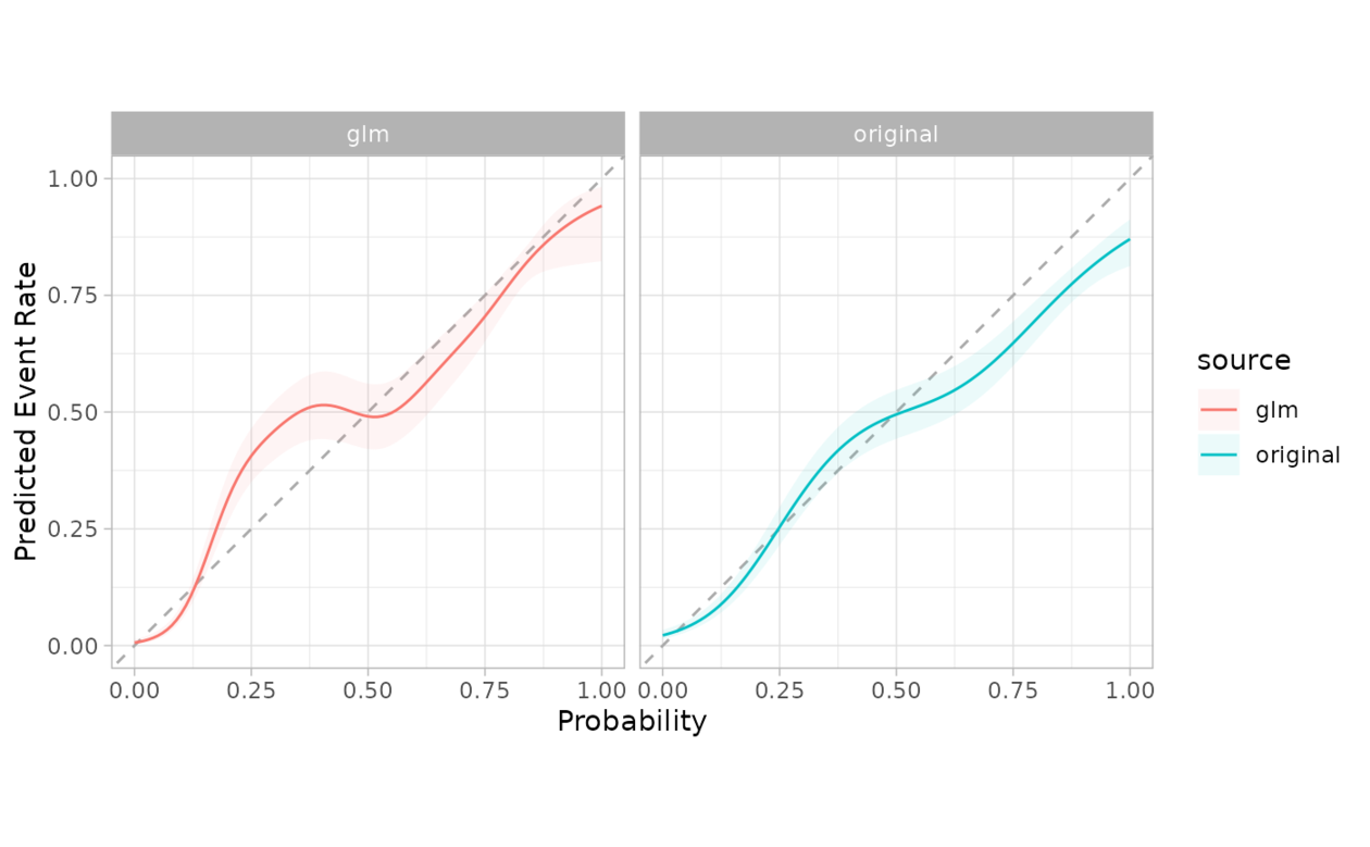 # The grouping can be faceted in ggplot2
combined %>%
cal_plot_logistic(Class, .pred_good, .by = source) +
facet_wrap(~source) +
theme(legend.position = "")
# The grouping can be faceted in ggplot2
combined %>%
cal_plot_logistic(Class, .pred_good, .by = source) +
facet_wrap(~source) +
theme(legend.position = "")
相关用法
- R probably cal_plot_logistic 通过逻辑回归绘制概率校准图
- R probably cal_plot_regression 回归校准图
- R probably cal_plot_windowed 通过移动窗口绘制概率校准图
- R probably cal_estimate_multinomial 使用多项校准模型来计算新的概率
- R probably cal_validate_logistic 使用和不使用逻辑校准来测量性能
- R probably cal_validate_isotonic_boot 使用和不使用袋装等渗回归校准来测量性能
- R probably cal_estimate_beta 使用 Beta 校准模型来计算新概率
- R probably cal_estimate_isotonic 使用等渗回归模型来校准模型预测。
- R probably cal_estimate_logistic 使用逻辑回归模型来校准概率
- R probably cal_validate_multinomial 使用和不使用多项式校准来测量性能
- R probably cal_apply 对一组现有预测应用校准
- R probably cal_validate_linear 使用和不使用线性回归校准来测量性能
- R probably cal_estimate_isotonic_boot 使用引导等渗回归模型来校准概率
- R probably cal_validate_isotonic 使用和不使用等渗回归校准来测量性能
- R probably cal_estimate_linear 使用线性回归模型来校准数值预测
- R probably cal_validate_beta 使用和不使用 Beta 校准来测量性能
- R probably class_pred 创建类别预测对象
- R probably append_class_pred 添加 class_pred 列
- R probably threshold_perf 生成跨概率阈值的性能指标
- R probably as_class_pred 强制转换为 class_pred 对象
- R probably levels.class_pred 提取class_pred级别
- R probably locate-equivocal 找到模棱两可的值
- R probably int_conformal_quantile 通过保形推理和分位数回归预测区间
- R probably make_class_pred 根据类概率创建 class_pred 向量
- R probably reportable_rate 计算报告率
注:本文由纯净天空筛选整理自Max Kuhn等大神的英文原创作品 Probability calibration plots via binning。非经特殊声明,原始代码版权归原作者所有,本译文未经允许或授权,请勿转载或复制。