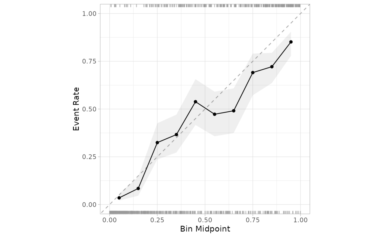
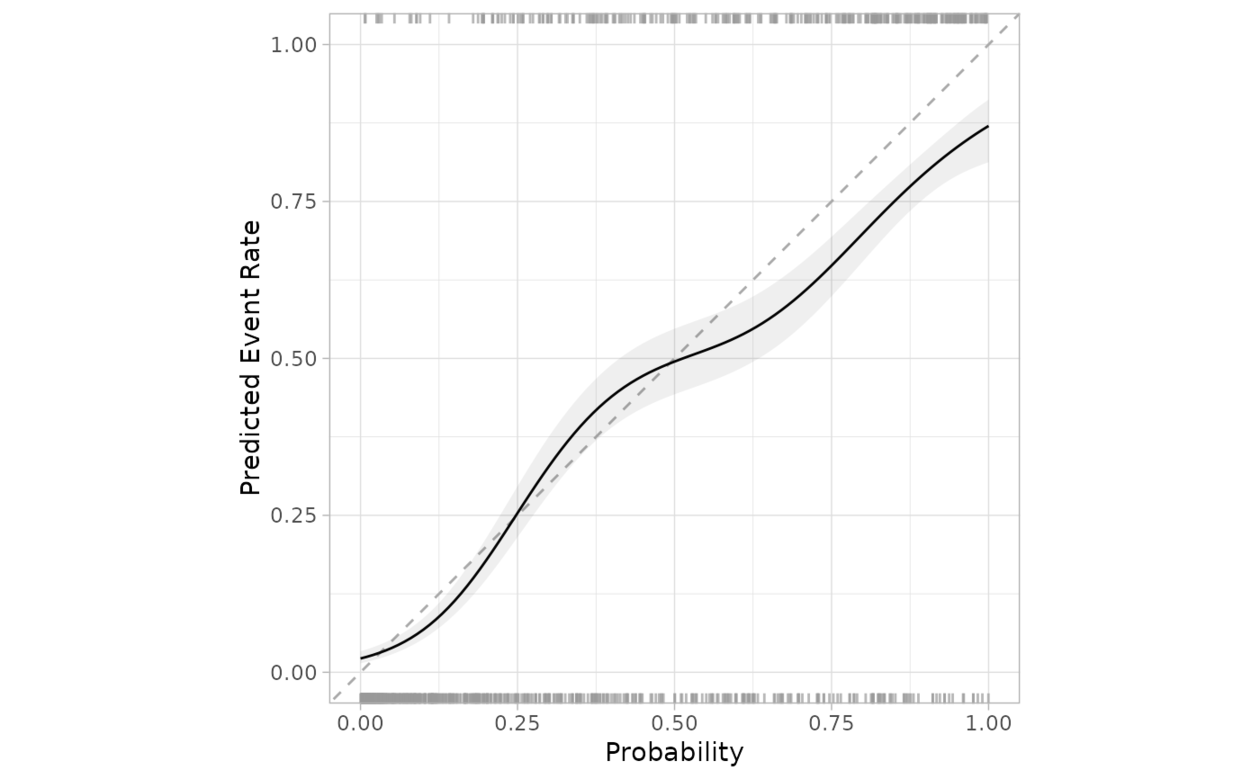
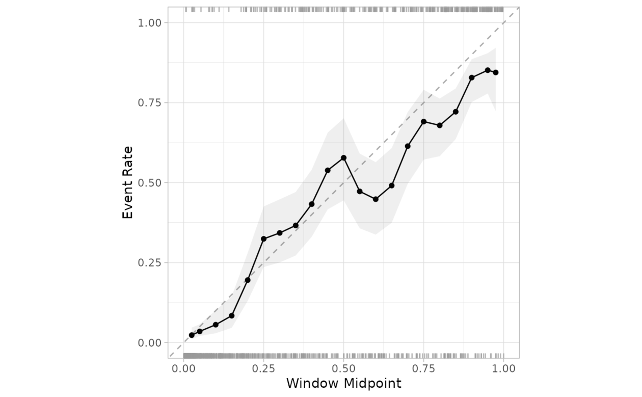
創建一個圖來評估觀察到的事件發生率是否與某個模型預測的事件概率大致相同。
從 0 到 1 創建一係列偶數、互斥的 bin。對於每個箱,預測概率落在箱範圍內的數據用於計算觀察到的事件率(以及事件率的置信區間)。如果預測經過良好校準,擬合曲線應與對角線對齊。
用法
cal_plot_breaks(
  .data,
  truth = NULL,
  estimate = dplyr::starts_with(".pred"),
  num_breaks = 10,
  conf_level = 0.9,
  include_ribbon = TRUE,
  include_rug = TRUE,
  include_points = TRUE,
  event_level = c("auto", "first", "second"),
  ...
)

# S3 method for data.frame
cal_plot_breaks(
  .data,
  truth = NULL,
  estimate = dplyr::starts_with(".pred"),
  num_breaks = 10,
  conf_level = 0.9,
  include_ribbon = TRUE,
  include_rug = TRUE,
  include_points = TRUE,
  event_level = c("auto", "first", "second"),
  ...,
  .by = NULL
)

# S3 method for tune_results
cal_plot_breaks(
  .data,
  truth = NULL,
  estimate = dplyr::starts_with(".pred"),
  num_breaks = 10,
  conf_level = 0.9,
  include_ribbon = TRUE,
  include_rug = TRUE,
  include_points = TRUE,
  event_level = c("auto", "first", "second"),
  ...
)

# S3 method for grouped_df
cal_plot_breaks(
  .data,
  truth = NULL,
  estimate = NULL,
  num_breaks = 10,
  conf_level = 0.9,
  include_ribbon = TRUE,
  include_rug = TRUE,
  include_points = TRUE,
  event_level = c("auto", "first", "second"),
  ...
)
參數
- .data
-
包含預測和概率列的未分組 DataFrame 對象。
- truth
-
真實類別結果的列標識符(即一個因子)。這應該是一個不帶引號的列名。
- estimate
-
列標識符向量,或
dplyr選擇器函數之一,用於選擇哪些變量包含類概率。它默認為 tidymodels 使用的前綴 (.pred_)。標識符的順序將被視為與truth變量的級別順序相同。 - num_breaks
-
對概率進行分組的段數。默認為 10。
- conf_level
-
可視化中使用的置信度。默認為 0.9。
- include_ribbon
-
指示是否要包含函數區層的標誌。默認為
TRUE。 - include_rug
-
指示是否要包括地毯層的標誌。默認為
TRUE。在圖中,頂部顯示事件發生的頻率,底部顯示事件未發生的頻率。 - include_points
-
指示是否要包含點圖層的標誌。
- event_level
-
單字符串。 "first" 或 "second" 指定將哪個真實級別視為 "event"。默認為"auto",它允許函數根據模型類型(二元、多類或線性)決定使用哪一個
- ...
-
傳遞給
tune_results對象的其他參數。 - .by
-
分組變量的列標識符。這應該是一個不帶引號的列名稱,用於選擇用於分組的定性變量。默認為
NULL。當.by = NULL時,不會進行分組。
也可以看看
https://www.tidymodels.org/learn/models/calibration/, cal_plot_windowed(), cal_plot_logistic()
例子
library(ggplot2)
library(dplyr)
cal_plot_breaks(
segment_logistic,
Class,
.pred_good
)
 cal_plot_logistic(
segment_logistic,
Class,
.pred_good
)
cal_plot_logistic(
segment_logistic,
Class,
.pred_good
)
 cal_plot_windowed(
segment_logistic,
Class,
.pred_good
)
cal_plot_windowed(
segment_logistic,
Class,
.pred_good
)
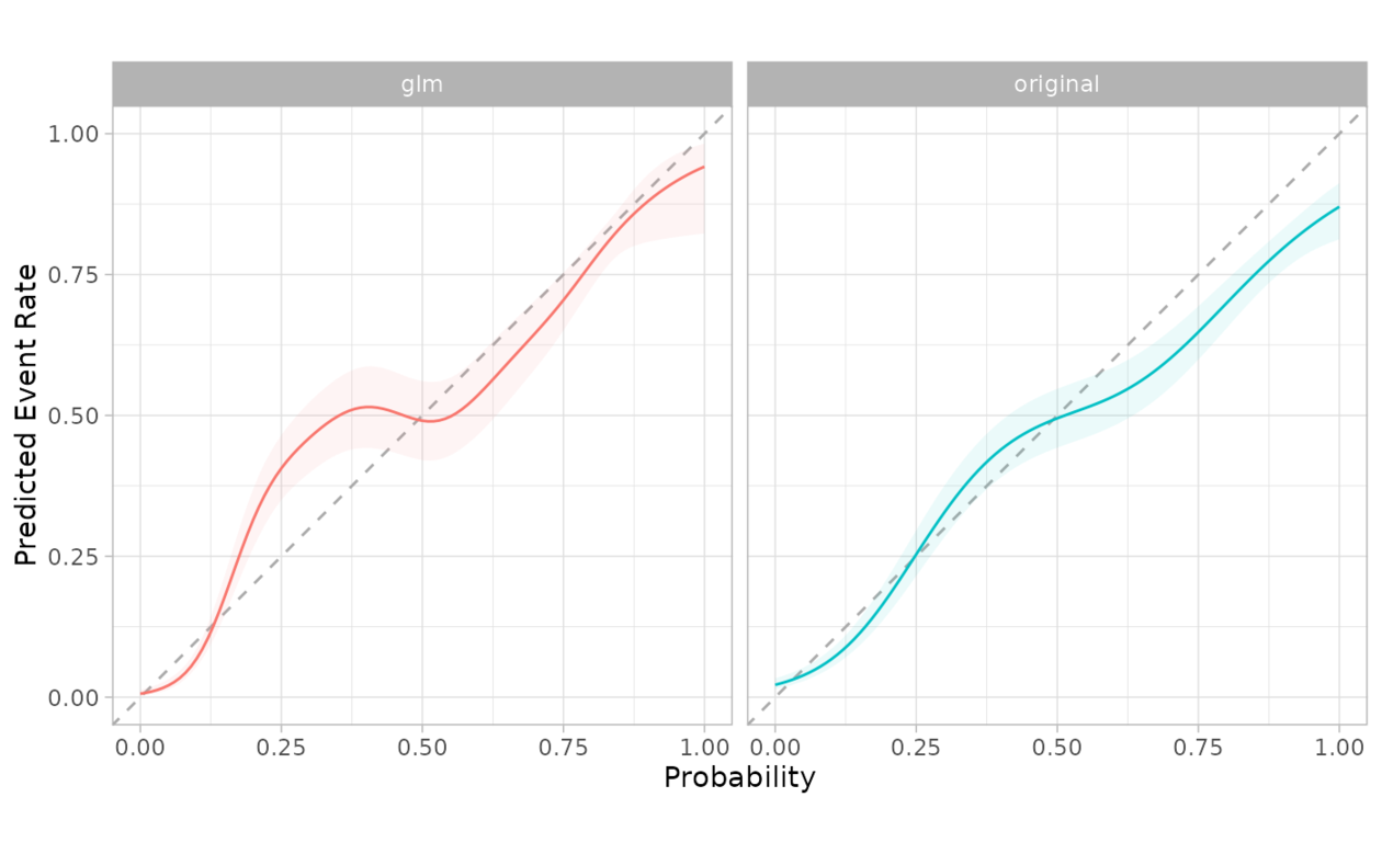
 # The functions support dplyr groups
model <- glm(Class ~ .pred_good, segment_logistic, family = "binomial")
preds <- predict(model, segment_logistic, type = "response")
gl <- segment_logistic %>%
mutate(.pred_good = 1 - preds, source = "glm")
combined <- bind_rows(mutate(segment_logistic, source = "original"), gl)
combined %>%
cal_plot_logistic(Class, .pred_good, .by = source)
# The functions support dplyr groups
model <- glm(Class ~ .pred_good, segment_logistic, family = "binomial")
preds <- predict(model, segment_logistic, type = "response")
gl <- segment_logistic %>%
mutate(.pred_good = 1 - preds, source = "glm")
combined <- bind_rows(mutate(segment_logistic, source = "original"), gl)
combined %>%
cal_plot_logistic(Class, .pred_good, .by = source)
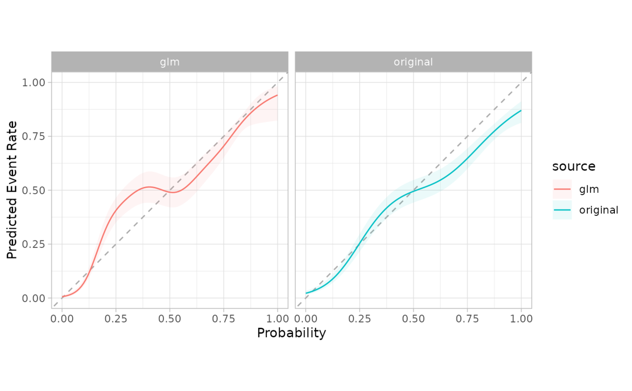 # The grouping can be faceted in ggplot2
combined %>%
cal_plot_logistic(Class, .pred_good, .by = source) +
facet_wrap(~source) +
theme(legend.position = "")
# The grouping can be faceted in ggplot2
combined %>%
cal_plot_logistic(Class, .pred_good, .by = source) +
facet_wrap(~source) +
theme(legend.position = "")
相關用法
- R probably cal_plot_logistic 通過邏輯回歸繪製概率校準圖
- R probably cal_plot_regression 回歸校準圖
- R probably cal_plot_windowed 通過移動窗口繪製概率校準圖
- R probably cal_estimate_multinomial 使用多項校準模型來計算新的概率
- R probably cal_validate_logistic 使用和不使用邏輯校準來測量性能
- R probably cal_validate_isotonic_boot 使用和不使用袋裝等滲回歸校準來測量性能
- R probably cal_estimate_beta 使用 Beta 校準模型來計算新概率
- R probably cal_estimate_isotonic 使用等滲回歸模型來校準模型預測。
- R probably cal_estimate_logistic 使用邏輯回歸模型來校準概率
- R probably cal_validate_multinomial 使用和不使用多項式校準來測量性能
- R probably cal_apply 對一組現有預測應用校準
- R probably cal_validate_linear 使用和不使用線性回歸校準來測量性能
- R probably cal_estimate_isotonic_boot 使用引導等滲回歸模型來校準概率
- R probably cal_validate_isotonic 使用和不使用等滲回歸校準來測量性能
- R probably cal_estimate_linear 使用線性回歸模型來校準數值預測
- R probably cal_validate_beta 使用和不使用 Beta 校準來測量性能
- R probably class_pred 創建類別預測對象
- R probably append_class_pred 添加 class_pred 列
- R probably threshold_perf 生成跨概率閾值的性能指標
- R probably as_class_pred 強製轉換為 class_pred 對象
- R probably levels.class_pred 提取class_pred級別
- R probably locate-equivocal 找到模棱兩可的值
- R probably int_conformal_quantile 通過保形推理和分位數回歸預測區間
- R probably make_class_pred 根據類概率創建 class_pred 向量
- R probably reportable_rate 計算報告率
注:本文由純淨天空篩選整理自Max Kuhn等大神的英文原創作品 Probability calibration plots via binning。非經特殊聲明,原始代碼版權歸原作者所有,本譯文未經允許或授權,請勿轉載或複製。