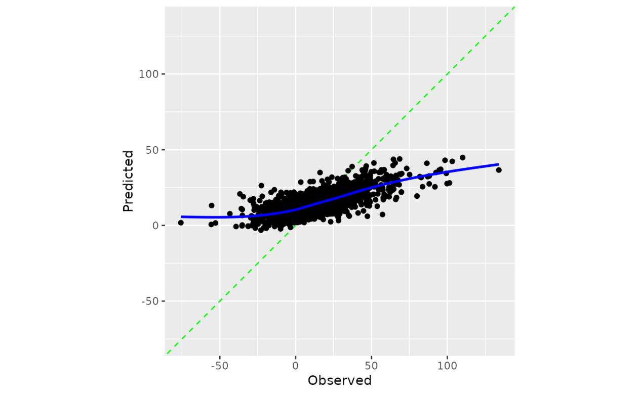
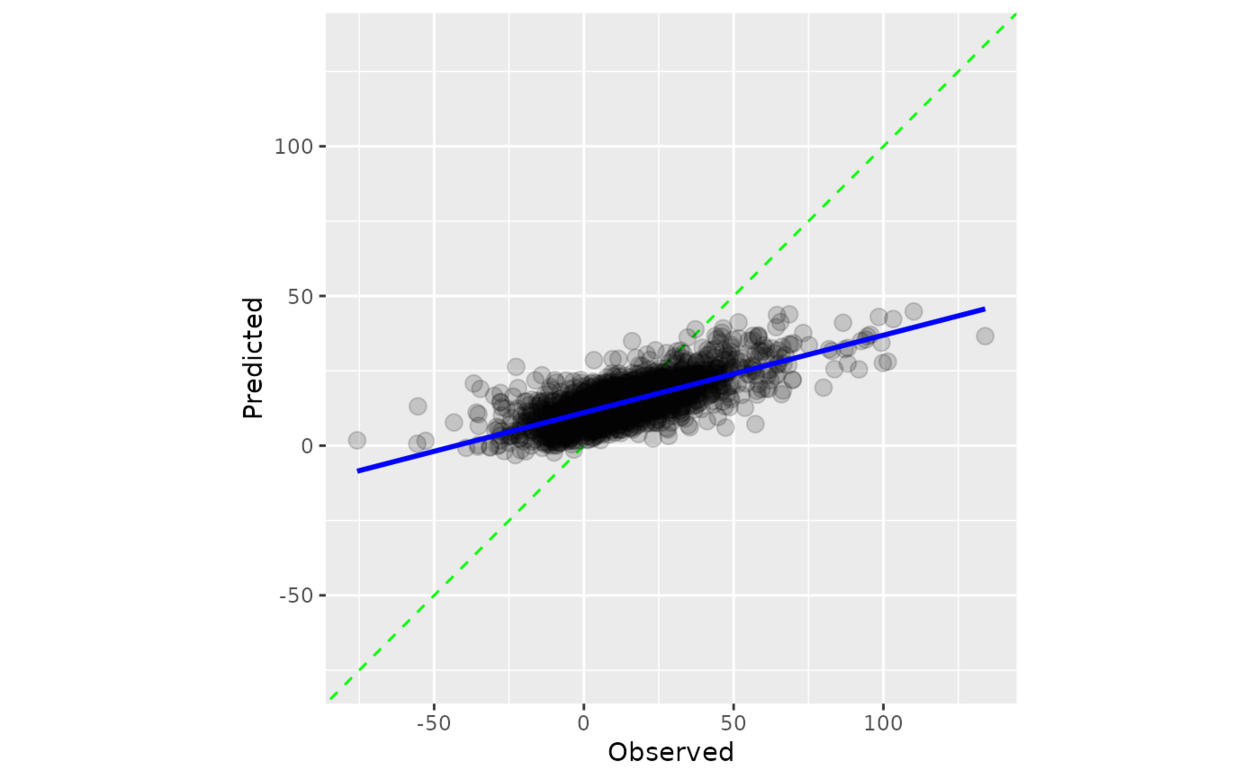
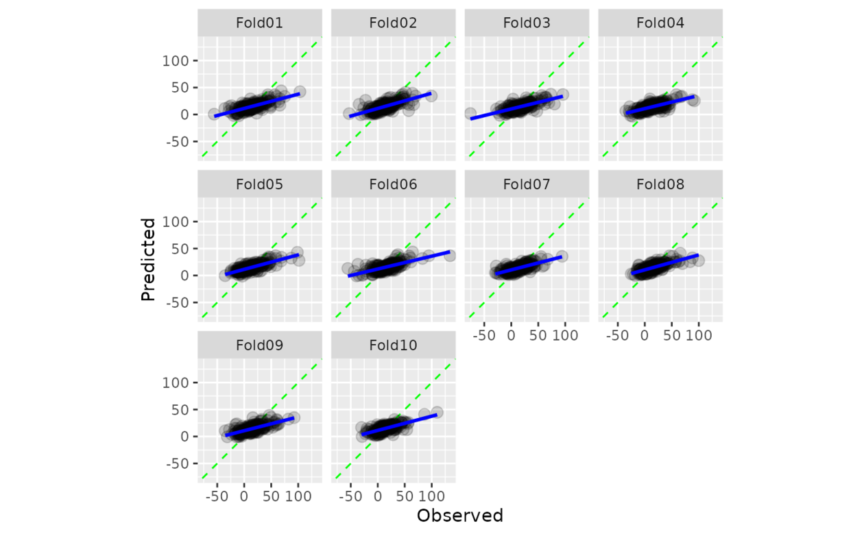
計算觀測值和預測值的散點圖,其中軸相同。當 smooth = TRUE 時,顯示廣義加性模型擬合。如果預測經過良好校準,擬合曲線應與對角線對齊。
用法
cal_plot_regression(.data, truth = NULL, estimate = NULL, smooth = TRUE, ...)

# S3 method for data.frame
cal_plot_regression(
  .data,
  truth = NULL,
  estimate = NULL,
  smooth = TRUE,
  ...,
  .by = NULL
)

# S3 method for tune_results
cal_plot_regression(.data, truth = NULL, estimate = NULL, smooth = TRUE, ...)

# S3 method for grouped_df
cal_plot_regression(.data, truth = NULL, estimate = NULL, smooth = TRUE, ...)
參數
- .data
-
包含預測列的未分組 DataFrame 對象。
- truth
-
真實結果的列標識符(數字)。這應該是一個不帶引號的列名。
- estimate
-
預測的列標識符。這應該是一個不帶引號的列名
- smooth
-
邏輯上:應該添加更平滑的曲線。
- ...
-
傳遞給
ggplot2::geom_point()的其他參數。 - .by
-
分組變量的列標識符。這應該是一個不帶引號的列名稱,用於選擇用於分組的定性變量。默認為
NULL。當.by = NULL時,不會進行分組。
相關用法
- R probably cal_plot_logistic 通過邏輯回歸繪製概率校準圖
- R probably cal_plot_breaks 通過分箱繪製概率校準圖
- R probably cal_plot_windowed 通過移動窗口繪製概率校準圖
- R probably cal_estimate_multinomial 使用多項校準模型來計算新的概率
- R probably cal_validate_logistic 使用和不使用邏輯校準來測量性能
- R probably cal_validate_isotonic_boot 使用和不使用袋裝等滲回歸校準來測量性能
- R probably cal_estimate_beta 使用 Beta 校準模型來計算新概率
- R probably cal_estimate_isotonic 使用等滲回歸模型來校準模型預測。
- R probably cal_estimate_logistic 使用邏輯回歸模型來校準概率
- R probably cal_validate_multinomial 使用和不使用多項式校準來測量性能
- R probably cal_apply 對一組現有預測應用校準
- R probably cal_validate_linear 使用和不使用線性回歸校準來測量性能
- R probably cal_estimate_isotonic_boot 使用引導等滲回歸模型來校準概率
- R probably cal_validate_isotonic 使用和不使用等滲回歸校準來測量性能
- R probably cal_estimate_linear 使用線性回歸模型來校準數值預測
- R probably cal_validate_beta 使用和不使用 Beta 校準來測量性能
- R probably class_pred 創建類別預測對象
- R probably append_class_pred 添加 class_pred 列
- R probably threshold_perf 生成跨概率閾值的性能指標
- R probably as_class_pred 強製轉換為 class_pred 對象
- R probably levels.class_pred 提取class_pred級別
- R probably locate-equivocal 找到模棱兩可的值
- R probably int_conformal_quantile 通過保形推理和分位數回歸預測區間
- R probably make_class_pred 根據類概率創建 class_pred 向量
- R probably reportable_rate 計算報告率
注:本文由純淨天空篩選整理自Max Kuhn等大神的英文原創作品 Regression calibration plots。非經特殊聲明,原始代碼版權歸原作者所有,本譯文未經允許或授權,請勿轉載或複製。