用法:
Series.plot.barh(x=None, y=None, **kwargs)制作水平条形图。
水平条形图是用矩形条形表示定量数据的图表,矩形条形的长度与它们所代表的值成正比。条形图显示离散类别之间的比较。该图的一个轴显示正在比较的特定类别,另一个轴表示测量值。
- x:标签或位置,可选
允许绘制一列与另一列。如果未指定,则使用 DataFrame 的索引。
- y:标签或位置,可选
允许绘制一列与另一列。如果未指定,则使用所有数字列。
- color:str,array-like,或 dict,可选
DataFrame 的每个列的颜色。可能的值为:
- 由名称、RGB 或 RGBA 代码引用的单一颜色字符串,
例如‘red’ 或“#a98d19”。
- 由名称、RGB 或 RGBA 引用的一系列颜色字符串
代码,它将递归地用于每一列。例如 [‘green’,'yellow'] 每列的条将交替填充为绿色或黄色。如果只有一列要绘制,则仅使用颜色列表中的第一种颜色。
- {列名形式的字典color},这样每一列都将是
相应地着色。例如,如果您的列被称为
a和b,那么传递 {‘a’: ‘green’, ‘b’: ‘red’} 会将列a的条形着色为绿色,将列b的条形着色为红色.
- **kwargs:
其他关键字参数记录在
DataFrame.plot()中。
- matplotlib.axes.Axes 或它们的 np.ndarray
当
subplots=True时,每列返回一个带有一个matplotlib.axes.Axes的 ndarray。
参数:
返回:
例子:
基本示例
>>> df = pd.DataFrame({'lab': ['A', 'B', 'C'], 'val': [10, 30, 20]})
>>> ax = df.plot.barh(x='lab', y='val')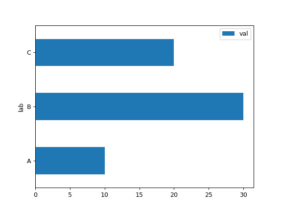
将整个 DataFrame 绘制为水平条形图
>>> speed = [0.1, 17.5, 40, 48, 52, 69, 88]
>>> lifespan = [2, 8, 70, 1.5, 25, 12, 28]
>>> index = ['snail', 'pig', 'elephant',
...          'rabbit', 'giraffe', 'coyote', 'horse']
>>> df = pd.DataFrame({'speed': speed,
...                    'lifespan': lifespan}, index=index)
>>> ax = df.plot.barh()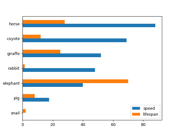
绘制 DataFrame 的堆积条形图
>>> ax = df.plot.barh(stacked=True)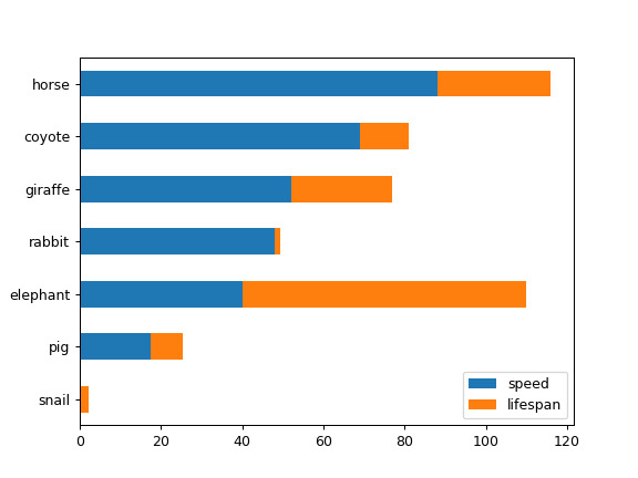
我们可以为每一列指定颜色
>>> ax = df.plot.barh(color={"speed": "red", "lifespan": "green"})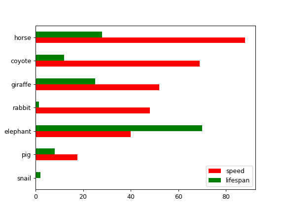
将 DataFrame 的一列绘制为水平条形图
>>> speed = [0.1, 17.5, 40, 48, 52, 69, 88]
>>> lifespan = [2, 8, 70, 1.5, 25, 12, 28]
>>> index = ['snail', 'pig', 'elephant',
...          'rabbit', 'giraffe', 'coyote', 'horse']
>>> df = pd.DataFrame({'speed': speed,
...                    'lifespan': lifespan}, index=index)
>>> ax = df.plot.barh(y='speed')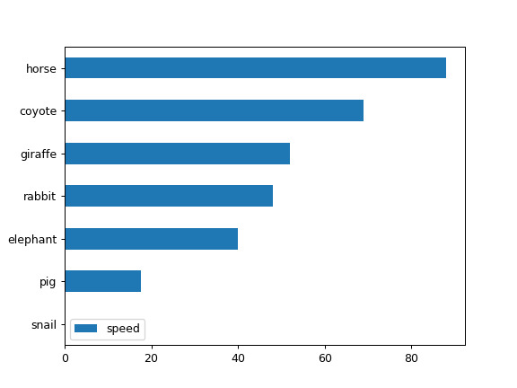
绘制 DataFrame 与所需列
>>> speed = [0.1, 17.5, 40, 48, 52, 69, 88]
>>> lifespan = [2, 8, 70, 1.5, 25, 12, 28]
>>> index = ['snail', 'pig', 'elephant',
...          'rabbit', 'giraffe', 'coyote', 'horse']
>>> df = pd.DataFrame({'speed': speed,
...                    'lifespan': lifespan}, index=index)
>>> ax = df.plot.barh(x='lifespan')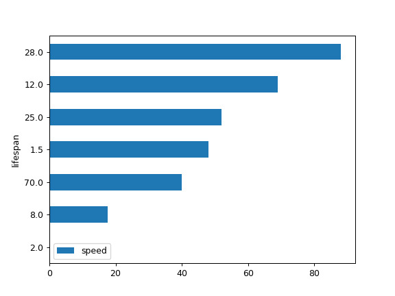
相关用法
- Python pandas.Series.plot.bar用法及代码示例
- Python pandas.Series.plot.box用法及代码示例
- Python pandas.Series.plot.line用法及代码示例
- Python pandas.Series.plot.hist用法及代码示例
- Python pandas.Series.plot.kde用法及代码示例
- Python pandas.Series.plot.pie用法及代码示例
- Python pandas.Series.plot.area用法及代码示例
- Python pandas.Series.plot.density用法及代码示例
- Python pandas.Series.pop用法及代码示例
- Python pandas.Series.pow用法及代码示例
- Python pandas.Series.product用法及代码示例
- Python pandas.Series.pipe用法及代码示例
- Python pandas.Series.pct_change用法及代码示例
- Python pandas.Series.prod用法及代码示例
- Python pandas.Series.add_prefix用法及代码示例
- Python pandas.Series.map用法及代码示例
- Python pandas.Series.max用法及代码示例
- Python pandas.Series.str.isdecimal用法及代码示例
- Python pandas.Series.str.get用法及代码示例
- Python pandas.Series.to_csv用法及代码示例
注:本文由纯净天空筛选整理自pandas.pydata.org大神的英文原创作品 pandas.Series.plot.barh。非经特殊声明,原始代码版权归原作者所有,本译文未经允许或授权,请勿转载或复制。