对一个带有几个条目的pandas DataFrame,想计算某些类型商店的收入之间的相关性。这里有有许多带有收入的商店数据,活动区域分类(剧院,布料店,食品……)和其他数据。
我尝试创建一个新的数据框并插入一个列,该列具有属于同一类别的各种商店的收入,并且返回的数据框只有第一列有值,其余的则填充了NaN。我尝试的代码:
corr = pd.DataFrame()
for at in activity:
    stores.loc[stores['Activity']==at]['income']
然后,准备使用.corr()给出商店类别之间的相关矩阵。
在那之后,我想知道如何使用matplolib绘制矩阵值(-1到1,因为我想使用Pearson的相关性)。
最佳解决办法
可以采用下面的方式:
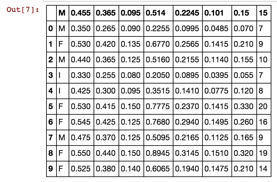
在本例中使用UCI Abalone数据……
import matplotlib
import numpy as np
import matplotlib.pyplot as plt
%matplotlib inline

# Read file into a Pandas dataframe
from pandas import DataFrame, read_csv
f = 'https://archive.ics.uci.edu/ml/machine-learning-databases/abalone/abalone.data'
df = read_csv(f)
df=df[0:10]
df
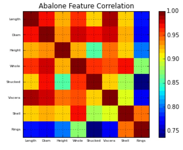
相关矩阵绘图功能:
#相关矩阵绘图功能
def correlation_matrix(df):
    from matplotlib import pyplot as plt
    from matplotlib import cm as cm

    fig = plt.figure()
    ax1 = fig.add_subplot(111)
    cmap = cm.get_cmap('jet', 30)
    cax = ax1.imshow(df.corr(), interpolation="nearest", cmap=cmap)
    ax1.grid(True)
    plt.title('Abalone Feature Correlation')
    labels=['Sex','Length','Diam','Height','Whole','Shucked','Viscera','Shell','Rings',]
    ax1.set_xticklabels(labels,fontsize=6)
    ax1.set_yticklabels(labels,fontsize=6)
    # Add colorbar, make sure to specify tick locations to match desired ticklabels
    fig.colorbar(cax, ticks=[.75,.8,.85,.90,.95,1])
    plt.show()

correlation_matrix(df)
次佳解决办法
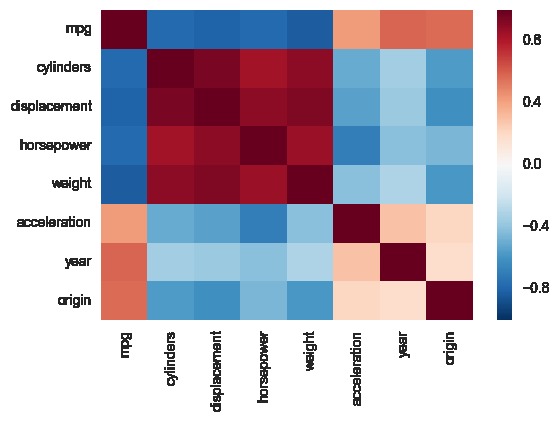
另一种方法是使用seaborn中的热图函数来绘制协方差。此示例使用R中ISLR程序包中的自动数据集(与您显示的示例中的相同)。
import pandas.rpy.common as com
import seaborn as sns
%matplotlib inline

# load the R package ISLR
infert = com.importr("ISLR")

# load the Auto dataset
auto_df = com.load_data('Auto')

# calculate the correlation matrix
corr = auto_df.corr()

# plot the heatmap
sns.heatmap(corr,
        xticklabels=corr.columns,
        yticklabels=corr.columns)
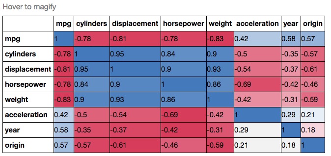
如果想要更加炫酷,你可以使用Pandas Style,例如:
cmap = cmap=sns.diverging_palette(5, 250, as_cmap=True)

def magnify():
    return [dict(selector="th",
                 props=[("font-size", "7pt")]),
            dict(selector="td",
                 props=[('padding', "0em 0em")]),
            dict(selector="th:hover",
                 props=[("font-size", "12pt")]),
            dict(selector="tr:hover td:hover",
                 props=[('max-width', '200px'),
                        ('font-size', '12pt')])
]

corr.style.background_gradient(cmap, axis=1)\
    .set_properties(**{'max-width': '80px', 'font-size': '10pt'})\
    .set_caption("Hover to magify")\
    .set_precision(2)\
    .set_table_styles(magnify())