Matplotlib是Python中令人驚歎的可視化庫,用於數組的二維圖。 Matplotlib是一個基於NumPy數組的多平台數據可視化庫,旨在與更廣泛的SciPy堆棧配合使用。
matplottlib.patches.ConnectionPatch
這個matplottlib.patches.ConnectionPatch 的子類matplotlib.patches.FancyArrowPatch類,用於在兩點之間建立連接線。
用法:class matplotlib.patches.ConnectionPatch(xyA, xyB, coordsA, coordsB=None, axesA=None, axesB=None, arrowstyle=’-‘, arrow_transmuter=None, connectionstyle=’arc3’, connector=None, patchA=None, patchB=None, shrinkA=0.0, shrinkB=0.0, mutation_scale=10.0, mutation_aspect=None, clip_on=False, dpi_cor=1.0, **kwargs)
參數:
- xyA:它是x-y圖上也稱為點A的連接線的起點。
- xyB:它是x-y圖上連接線的起點,也稱為點B。
- coordsA:A點的坐標。
- coordsB:B點的坐標。
- axesA:它是x-y圖上連接軸的起點。
- axesB:它是x-y圖上連接軸的終點。
- arrowstyle:用於設置連接箭頭的樣式。其默認類型為“-”。
- arrow_transmuter:用於忽略連接線。
- connectionstyle:它描述了posA和posB的連接方式。它可以是ConnectionStyle類的實例,也可以是connectionstyle名稱的字符串,它具有可選的逗號分隔屬性。
- connector:通常忽略它,並決定忽略哪個連接器。
- patchA:用於在A點添加補丁。
- patchB:用於在B點添加補丁
- shrinkA:用於在A點收縮連接器。
- shrinkB:用於在B點收縮連接器。
- mutation_scale:箭頭樣式的屬性(例如head_length)的縮放比例值。
- mutation_aspect:變異前,矩形的高度將被該值擠壓,變異框將被其倒數拉伸。
- clip_on:設置藝術家是否使用剪輯。
- dpi_cor:dpi_cor當前用於linewidth-related事物和收縮因子。突變規模受此影響。
以下是有效的Kwargs key 列表;
| 鑰匙 | 描述 |
|---|---|
| arrowstyle | 箭頭樣式 |
| connectionstyle | 連接方式 |
| relpos | 默認值為(0.5,0.5) |
| patchA | 默認為文本的邊框 |
| patchB | 默認為無 |
| shrinkA | 默認為2分 |
| shrinkB | 默認為2分 |
| mutation_scale | 默認為文本大小(以磅為單位) |
| mutation_aspect | 默認值為1。 |
| ? | 任何鑰匙 matplotlib.patches.PathPatch |
xyA和xyB的坐標由字符串coordsA和coordsB表示。
| 屬性 | 描述 |
|---|---|
| “圖點” | 從圖的左下角指向的點 |
| “數字像素” | 圖左下角的像素 |
| “數字分數” | 0,0在圖的左下角,1,1在右上角 |
| “軸點” | 從軸的左下角開始的點 |
| “軸像素” | 軸左下角的像素 |
| “軸分數” | 0,0是軸的左下角,1,1是右上角 |
| ‘data’ | 使用要注釋的對象的坐標係(默認) |
| “偏移點” | 與xy值的偏移量(以磅為單位) |
| ‘polar’ | 您甚至可以在笛卡爾圖中為注釋指定theta,r。請注意,如果使用極軸,則無需為坐標係指定極坐標,因為這是原始的“data”坐標係。 |
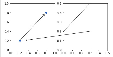
範例1:
from matplotlib.patches import ConnectionPatch
import matplotlib.pyplot as plt

fig, (ax1, ax2) = plt.subplots(1, 2,
                               figsize =(6, 3))

# Draw a simple arrow between
# two points in axes coordinates
# within a single axes.
xyA = (0.2, 0.2)
xyB = (0.8, 0.8)
coordsA = "data"
coordsB = "data"
con = ConnectionPatch(xyA, xyB,
                      coordsA, coordsB,
                      arrowstyle ="-|>",
                      shrinkA = 5, shrinkB = 5,
                      mutation_scale = 20,
                      fc ="w")

ax1.plot([xyA[0], xyB[0]], [xyA[1],
                            xyB[1]], "o")
ax1.add_artist(con)

# Draw an arrow between the
# same point in data coordinates,
# but in different axes.
xy = (0.3, 0.2)
con = ConnectionPatch(
    xyA = xy, coordsA = ax2.transData,
    xyB = xy, coordsB = ax1.transData,
    arrowstyle ="->", shrinkB = 5)

ax2.add_artist(con)

# Draw a line between the different
# points, defined in different coordinate
# systems.
con = ConnectionPatch(
    # in axes coordinates
    xyA =(0.6, 1.0), coordsA = ax2.transAxes,
    # x in axes coordinates, y in data coordinates
    xyB =(0.0, 0.2), coordsB = ax2.get_yaxis_transform(),
    arrowstyle ="-")

ax2.add_artist(con)

ax1.set_xlim(0, 1)
ax1.set_ylim(0, 1)
ax2.set_xlim(0, .5)
ax2.set_ylim(0, .5)

plt.show()
輸出:
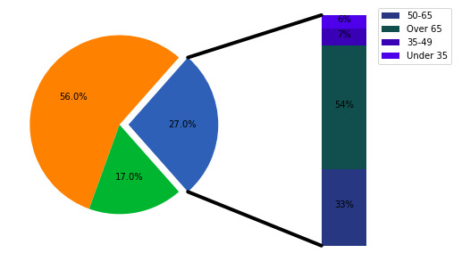
範例2:
import matplotlib.pyplot as plt
from matplotlib.patches import ConnectionPatch
import numpy as np


# make figure and assign axis
# objects
fig = plt.figure(figsize =(9, 5))
ax1 = fig.add_subplot(121)
ax2 = fig.add_subplot(122)
fig.subplots_adjust(wspace = 0)

# pie chart parameters
ratios = [.27, .56, .17]
explode = [0.1, 0, 0]

# rotate so that first wedge is
# split by the x-axis
angle = -180 * ratios[0]
ax1.pie(ratios, autopct ='% 1.1f %%',
        startangle = angle,
        explode = explode)

# bar chart parameters

xpos = 0
bottom = 0
ratios = [.33, .54, .07, .06]
width = .2
colors = [[.1, .3, .5],
          [.1, .3, .3],
          [.1, .3, .7],
          [.1, .3, .9]]

for j in range(len(ratios)):
    height = ratios[j]
    ax2.bar(xpos, height, width,
            bottom = bottom,
            color = colors[j])

    ypos = bottom + ax2.patches[j].get_height() / 2
    bottom += height
    ax2.text(xpos,
             ypos,
             "% d %%" % (ax2.patches[j].get_height() * 100),
             ha ='center')

ax2.set_title('')
ax2.legend(('50-65', 'Over 65', '35-49', 'Under 35'))
ax2.axis('off')
ax2.set_xlim(- 2.5 * width, 2.5 * width)

# use ConnectionPatch to draw
# lines between the two plots
# get the wedge data
theta1, theta2 = ax1.patches[0].theta1, ax1.patches[0].theta2
center, r = ax1.patches[0].center, ax1.patches[0].r
bar_height = sum([item.get_height() for item in ax2.patches])

# draw top connecting line
x = r * np.cos(np.pi / 180 * theta2) + center[0]
y = np.sin(np.pi / 180 * theta2) + center[1]
con = ConnectionPatch(xyA =(-width / 2, bar_height),
                      coordsA = ax2.transData,
                      xyB =(x, y),
                      coordsB = ax1.transData)

con.set_color([0, 0, 0])
con.set_linewidth(4)
ax2.add_artist(con)

# draw bottom connecting line
x = r * np.cos(np.pi / 180 * theta1) + center[0]
y = np.sin(np.pi / 180 * theta1) + center[1]

con = ConnectionPatch(xyA =(-width / 2, 0),
                      coordsA = ax2.transData,
                      xyB =(x, y),
                      coordsB = ax1.transData)

con.set_color([0, 0, 0])
ax2.add_artist(con)
con.set_linewidth(4)

plt.show()
輸出:
相關用法
- Python Matplotlib.ticker.MultipleLocator用法及代碼示例
- Python Matplotlib.gridspec.GridSpec用法及代碼示例
- Python Matplotlib.patches.CirclePolygon用法及代碼示例
- Python Matplotlib.colors.Normalize用法及代碼示例
注:本文由純淨天空篩選整理自RajuKumar19大神的英文原創作品 Matplotlib.patches.ConnectionPatch class in Python。非經特殊聲明,原始代碼版權歸原作者所有,本譯文未經允許或授權,請勿轉載或複製。