Matplotlib是Python中令人驚歎的可視化庫,用於數組的二維圖。 Matplotlib是一個基於NumPy數組的多平台數據可視化庫,旨在與更廣泛的SciPy堆棧配合使用。
matplotlib.colors.LinearSegmentedColarmap
matplotlib.colors.LinearSegmentedColarmap類屬於matplotlib.colors模塊。 matplotlib.colors模塊用於將顏色或數字參數轉換為RGBA或RGB。此模塊用於將數字映射到顏色或以一維顏色數組(也稱為colormap)進行顏色規格轉換。
matplotlib.colors.LinearSegmentedColormap類用於在線性段的幫助下基於查找表對對象進行顏色映射。查找表是通過線性插值法針對每種原色生成的,因為0-1域將其分為任意數量的段。它也可以用於根據線性映射段創建顏色映射。帶有段數據名稱的字典帶有紅色,藍色和綠色條目。每個條目都必須是x,y0,y1元組的列表,以創建表的行。重要的是要注意alpha條目是可選的。
例如,假設您希望紅色從0遞增到1,綠色則做同樣的事情,但中間要超過一半,藍色要超過上一半。然後,您將使用以下字典:
seg_data_dict =
{‘red’: [(0.0, 0.0, 0.0),
(0.5, 1.0, 1.0),
(1.0, 1.0, 1.0)],
‘green’:[(0.0, 0.0, 0.0),
(0.25, 0.0, 0.0),
(0.75, 1.0, 1.0),
(1.0, 1.0, 1.0)],‘blue’: [(0.0, 0.0, 0.0),
(0.5, 0.0, 0.0),
(1.0, 1.0, 1.0)]}
表中給定顏色的每一行都是元組x,y0,y1的序列。在每個序列中,x必須從0到1單調遞增。對於所有落在x [i]和x [i + 1]之間的輸入值z,給定顏色的線性插值輸出值在y1 [i]和y0 [之間]。 i + 1]:
row i: x y0 y1
row i+1:x y0 y1
因此,從不使用第一行的y0和最後一行的y1。
該類的方法:
- static from_list(name, colors, N=256, gamma=1.0):此方法用於創建線性分段的顏色圖,其名稱由一係列顏色組成,該顏色序列從val = 0處的colors [0]到val = 1處的colors [-1]均勻移動。 N表示rgb量化級別的數量。此外,元組列表(值,顏色)也會在範圍內產生不均勻的劃分。
- reversed(self, name=None):它用於製作顏色圖的反向實例。
parameters:- name:它是一個可選參數,可以接受以字符串形式表示的反轉色圖的名稱。如果為None,則名稱設置為父色圖+ “r”的名稱。
返回值:此方法返回反向的顏色圖。
- name:它是一個可選參數,可以接受以字符串形式表示的反轉色圖的名稱。如果為None,則名稱設置為父色圖+ “r”的名稱。
- set_gamma(self, gamma):它用於通過設置新的伽瑪值來重新生成顏色圖
範例1:
import numpy as np
import matplotlib.pyplot as plt
from matplotlib.colors import LinearSegmentedColormap
# some dummy data
a = np.arange(0, np.pi, 0.1)
b = np.arange(0, 2 * np.pi, 0.1)
A, B = np.meshgrid(a, b)
X = np.cos(A) * np.sin(B) * 10
# custom segmented color dictionary
cdict1 = {'red': ((0.0, 0.0, 0.0),
(0.5, 0.0, 0.1),
(1.0, 1.0, 1.0)),
'green':((0.0, 0.0, 0.0),
(1.0, 0.0, 0.0)),
'blue': ((0.0, 0.0, 1.0),
(0.5, 0.1, 0.0),
(1.0, 0.0, 0.0))
}
cdict2 = {'red': ((0.0, 0.0, 0.0),
(0.5, 0.0, 1.0),
(1.0, 0.1, 1.0)),
'green':((0.0, 0.0, 0.0),
(1.0, 0.0, 0.0)),
'blue': ((0.0, 0.0, 0.1),
(0.5, 1.0, 0.0),
(1.0, 0.0, 0.0))
}
cdict3 = {'red': ((0.0, 0.0, 0.0),
(0.25, 0.0, 0.0),
(0.5, 0.8, 1.0),
(0.75, 1.0, 1.0),
(1.0, 0.4, 1.0)),
'green':((0.0, 0.0, 0.0),
(0.25, 0.0, 0.0),
(0.5, 0.9, 0.9),
(0.75, 0.0, 0.0),
(1.0, 0.0, 0.0)),
'blue': ((0.0, 0.0, 0.4),
(0.25, 1.0, 1.0),
(0.5, 1.0, 0.8),
(0.75, 0.0, 0.0),
(1.0, 0.0, 0.0))
}
# Creating a modified version of cdict3
# with some transparency
# in the center of the range.
cdict4 = {**cdict3,
'alpha':((0.0, 1.0, 1.0),
# (0.25, 1.0, 1.0),
(0.5, 0.3, 0.3),
# (0.75, 1.0, 1.0),
(1.0, 1.0, 1.0)),
}
blue_red1 = LinearSegmentedColormap('BlueRed1',
cdict1)
blue_red2 = LinearSegmentedColormap('BlueRed2',
cdict2)
plt.register_cmap(cmap = blue_red2)
# optional lut kwarg
plt.register_cmap(name ='BlueRed3',
data = cdict3)
plt.register_cmap(name ='BlueRedAlpha',
data = cdict4)
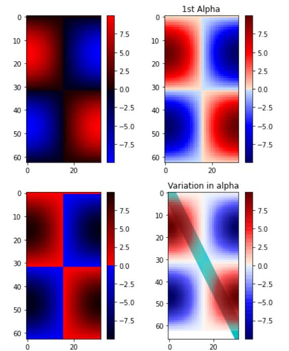
figure, axes = plt.subplots(2, 2,
figsize =(6, 9))
figure.subplots_adjust(left = 0.02,
bottom = 0.06,
right = 0.95,
top = 0.94,
wspace = 0.05)
# Making 4 different subplots:
img1 = axes[0, 0].imshow(X,
interpolation ='nearest',
cmap = blue_red1)
figure.colorbar(img1, ax = axes[0, 0])
cmap = plt.get_cmap('BlueRed2')
img2 = axes[1, 0].imshow(X,
interpolation ='nearest',
cmap = cmap)
figure.colorbar(img2, ax = axes[1, 0])
# set the third cmap as the default.
plt.rcParams['image.cmap'] = 'BlueRed3'
img3 = axes[0, 1].imshow(X,
interpolation ='nearest')
figure.colorbar(img3, ax = axes[0, 1])
axes[0, 1].set_title("1st Alpha")
# Draw a line with low zorder to
# keep it behind the image.
axes[1, 1].plot([0, 10 * np.pi],
[0, 20 * np.pi],
color ='c',
lw = 19,
zorder =-1)
img4 = axes[1, 1].imshow(X,
interpolation ='nearest')
figure.colorbar(img4, ax = axes[1, 1])
# Here it is:changing the colormap
# for the current image and its
# colorbar after they have been plotted.
img4.set_cmap('BlueRedAlpha')
axes[1, 1].set_title("Variation in alpha")
figure.subplots_adjust(top = 0.8)
plt.show()
輸出:
範例2:
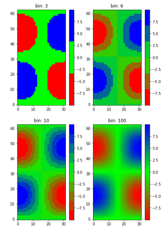
import numpy as np
import matplotlib.pyplot as plt
from matplotlib.colors import LinearSegmentedColormap

# Make some illustrative fake data:
a = np.arange(0, np.pi, 0.1)
b = np.arange(0, 2 * np.pi, 0.1)
A, B = np.meshgrid(a, b)
X = np.cos(A) * np.sin(B) * 10

# colormap froma list
# R -> G -> B
list_colors = [(1, 0, 0),
               (0, 1, 0),
               (0, 0, 1)]


# Discretizes the interpolation
# into bins
all_bins = [3, 6, 10, 100]
cmap_name = 'my_list'
figure, axes = plt.subplots(2, 2,
                            figsize =(6, 9))

figure.subplots_adjust(left = 0.02,
                       bottom = 0.06,
                       right = 0.95,
                       top = 0.94,
                       wspace = 0.05)

for all_bin, ax in zip(all_bins, axes.ravel()):

    # Making the the colormap
    cm = LinearSegmentedColormap.from_list(
        cmap_name,
        list_colors,
        N = all_bin)

    im = ax.imshow(X, interpolation ='nearest',
                   origin ='lower', cmap = cm)

    ax.set_title("bin:% s" % all_bin)
    fig.colorbar(im, ax = ax)
輸出:
相關用法
- Python Matplotlib.ticker.MultipleLocator用法及代碼示例
- Python Matplotlib.gridspec.GridSpec用法及代碼示例
- Python Matplotlib.patches.CirclePolygon用法及代碼示例
- Python Matplotlib.colors.Normalize用法及代碼示例
注:本文由純淨天空篩選整理自RajuKumar19大神的英文原創作品 Matplotlib.colors.LinearSegmentedColormap class in Python。非經特殊聲明,原始代碼版權歸原作者所有,本譯文未經允許或授權,請勿轉載或複製。