Matplotlib是Python中令人驚歎的可視化庫,用於數組的二維圖。 Matplotlib是一個基於NumPy數組的多平台數據可視化庫,旨在與更廣泛的SciPy堆棧配合使用。
matplotlib.colors.Colormap
matplotlib.colors.Colormap類屬於matplotlib.colors模塊。 matplotlib.colors模塊用於將顏色或數字參數轉換為RGBA或RGB。此模塊用於將數字映射到顏色或以一維顏色數組(也稱為colormap)進行顏色規格轉換。
matplotlib.colors.Colormap類是所有標量到RGBA映射的基類。通常,色圖實例用於將數據值(浮點數)從間隔0-1轉換為它們各自的RGBA顏色。這裏,matplotlib.colors.Normalize類用於縮放數據。 matplotlib.cm.ScalarMappable子類將其大量用於data-> normalize-> map-to-color處理鏈。
用法:
matplotlib.colors.Colormap類(名稱,N = 256)
Parameters:
- name:它接受一個代表顏色名稱的字符串。
- N:它是一個整數值,代表rgb量化級別的數量。
類的方法:
- colorbar_extend = None:如果顏色映射存在於標量可映射對象上並且colorbar_extend設置為false,則創建顏色條將選擇colorbar_extend作為matplotlib.colorbar.Colorbar構造函數中的extend關鍵字的默認值。
- is_gray(self):返回一個布爾值,以檢查plt是否為灰色。
- reversed(self, name=None):用於製作Colormap的反向實例。基類未實現此函數。它具有一個參數,即name是可選參數,並接受反向色圖的字符串名稱。如果設置為None,則成為父色圖+ “r”的名稱。
- set_bad(自我,顏色=“ k”,字母=無):它設置用於遮罩值的顏色。
- set_over(self, color=’k’,, alpha=None):它用於設置顏色以用於超出範圍的高值。它要求norm.clip為False。
- set_under(self, color=’k’,, alpha=None):它用於設置顏色以用於超出範圍的低值。它要求norm.clip為False。
例:
import numpy as np
import matplotlib.pyplot as plt
start_point = 'lower'
diff = 0.025
a = b = np.arange(-3.0, 3.01, diff)
A, B = np.meshgrid(a, b)
X1 = np.exp(-A**2 - B**2)
X2 = np.exp(-(A - 1)**2 - (B - 1)**2)
X = (X1 - X2) * 2
RR, RC = X.shape
# putting NaNs in one corner:
X[-RR // 6:, -RC // 6:] = np.nan
X = np.ma.array(X)
# masking the other corner:
X[:RR // 6,:RC // 6] = np.ma.masked
# masking a circle in the middle:
INNER = np.sqrt(A**2 + B**2) < 0.5
X[INNER] = np.ma.masked
# using automatic selection of
# contour levels;
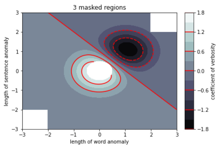
figure1, axes2 = plt.subplots(constrained_layout = True)
C = axes2.contourf(A, B, X, 10,
cmap = plt.cm.bone,
origin = start_point)
C2 = axes2.contour(C, levels = C.levels[::2],
colors ='r', origin = start_point)
axes2.set_title('3 masked regions')
axes2.set_xlabel('length of word anomaly')
axes2.set_ylabel('length of sentence anomaly')
# Make a colorbar for the ContourSet
# returned by the contourf call.
cbar = figure1.colorbar(C)
cbar.ax.set_ylabel('coefficient of verbosity')
# Add the contour line levels
# to the colorbar
cbar.add_lines(C2)
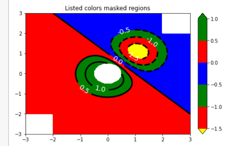
figure2, axes2 = plt.subplots(constrained_layout = True)
# making a contour plot with the
# levels specified,
levels = [-1.5, -1, -0.5, 0, 0.5, 1]
C3 = axes2.contourf(A, B, X, levels,
colors =('r', 'g', 'b'),
origin = start_point,
extend ='both')
# data below the lowest contour
# level yellow, data below the
# highest level green:
C3.cmap.set_under('yellow')
C3.cmap.set_over('green')
C4 = axes2.contour(A, B, X, levels,
colors =('k', ),
linewidths =(3, ),
origin = start_point)
axes2.set_title('Listed colors (3 masked regions)')
axes2.clabel(C4, fmt ='% 2.1f',
colors ='w',
fontsize = 14)
figure2.colorbar(C3)
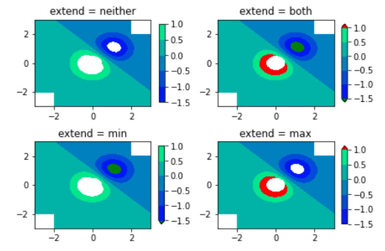
# Illustrating all 4 possible
# "extend" settings:
extends = ["neither", "both", "min", "max"]
cmap = plt.cm.get_cmap("winter")
cmap.set_under("green")
cmap.set_over("red")
figure, axes = plt.subplots(2, 2,
constrained_layout = True)
for ax, extend in zip(axes.ravel(), extends):
cs = ax.contourf(A, B, X, levels,
cmap = cmap,
extend = extend,
origin = start_point)
figure.colorbar(cs, ax = ax, shrink = 0.9)
ax.set_title("extend = % s" % extend)
ax.locator_params(nbins = 4)
plt.show()輸出:
相關用法
- Python Matplotlib.ticker.MultipleLocator用法及代碼示例
- Python Matplotlib.gridspec.GridSpec用法及代碼示例
- Python Matplotlib.patches.CirclePolygon用法及代碼示例
- Python Matplotlib.colors.Normalize用法及代碼示例
注:本文由純淨天空篩選整理自RajuKumar19大神的英文原創作品 Matplotlib.colors.Colormap class in Python。非經特殊聲明,原始代碼版權歸原作者所有,本譯文未經允許或授權,請勿轉載或複製。