此 CSS 屬性定義用作元素邊框的圖像。它在元素外繪製一個圖像,並用相應的圖像替換元素的邊框。用圖像替換元素的邊框是一項有趣的任務。
當 border-collapse 設置為折疊時,border-image 屬性可以應用於除內部表的元素(如 tr、th、td)之外的所有元素。
它是 border-image-source、border-image-slice、border-image-width、border-image-outset 和 border-image-repeat 的簡寫屬性。我們可以使用 border-image 屬性一次設置所有這些屬性。如果未指定任何值,則將它們設置為默認值。此屬性的默認值為:
border-image:none 100% 1 0 stretch用法
border-image:source slice width outset repeat | initial | inherit;該屬性的值如下表所示。
| 值 | 描述 |
|---|---|
| border-image-source: | 它指定 border-image 的來源。它設置圖像的路徑,或者我們可以說它指定要用作邊框的圖像的位置。 |
| border-image-slice: | 它用於分割或切片圖像,由 border-image-source 屬性指定。此屬性的值指定如何對圖像進行切片以創建邊框部分。此屬性將圖像分為九個部分,它們是:
|
| border-image-width: | 它設置 border-image 的寬度。它可以接受無單位的正值、百分比值或關鍵字 auto。它的默認值為 1。我們最多可以指定四個值來提供各個邊的寬度。 |
| border-image-outset: | 它設置邊框圖像從其邊框框中設置的空間量。 |
| border-image-repeat: | 它控製圖像的重複以填充邊框區域。我們最多可以為此屬性指定兩個值。如果我們指定一個值,則它同時應用於垂直和水平兩側。但是如果我們指定兩個值,那麽第一個值應用於水平邊,第二個值應用於垂直邊。 下麵列出了此屬性的值。
|
| Initial | 它將屬性設置為其默認值 (border-image: none 100% 1 0 stretch )。 |
| inherit | 它從其父元素繼承屬性。 |
現在,讓我們看一些示例以了解如何使用 border-image 屬性設置 border-image。
示例
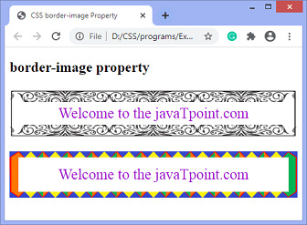
在這個例子中,我們用圖像替換段落元素的邊框。在第一段中,我們指定了 border-image-repeat 屬性的單個值(即圓形),而在第二段中,我們指定了它的兩個值(圓形、拉伸),第一個值是水平邊,第二個值是對於垂直邊。
<!DOCTYPE html>
<html>
<head>
<title>
CSS border-image Property
</title>

<style>
p{
border:10px solid transparent;
padding:15px;
text-align:center;
font-size:25px;
color:darkviolet;
}
#border {
border-image:url('border.png')  60 / 20px 20px round;

}
#border1 {
border-image:url('diamond.png')  43 / 10px 15px round stretch;

}
</style>
</head>

<body>
<h2>border-image property</h2>

<p id = "border">
Welcome to the javaTpoint.com
</p>
<p id = "border1">
Welcome to the javaTpoint.com
</p>
</body>
</html>
輸出
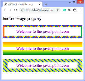
我們還可以將漸變指定為邊框圖像。
示例 - 使用 linear-gradient
在本例中,我們使用 linear-gradient 和 repeating-linear-gradient 作為段落元素的邊框圖像。
<!DOCTYPE html>
<html>
<head>
<title>
CSS border-image Property
</title>

<style>
p{
border:10px solid transparent;
padding:15px;
text-align:center;
font-size:25px;
color:darkviolet;
}

#border {
border-image:url('diamond.png') 40 round stretch;

}
#border1 {
border-image:linear-gradient(orange, yellow, green) 40 / 30px 10px  stretch;

}
#border2 {
border-image:repeating-linear-gradient(50deg, blue, yellow, lightgreen 20px) 30 / 20px 30px round;

}

</style>
</head>

<body>
<h2>border-image property</h2>

<p id = "border">
Welcome to the javaTpoint.com
</p>
<p id = "border1">
Welcome to the javaTpoint.com
</p>
<p id = "border2">
Welcome to the javaTpoint.com
</p>
</body>
</html>
輸出
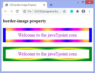
示例 - 使用 radial-gradient
在本例中,我們使用 radial-gradient 作為段落元素的邊框圖像。
<!DOCTYPE html>
<html>
<head>
<title>
CSS border-image Property
</title>

<style>
p{
border:10px solid transparent;
padding:15px;
text-align:center;
font-size:25px;

color:darkviolet;
}

#border1 {
border-image:radial-gradient(circle, yellow, magenta, blue) 30 / 15px repeat;
}
#border2 {
border-image:radial-gradient(farthest-side, red, yellow, green) 30 / 15px round;

}

</style>
</head>

<body>
<h2>border-image property</h2>

<p id = "border1">
Welcome to the javaTpoint.com
</p>
<p id = "border2">
Welcome to the javaTpoint.com
</p>
</body>
</html>
輸出
相關用法
- CSS border-image-repeat用法及代碼示例
- CSS border-image用法及代碼示例
- CSS border-image-source用法及代碼示例
- CSS border-image-slice用法及代碼示例
- CSS border-image-outset用法及代碼示例
- CSS border-image-width用法及代碼示例
- CSS border-inline-end-style屬性用法及代碼示例
- CSS border-inline用法及代碼示例
- CSS border-inline-start-width屬性用法及代碼示例
- CSS border-inline-start-style屬性用法及代碼示例
- CSS border-inline-end-color屬性用法及代碼示例
- CSS border-inline-end用法及代碼示例
- CSS border-inline-start-color屬性用法及代碼示例
- CSS border-inline-width用法及代碼示例
- CSS border-inline-end-width屬性用法及代碼示例
- CSS border-inline-color用法及代碼示例
- CSS border-inline-style用法及代碼示例
- CSS border-inline-start用法及代碼示例
- CSS - border-bottom-style用法及代碼示例
- CSS border-end-start-radius屬性用法及代碼示例
注:本文由純淨天空篩選整理自 CSS border-image property。非經特殊聲明,原始代碼版權歸原作者所有,本譯文未經允許或授權,請勿轉載或複製。