Seaborn是基于Matplotlib的Python数据可视化库。它提供了一个高级接口,用于绘制引人入胜且内容丰富的统计图形。 well-designed可视化只是一些非凡的东西。颜色脱颖而出,各层完美地融合在一起,轮廓遍及整个流程,整个包装不仅具有良好的美学品质,而且还为我们提供了有意义的见解。
seaborn.barplot()方法
条形图通常用于根据某些方法汇总分类数据,默认情况下,它是平均值。也可以理解为按行动分组的可视化。要使用此图,我们为x轴选择一个分类列,为y轴选择一个数值列,并且我们看到它创建了一个以每个分类列取平均值的图。
用法:seaborn.barplot(x=None, y=None, hue=None, data=None, order=None, hue_order=None, estimator=<function mean at 0x000002BC3EB5C4C8>, ci=95, n_boot=1000, units=None, orient=None, color=None, palette=None, saturation=0.75, errcolor=’.26′, errwidth=None, capsize=None, dodge=True, ax=None, **kwargs,)
参数:
| 参数 | 值 | 描述 |
|---|---|---|
| x, y, hue | “数据”或矢量数据中的变量名称,可选 | 用于绘制long-form数据的输入。请参见示例以获取解释。 |
| data | DataFrame,数组或数组列表,可选 | 绘图数据集。如果不存在“ x”和“ y”,则将其解释为wide-form。否则,预期为long-form。 |
| order, hue_order | 字符串列表,可选 | 为了绘制分类级别,否则从数据对象推断级别。 |
| estimator | 可调用的映射向量->标量,可选 | 统计函数,用于估计每个分类箱中。 |
| ci | 浮点数或“sd”或无,可选 | 置信区间的大小,可用于估计值附近。如果为“sd”,请跳过引导程序并绘制观测值的标准偏差。如果为“ None”,将不执行引导,并且不会绘制错误条。 |
| n_boot | int,可选 | 计算置信区间时要使用的引导程序迭代次数。 |
| units | “数据”或矢量数据中的变量名称,可选 | 采样单位的标识符,将用于执行多级引导程序并考虑重复测量的设计。 |
| orient | “v” | “h”,可选 | 绘图的方向(垂直或水平)。这通常是根据输入变量的dtype推论得出的,但可用于指定“categorical”变量是数字变量还是绘制wide-form数据时。 |
| color | matplotlib颜色,可选 | 所有元素的颜色,或渐变调色板的种子。 |
| palette | 调色板名称,列表或字典,可选 | 用于“ hue”变量的不同级别的颜色。应该是可由color_palette函数解释的东西,或者是将色相级别映射到matplotlib颜色的字典。 |
| saturation | 浮点数,可选 | 原始饱和度的绘制颜色比例。大色块通常看起来略带不饱和色,但看起来更好,但是如果您希望绘图颜色与输入颜色规格完全匹配,请将其设置为“ 1”。 |
| errcolor | matplotlib颜色 | 代表置信区间的线条颜色。 |
| errwidth | 浮点数,可选 | 误差线(和顶盖)的粗细。 |
| capsize | 浮点数,可选 | “caps”在误差条上的宽度。 |
| dodge | 布尔值,可选 | 使用色相嵌套时,是否应沿分类轴移动元素。 |
| ax | matplotlib轴,可选 | 轴对象以绘制绘图,否则使用当前轴。 |
| kwargs | 值映射 | 其他关键字参数在绘制时传递到“ plt.bar”。 |
使用以下步骤:
- 导入Seaborn
- 从Seaborn加载数据集,因为它包含良好的数据集。
- 使用seaborn.barplot()方法绘制条形图。
下面是实现:
范例1:
Python3
# importing the required library
import seaborn as sns
import matplotlib.pyplot as plt
# read a titanic.csv file
# from seaborn libraray
df = sns.load_dataset('titanic')
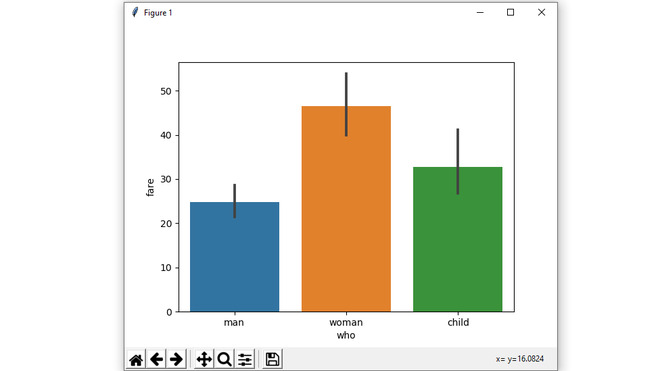
# who v/s fare barplot
sns.barplot(x = 'who',
y = 'fare',
data = df)
# Show the plot
plt.show()输出:
范例2:
Python3
# importing the required library
import seaborn as sns
import matplotlib.pyplot as plt
# read a titanic.csv file
# from seaborn libraray
df = sns.load_dataset('titanic')
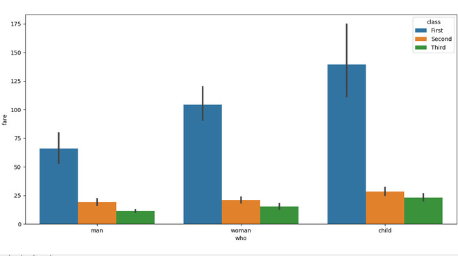
# who v/s fare barplot
sns.barplot(x = 'who',
y = 'fare',
hue = 'class',
data = df)
# Show the plot
plt.show()输出:
范例3:
Python3
# importing the required library
import seaborn as sns
import matplotlib.pyplot as plt
# read a titanic.csv file
# from seaborn libraray
df = sns.load_dataset('titanic')
# who v/s fare barplot
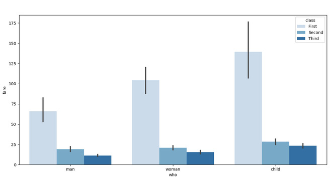
sns.barplot(x = 'who',
y = 'fare',
hue = 'class',
data = df,
palette = "Blues")
# Show the plot
plt.show()输出:
范例4:
Python3
# importing the required library
import seaborn as sns
import matplotlib.pyplot as plt
import numpy as np

# read a titanic.csv file
# from seaborn libraray
df = sns.load_dataset('titanic')


# who v/s fare barplot
sns.barplot(x = 'who',
            y = 'fare',
            hue = 'class',
            data = df,
            estimator = np.median,
            ci = 0)

# Show the plot
plt.show()
输出:

相关用法
- Python os._exit()用法及代码示例
- Python os.WEXITSTATUS()用法及代码示例
- Python os.abort()用法及代码示例
- Python os.renames()用法及代码示例
- Python os.lseek()用法及代码示例
- Python PyTorch sin()用法及代码示例
- Python Sympy Line.is_parallel()用法及代码示例
- Python PIL GaussianBlur()用法及代码示例
- Python Numpy np.hermefit()用法及代码示例
- Python Numpy np.hermevander()用法及代码示例
- Python Method和Function的区别用法及代码示例
- Python TextBlob.word_counts()用法及代码示例
- Python sympy.GreaterThan()用法及代码示例
- Python sympy.StrictLessThan()用法及代码示例
- Python sympy.LessThan()用法及代码示例
- Python sympy.StrictGreaterThan()用法及代码示例
注:本文由纯净天空筛选整理自deepanshu_rustagi大神的英文原创作品 Seaborn.barplot() method in Python。非经特殊声明,原始代码版权归原作者所有,本译文未经允许或授权,请勿转载或复制。