Seaborn是一个了不起的可视化库,用于在Python中进行统计图形绘制。它提供了漂亮的默认样式和调色板,以使统计图更具吸引力。它建立在matplotlib库的顶部,并与 Pandas 的数据结构紧密集成。
seaborn.pointplot():
- 此方法用于使用散点图字形显示点估计和置信区间。点图通过散点图的位置表示对数值变量的集中趋势的估计,并使用误差线提供了一些围绕该估计的不确定性的指示。
- 即使数据具有数字或日期类型,此函数也始终将变量之一视为分类变量,并在相关轴上的序数位置(0,1,…n)绘制数据。
用法: seaborn.pointplot(x=None, y=None, hue=None, data=None, order=None,hue_order=None, estimator=<function mean at 0x00000193E305E828>, ci=95, n_boot=1000, units=None, markers=’o’, linestyles=’-‘, dodge=False, join=True, scale=1, orient=None, color=None, palette=None, errwidth=None, capsize=None, ax=None, **kwargs)
参数:以下是一些主要参数的说明:
- x, y:用于绘制long-form数据的输入。
- hue:(可选)用于颜色编码的列名称。
- data: DataFrame 作为用于绘制的数据集。
- markers:(可选)用于每个‘hue’级别的标记。
- linestyles:(可选)用于每个‘hue’级别的线型。
- dodge:(可选)沿分类轴分隔‘hue’变量的每个级别的点的数量。
- color:(可选)所有元素的颜色,或渐变调色板的种子。
- capsize:(可选)误差条上‘caps’的宽度。
返回:在其上绘制了绘图的“轴”对象。
下面是上述方法的实现:
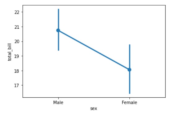
范例1:
Python3
# importing required packages
import seaborn as sns
import matplotlib.pyplot as plt

# loading dataset
data = sns.load_dataset("tips")

# draw pointplot
sns.pointplot(x = "sex",
              y = "total_bill",
              data = data)
# show the plot
plt.show()
# This code is contributed
# by Deepanshu Rustagi.
输出:
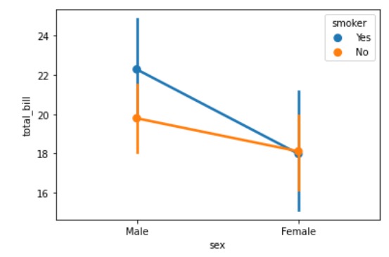
范例2:
Python3
# importing required packages
import seaborn as sns
import matplotlib.pyplot as plt

# loading dataset
data = sns.load_dataset("tips")

# draw pointplot with
# hue = smoker
sns.pointplot(x = "sex",
              y = "total_bill",
              hue = "smoker",
              data = data)
# show the plot
plt.show()
# This code is contributed
# by Deepanshu Rustagi.
输出:
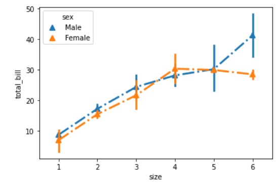
范例3:
Python3
# importing required packages
import seaborn as sns
import matplotlib.pyplot as plt

# loading dataset
data = sns.load_dataset("tips")

# draw pointplot
sns.pointplot(x = "size",
              y = "total_bill",
              linestyles = '-.',
              markers = '^',
              hue = "sex",
              data = data)
# show the plot
plt.show()

# This code is contributed
# by Deepanshu Rustagi.
输出:
相关用法
- Python set()用法及代码示例
- Python next()用法及代码示例
- Python os.dup()用法及代码示例
- Python os.write()用法及代码示例
- Python turtle.pos()用法及代码示例
- Python os.closerange()用法及代码示例
- Python sympy.has()用法及代码示例
- Python os.unlink()用法及代码示例
- Python PIL putalpha()用法及代码示例
- Python Numpy np.fft()用法及代码示例
- Python sympy.nT()用法及代码示例
- Python os.fstat()用法及代码示例
- Python os.close()用法及代码示例
- Python os.dup2()用法及代码示例
- Python sympy.crt()用法及代码示例
- Python os.fchdir()用法及代码示例
- Python os.times()用法及代码示例
- Python os.read()用法及代码示例
注:本文由纯净天空筛选整理自deepanshu_rustagi大神的英文原创作品 Python – seaborn.pointplot() method。非经特殊声明,原始代码版权归原作者所有,本译文未经允许或授权,请勿转载或复制。