先决条件:Seaborn编程基础
Seaborn是基于matplotlib的Python数据可视化库。它提供了一个高级接口,用于绘制引人入胜且内容丰富的统计图形。 Seaborn帮助解决Matplotlib面临的两个主要问题。问题是什么?
- 默认Matplotlib参数
- 使用 DataFrame
随着Seaborn对Matplotlib的补充和扩展,学习曲线是渐进的。如果您了解Matplotlib,那么您已经走到了Seaborn的一半。
seaborn.PairGrid():
- 子图网格,用于在数据集中绘制成对关系。
- 此类将数据集中的每个变量映射到多轴网格中的列和行。可以使用不同的axes-level绘图函数在上三角形和下三角形中绘制双变量图,并且每个变量的边际分布可以显示在对角线上。
- 它还可以使用hue参数表示条件化的附加级别,该参数以不同的颜色绘制不同的数据子集。这使用颜色来解析第三维上的元素,但仅在彼此之上绘制子集,而不会像axes-level函数接受色相那样为特定的可视化效果定制色相参数。
seaborn.PairGrid( data, \*\*kwargs)
Seaborn.PairGrid使用许多参数作为输入,下面以表的形式描述了其中的主要参数:
| 参数 | 描述 | Value |
| data | 整洁(long-form)数据帧,其中每一列都是变量,每一行都是观察值。 | DataFrame |
| hue | 在“数据”中可变以将绘图方面映射到不同的颜色。 | 字符串(变量名),可选 |
| palette | 映射“ hue”变量的颜色集。如果是字典,则键应为“色相”变量中的值。 | dict或seaborn调色板 |
| vars | 要使用的“数据”中的变量,否则使用具有数字数据类型的每一列。 | 变量名列表,可选 |
| dropna | 绘制之前从数据中删除缺失值。 | 布尔值,可选 |
下面是上述方法的实现:
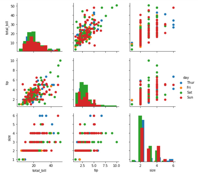
范例1:
Python3
# importing packages
import seaborn
import matplotlib.pyplot as plt

# loading dataset
df = seaborn.load_dataset('tips')

# PairGrid object with hue
graph = seaborn.PairGrid(df, hue ='day')
# type of graph for diagonal
graph = graph.map_diag(plt.hist)
# type of graph for non-diagonal
graph = graph.map_offdiag(plt.scatter)
# to add legends
graph = graph.add_legend()
# to show
plt.show()
# This code is contributed by Deepanshu Rusatgi.
输出:
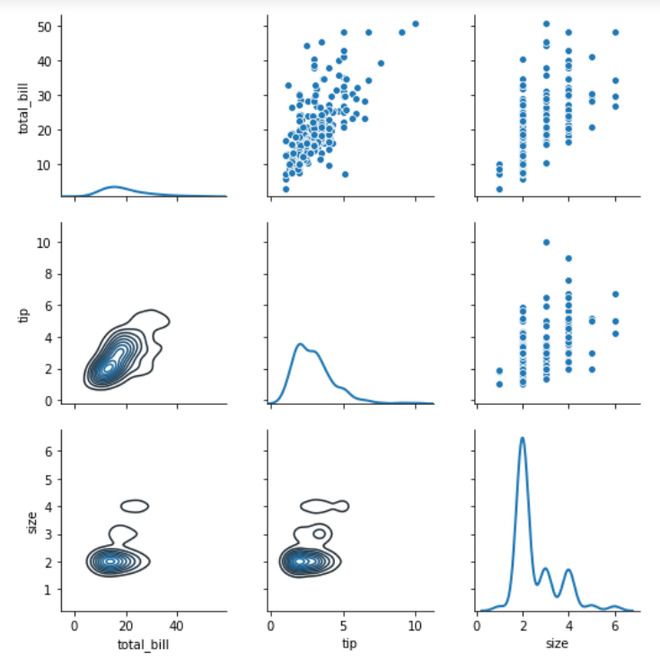
范例2:
Python3
# importing packages
import seaborn
import matplotlib.pyplot as plt

# loading dataset
df = seaborn.load_dataset('tips')

# PairGrid object with hue
graph = seaborn.PairGrid(df)
# type of graph for non-diagonal(upper part)
graph = graph.map_upper(sns.scatterplot)
# type of graph for non-diagonal(lower part)
graph = graph.map_lower(sns.kdeplot)
# type of graph for diagonal
graph = graph.map_diag(sns.kdeplot, lw = 2)
# to show
plt.show()
# This code is contributed by Deepanshu Rusatgi.
输出:
相关用法
- Python os._exit()用法及代码示例
- Python os.WEXITSTATUS()用法及代码示例
- Python os.abort()用法及代码示例
- Python os.renames()用法及代码示例
- Python os.lseek()用法及代码示例
- Python PyTorch sin()用法及代码示例
- Python Sympy Line.is_parallel()用法及代码示例
- Python PIL GaussianBlur()用法及代码示例
- Python Numpy np.hermefit()用法及代码示例
- Python Numpy np.hermevander()用法及代码示例
- Python Method和Function的区别用法及代码示例
- Python TextBlob.word_counts()用法及代码示例
- Python sympy.GreaterThan()用法及代码示例
- Python sympy.StrictLessThan()用法及代码示例
- Python sympy.LessThan()用法及代码示例
- Python sympy.StrictGreaterThan()用法及代码示例
注:本文由纯净天空筛选整理自deepanshu_rustagi大神的英文原创作品 Python – seaborn.PairGrid() method。非经特殊声明,原始代码版权归原作者所有,本译文未经允许或授权,请勿转载或复制。