Seaborn是基于matplotlib的Python数据可视化库。它提供了一个高级接口,用于绘制引人入胜且内容丰富的统计图形。 Seaborn帮助解决Matplotlib面临的两个主要问题。问题是什么?
- 默认Matplotlib参数
- 使用 DataFrame
随着Seaborn对Matplotlib的补充和扩展,学习曲线是渐进的。如果您知道Matplotlib,那么您通过Seaborn已经是half-way。
seaborn.jointplot():
用双变量和单变量图绘制两个变量的图。此函数提供了一个方便的接口,可用于“ JointGrid”类,其中包含几种固定的绘图类型。这旨在成为一个相当轻巧的包装器;如果您需要更大的灵活性,则应直接使用:class:“ JointGrid”。
用法: seaborn.jointplot(x, y, data=None, kind=’scatter’, stat_func=None, color=None, height=6, ratio=5, space=0.2, dropna=True, xlim=None, ylim=None, joint_kws=None, marginal_kws=None, annot_kws=None, **kwargs)
参数:以下是一些主要参数的说明:
x,y:这些参数采用数据或“data”中的变量名称。
data:(可选)当“x”和“y”是变量名时,此参数采用DataFrame。
kind:(可选)此参数采用绘图类型。
color:(可选)此参数采用Color用作图元素。
dropna:(可选)此参数为布尔值,如果为True,则删除“x”和“y”中缺少的观测值。
返回:带有网格图的联合网格对象。
下面是上述方法的实现:
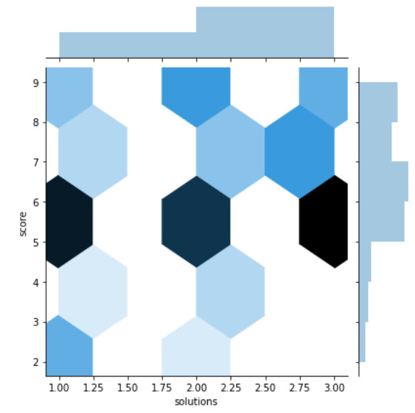
范例1:
Python3
# importing required packages
import seaborn as sns
import matplotlib.pyplot as plt

# loading dataset
data = sns.load_dataset("attention")

# draw jointplot with
# hex kind
sns.jointplot(x = "solutions", y = "score",
              kind = "hex", data = data)
# show the plot
plt.show()

# This code is contributed
# by Deepanshu Rustagi.
输出:
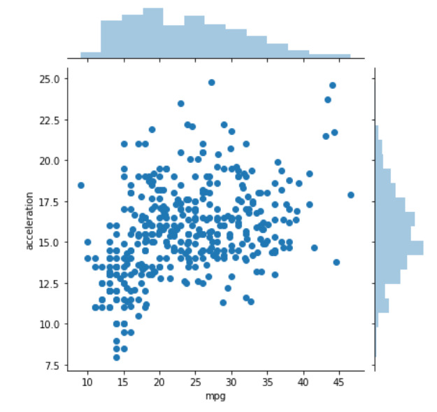
范例2:
Python3
# importing required packages
import seaborn as sns
import matplotlib.pyplot as plt

# loading dataset
data = sns.load_dataset("mpg")

# draw jointplot with
# scatter kind
sns.jointplot(x = "mpg", y = "acceleration",
              kind = "scatter", data = data)
# show the plot
plt.show()

# This code is contributed
# by Deepanshu Rustagi.
输出:
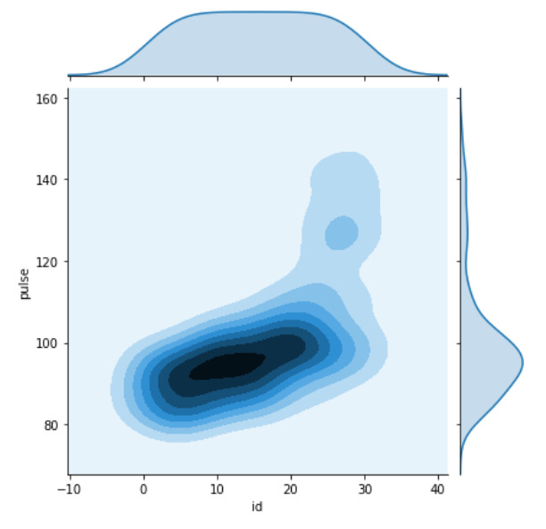
范例3:
Python3
# importing required packages
import seaborn as sns
import matplotlib.pyplot as plt

# loading dataset
data = sns.load_dataset("exercise")

# draw jointplot with
# kde kind
sns.jointplot(x = "id", y = "pulse",
              kind = "kde", data = data)
# Show the plot
plt.show()

# This code is contributed
# by Deepanshu Rustagi.
输出:
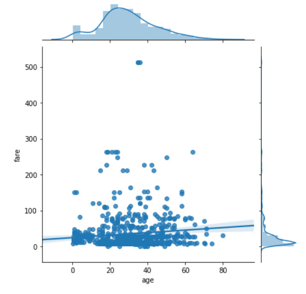
范例4:
Python3
# importing required packages
import seaborn as sns
import matplotlib.pyplot as plt

# loading dataset
data = sns.load_dataset("titanic")

# draw jointplot with
# reg kind
sns.jointplot(x = "age", y = "fare",
              kind = "reg", data = data,
              dropna = True)

# show the plot
plt.show()

# This code is contributed
# by Deepanshu Rustagi.
输出:
相关用法
- Python os._exit()用法及代码示例
- Python os.WEXITSTATUS()用法及代码示例
- Python os.abort()用法及代码示例
- Python os.renames()用法及代码示例
- Python os.lseek()用法及代码示例
- Python PyTorch sin()用法及代码示例
- Python Sympy Line.is_parallel()用法及代码示例
- Python PIL GaussianBlur()用法及代码示例
- Python Numpy np.hermefit()用法及代码示例
- Python Numpy np.hermevander()用法及代码示例
- Python Method和Function的区别用法及代码示例
- Python TextBlob.word_counts()用法及代码示例
- Python sympy.GreaterThan()用法及代码示例
- Python sympy.StrictLessThan()用法及代码示例
- Python sympy.LessThan()用法及代码示例
- Python sympy.StrictGreaterThan()用法及代码示例
注:本文由纯净天空筛选整理自deepanshu_rustagi大神的英文原创作品 Python – seaborn.jointplot() method。非经特殊声明,原始代码版权归原作者所有,本译文未经允许或授权,请勿转载或复制。