条形图或条形图是一种图形,用长条和长条与它们所代表的值成比例的矩形条表示数据类别。条形图可以水平或垂直绘制。条形图描述了离散类别之间的比较。曲线的一个轴代表要比较的特定类别,而另一个轴代表与那些类别相对应的测量值。
创建水平条形图
Python中的matplotlib API提供了barh()函数,可以在MATLAB样式中使用或用作面向对象的API。与轴一起使用的barh()函数的语法如下:-
用法:matplotlib.pyplot.barh(y, width, height=0.8, left=None, *, align=’center’, **kwargs)
下面描述了上述函数的一些位置参数和可选参数:
| 参数 | Description |
| ÿ | Y条的Co-ordinates。 |
| width | 标量或类似数组的值表示条的宽度。 |
| height | 标量或类似数组的值表示条的高度(默认值为0.8)。 |
| left | 标量或标量序列,表示条形左侧的X坐标(默认值为0)。 |
| align | {‘center’, ‘edge’}对齐Y坐标的底线(默认值为中心)。 |
| color | 标量或类似数组的颜色表示条形的颜色。 |
| edgecolor | 标量或类似数组的值表示条的边颜色。 |
| linewidth | 标量或类似数组的值表示条形边的宽度。 |
| tick_label | 标量或数组之类,表示条的刻度标签(默认值为None)。 |
该函数根据给定的参数创建以矩形为边界的水平条形图。以下是创建水平条形图的barh()方法的简单示例,该条形图表示了就读研究所不同课程的学生人数。
范例1:
Python3
import numpy as np
import matplotlib.pyplot as plt


# creating the dataset
data = {'C':20, 'C++':15, 'Java':30,
        'Python':35}

courses = list(data.keys())
values = list(data.values())

fig = plt.figure(figsize=(10, 5))

# creating the bar plot
plt.barh(courses, values, color='maroon')

plt.xlabel("Courses offered")
plt.ylabel("No. of students enrolled")
plt.title("Students enrolled in different courses")
plt.show()
输出:
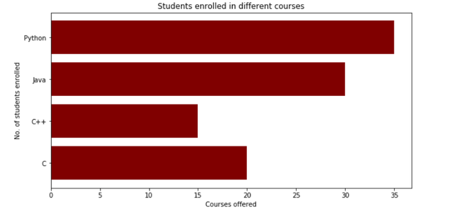
在这里,plt.barh(courses,values,color ='maroon')用于指定使用Courses列作为Y轴,并将值作为X轴来绘制条形图。 color属性用于设置条的颜色(在这种情况下为栗色)。plt.xlabel(“Courses offered”)和plt.ylabel(“students enrolled”)用于标记相应的轴.plt.title()用于为标题命名graph.plt.show()用于使用先前的命令将图形显示为输出。
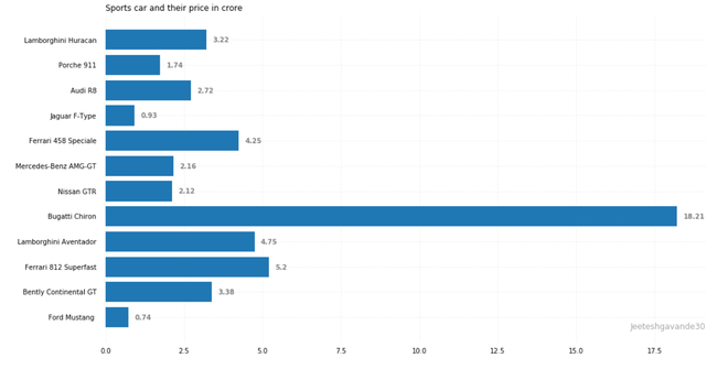
范例2:
Python3
import pandas as pd
from matplotlib import pyplot as plt

# Read CSV into pandas
data = pd.read_csv(r"Downloads/cars1.csv")
data.head()
df = pd.DataFrame(data)

name = df['car'].head(12)
price = df['price'].head(12)

# Figure Size
fig, ax = plt.subplots(figsize=(16, 9))

# Horizontal Bar Plot
ax.barh(name, price)

# Remove axes splines
for s in ['top', 'bottom', 'left', 'right']:
    ax.spines[s].set_visible(False)

# Remove x, y Ticks
ax.xaxis.set_ticks_position('none')
ax.yaxis.set_ticks_position('none')

# Add padding between axes and labels
ax.xaxis.set_tick_params(pad=5)
ax.yaxis.set_tick_params(pad=10)

# Add x, y gridlines
ax.grid(b=True, color='grey',
        linestyle='-.', linewidth=0.5,
        alpha=0.2)

# Show top values
ax.invert_yaxis()

# Add annotation to bars
for i in ax.patches:
    plt.text(i.get_width()+0.2, i.get_y()+0.5,
             str(round((i.get_width()), 2)),
             fontsize=10, fontweight='bold',
             color='grey')

# Add Plot Title
ax.set_title('Sports car and their price in crore',
             loc='left', )

# Add Text watermark
fig.text(0.9, 0.15, 'Jeeteshgavande30', fontsize=12,
         color='grey', ha='right', va='bottom',
         alpha=0.7)

# Show Plot
plt.show()
输出:
相关用法
- Python Wand function()用法及代码示例
- Python Sorted()用法及代码示例
- Python Numbers choice()用法及代码示例
- Python Tkinter askopenfile()用法及代码示例
- Python ord()用法及代码示例
- Python round()用法及代码示例
- Python id()用法及代码示例
注:本文由纯净天空筛选整理自jeeteshgavande30大神的英文原创作品 Matplotlib.pyplot.barh() function in Python。非经特殊声明,原始代码版权归原作者所有,本译文未经允许或授权,请勿转载或复制。