函數簽名
st.altair_chart(altair_chart, use_container_width=False)| 參數 | 說明 |
|---|---|
altair_chart (altair.vegalite.v2.api.Chart) | 要顯示的 Altair 圖表對象。 |
use_container_width (bool) | 如果為 True,則將圖表寬度設置為列寬。這優先於 Altair 的原生 |
示例
import pandas as pd
import numpy as np
import altair as alt

df = pd.DataFrame(
     np.random.randn(200, 3),
     columns=['a', 'b', 'c'])

c = alt.Chart(df).mark_circle().encode(
     x='a', y='b', size='c', color='c', tooltip=['a', 'b', 'c'])

st.altair_chart(c, use_container_width=True)
Altair 海圖示例可在 https://altair-viz.github.io/gallery/ 中找到。
注釋圖表
Altair 還允許您使用文本、圖像和表情符號對圖表進行注釋。您可以通過創建 layered charts 來做到這一點,它可以讓您將兩個不同的圖表疊加在一起。這個想法是使用第一個圖表來顯示數據,並使用第二個圖表來顯示注釋。然後可以使用+ 運算符將第二個圖表覆蓋在第一個圖表之上,以創建分層圖表。
讓我們來看一個使用文本和表情符號注釋時間序列圖表的示例。
第 1 步:創建基本圖表
在此示例中,我們創建了一個時間序列圖表來跟蹤股票價格的演變。該圖表是交互式的,並包含多行工具提示。單擊 這裏 以了解有關 Altair 中多行工具提示的更多信息。
首先,我們導入所需的庫並使用 包加載示例股票數據集:vega_datasets
import altair as alt
import pandas as pd
import streamlit as st
from vega_datasets import data

# We use @st.experimental_memo to keep the dataset in cache
@st.experimental_memo
def get_data():
    source = data.stocks()
    source = source[source.date.gt("2004-01-01")]
    return source

source = get_data()
接下來,我們定義一個函數get_chart() 來創建帶有多線工具提示的股票價格的交互式時間序列圖表。 x 軸代表日期,y 軸代表股票價格。
然後我們調用get_chart(),它將股票價格 DataFrame 作為輸入並返回一個圖表對象。這將是我們的基礎圖表,我們將在其上覆蓋 Step 2 中的注釋。
# Define the base time-series chart.
def get_chart(data):
    hover = alt.selection_single(
        fields=["date"],
        nearest=True,
        on="mouseover",
        empty="none",
    )

    lines = (
        alt.Chart(data, title="Evolution of stock prices")
        .mark_line()
        .encode(
            x="date",
            y="price",
            color="symbol",
        )
    )

    # Draw points on the line, and highlight based on selection
    points = lines.transform_filter(hover).mark_circle(size=65)

    # Draw a rule at the location of the selection
    tooltips = (
        alt.Chart(data)
        .mark_rule()
        .encode(
            x="yearmonthdate(date)",
            y="price",
            opacity=alt.condition(hover, alt.value(0.3), alt.value(0)),
            tooltip=[
                alt.Tooltip("date", title="Date"),
                alt.Tooltip("price", title="Price (USD)"),
            ],
        )
        .add_selection(hover)
    )
    return (lines + points + tooltips).interactive()

chart = get_chart(source)
第 2 步:注釋圖表
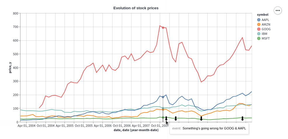
現在我們有了第一個顯示數據的圖表,我們可以用文本和表情符號對其進行注釋。讓我們將 ⬇ 表情符號覆蓋在時間序列圖表頂部的特定興趣點。我們希望用戶將鼠標懸停在 ⬇ 表情符號上以查看相關的注釋文本。
為簡單起見,讓我們注釋四個特定日期並將注釋的高度設置為恒定值 10 。
提示
您可以通過使用 Streamlit 小部件的輸出替換 hard-coded 值來改變注釋的水平和垂直位置!單擊這裏 跳轉到下麵的實時示例,並通過使用 Streamlit 小部件來培養注釋的理想水平和垂直位置的直覺。
為此,我們創建了一個 DataFrame annotations_df,其中包含日期、注釋文本和注釋的高度:
# Add annotations
ANNOTATIONS = [
    ("Mar 01, 2008", "Pretty good day for GOOG"),
    ("Dec 01, 2007", "Something's going wrong for GOOG & AAPL"),
    ("Nov 01, 2008", "Market starts again thanks to..."),
    ("Dec 01, 2009", "Small crash for GOOG after..."),
]
annotations_df = pd.DataFrame(ANNOTATIONS, columns=["date", "event"])
annotations_df.date = pd.to_datetime(annotations_df.date)
annotations_df["y"] = 10
使用這個 DataFrame ,我們創建了一個散點圖,其中 x 軸代表日期,y 軸代表注釋的高度。特定日期和高度的數據點由 ⬇ 表情符號表示,使用 Altair 的 mark_text() mark 。
當用戶將鼠標懸停在 ⬇ 表情符號上時,注釋文本會顯示為工具提示。這是使用 Altair 的 encode() 方法將包含注釋文本的 event 列映射到繪圖的視覺屬性 ⬇ 來實現的。
annotation_layer = (
    alt.Chart(annotations_df)
    .mark_text(size=20, text="⬇", dx=-8, dy=-10, align="left")
    .encode(
        x="date:T",
        y=alt.Y("y:Q"),
        tooltip=["event"],
    )
    .interactive()
)
最後,我們使用+ 運算符將注釋覆蓋在基本圖表的頂部,以創建最終的分層圖表! ????
st.altair_chart(
    (chart + annotation_layer).interactive(),
    use_container_width=True
)
要使用圖像而不是表情符號,請將包含 .mark_text() 的行替換為 .mark_image() ,並將下麵的 image_url 替換為圖像的 URL:
.mark_image(
    width=12,
    height=12,
    url="image_url",
)
交互式示例
既然您已經學會了如何為圖表添加注釋,那就無極限了!我們擴展了上麵的示例,讓您可以交互式地粘貼您喜歡的表情符號並使用 Streamlit 小部件在圖表上設置其位置。 ????
相關用法
- Python Streamlit st.area_chart用法及代碼示例
- Python Streamlit st.audio用法及代碼示例
- Python Streamlit st.experimental_singleton.clear用法及代碼示例
- Python Streamlit st.bokeh_chart用法及代碼示例
- Python Streamlit st.caption用法及代碼示例
- Python Streamlit st.text_input用法及代碼示例
- Python Streamlit st.title用法及代碼示例
- Python Streamlit st.cache用法及代碼示例
- Python Streamlit st.experimental_singleton用法及代碼示例
- Python Streamlit st.empty用法及代碼示例
- Python Streamlit st.error用法及代碼示例
- Python Streamlit st.video用法及代碼示例
- Python Streamlit st.vega_lite_chart用法及代碼示例
- Python Streamlit st.slider用法及代碼示例
- Python Streamlit st.header用法及代碼示例
- Python Streamlit st.container用法及代碼示例
- Python Streamlit st.form_submit_button用法及代碼示例
- Python Streamlit st.form用法及代碼示例
- Python Streamlit st.plotly_chart用法及代碼示例
- Python Streamlit st.bar_chart用法及代碼示例
- Python Streamlit st.code用法及代碼示例
- Python Streamlit st.experimental_memo.clear用法及代碼示例
- Python Streamlit st.warning用法及代碼示例
- Python Streamlit st.image用法及代碼示例
- Python Streamlit st.markdown用法及代碼示例
注:本文由純淨天空篩選整理自streamlit.io大神的英文原創作品 st.altair_chart。非經特殊聲明,原始代碼版權歸原作者所有,本譯文未經允許或授權,請勿轉載或複製。