Python的Plotly庫對於數據可視化和簡單,輕鬆地理解數據非常有用。
密謀figure_factory.create_2d_density
此函數用於創建2d密度。
用法:plotly.figure_factory.create_2d_density(x, y, colorscale=’Earth’, ncontours=20, hist_color=(0, 0, 0.5), point_color=(0, 0, 0.5), point_size=2, title=’2D Density Plot’, height=600, width=600)
參數:
x:用於生成圖的x軸數據
y:y軸數據以生成圖
colorscale:rgb或十六進製顏色,顏色元組或顏色列表或元組。
hist_color:繪製的直方圖的顏色
point_color:分散點的顏色
point_size:分散點的顏色
title:設置情節的標題
高度:圖表的高度
寬度:圖表的寬度
範例1:
Python3
from plotly.figure_factory import create_2d_density
import numpy as np


t = np.linspace(-1,1.2,2000)
x = (t**3)+(0.3*np.random.randn(2000))
y = (t**6)+(0.3*np.random.randn(2000))

fig = create_2d_density(x, y)
fig.show()
輸出:
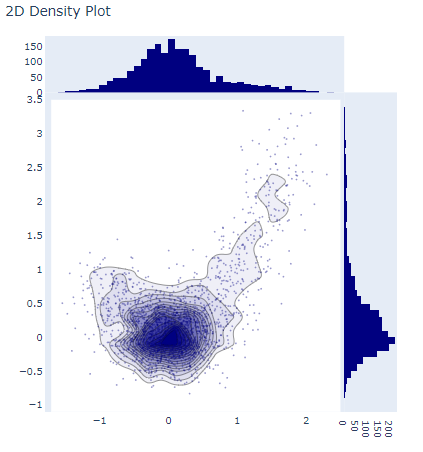
2D密度圖
範例2:
Python3
from plotly.figure_factory import create_2d_density
import numpy as np


# Make data points
t = np.linspace(-1,1.2,2000)
x = (t**3)+(0.3*np.random.randn(2000))
y = (t**6)+(0.3*np.random.randn(2000))

# Create custom colorscale
colorscale = ['#7A4579', '#D56073', 'rgb(236,158,105)',
             (1, 1, 0.2), (0.98,0.98,0.98)]

# Create a figure
fig = create_2d_density(x, y, colorscale=colorscale,
      hist_color='rgb(255, 237, 222)', point_size=3)

# Plot the data
fig.show()
輸出:
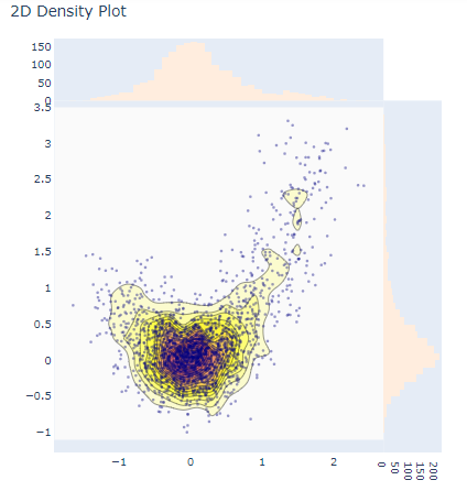
使用參數的2D密度圖
相關用法
- Python Wand function()用法及代碼示例
- Python dir()用法及代碼示例
- Python id()用法及代碼示例
- Python int()用法及代碼示例
- Python hex()用法及代碼示例
- Python str()用法及代碼示例
- Python tell()用法及代碼示例
- Python cmp()用法及代碼示例
- Python now()用法及代碼示例
- Python map()用法及代碼示例
- Python oct()用法及代碼示例
- Python ord()用法及代碼示例
- Python sum()用法及代碼示例
- Python math.gcd()用法及代碼示例
- Python math.cos()用法及代碼示例
- Python ldexp()用法及代碼示例
- Python fmod()用法及代碼示例
注:本文由純淨天空篩選整理自deepanshumehra1410大神的英文原創作品 plotly.figure_factory.create_2d_density() function in Python。非經特殊聲明,原始代碼版權歸原作者所有,本譯文未經允許或授權,請勿轉載或複製。