Matplotlib.pyplot.table()是matplotlib库的子部分,其中使用绘制的图形进行分析以生成表格。由于表格比图形提供了更精确的详细信息,因此该方法使分析更容易,更高效。 matplotlib.pyplot.table创建的表通常挂在堆积的条形图下方,以使读者了解上图所生成的数据。
用法:matplotlib.pyplot.table(cellText=None, cellColours=None, cellLoc=’right’, colWidths=None,rowLabels=None, rowColours=None, rowLoc=’left’, colLabels=None, colColours=None, colLoc=’center’, loc=’bottom’, bbox=None, edges=’closed’, **kwargs)
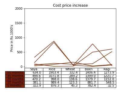
范例1:考虑一个图表,分析了几个月中农裁剪价格的上涨。以下代码用于非线性图。
Python3
# importing necesarry packagess
import numpy as np
import matplotlib.pyplot as plt


# input data values
data = [[322862, 876296, 45261, 782372,  32451],
        [58230, 113139,  78045,  99308, 516044],
        [89135,  8552, 15258, 497981, 603535],
        [24415,  73858, 150656, 19323,  69638],
        [139361, 831509, 43164, 7380,  52269]]

# preparing values for graph
columns = ('Soya', 'Rice', 'Wheat', 'Bakri', 'Ragi')
rows = ['%d months' % x for x in (50, 35, 20, 10, 5)]
values = np.arange(0, 2500, 500)
value_increment = 1000

# Adding pastel shades to graph
colors = plt.cm.Oranges(np.linspace(22, 3, 12))
n_rows = len(data)
index = np.arange(len(columns)) + 0.3
bar_width = 0.4

# Initialing vertical-offset for the graph.
y_offset = np.zeros(len(columns))

# Plot bars and create text labels for the table
cell_text = []

for row in range(n_rows):
    plt.plot(index, data[row], bar_width, color=colors[row])
    y_offset = y_offset + data[row]
    cell_text.append(['%1.1f' % (x / 1000.0) for x in y_offset])

# Reverse colors and text labels to display table contents with
# color.
colors = colors[::-1]
cell_text.reverse()

# Add a table at the bottom
the_table = plt.table(cellText=cell_text,
                      rowLabels=rows,
                      rowColours=colors,
                      colLabels=columns,
                      loc='bottom')

# make space for the table:
plt.subplots_adjust(left=0.2, bottom=0.2)
plt.ylabel("Price in Rs.{0}'s".format(value_increment))
plt.yticks(values * value_increment, ['%d' % val for val in values])
plt.xticks([])
plt.title('Cost price increase')

# plt.show()-display graph
# Create image. plt.savefig ignores figure edge and face color.
fig = plt.gcf()
plt.savefig('pyplot-table-original.png',
            bbox_inches='tight',
            dpi=150)
输出:
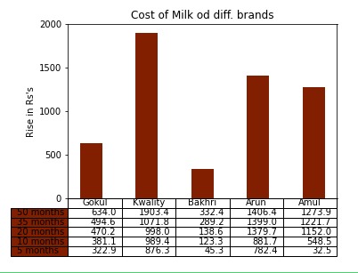
范例2:让我们考虑一下过去几年中不同品牌的牛奶价格上涨
Python3
# importing necesarry packagess
import numpy as np
import matplotlib.pyplot as plt


# input data values
data = [[322862, 876296, 45261, 782372,  32451],
        [58230, 113139,  78045,  99308, 516044],
        [89135,  8552, 15258, 497981, 603535],
        [24415,  73858, 150656, 19323,  69638],
        [139361, 831509, 43164, 7380,  52269]]

# preparing values for graph
columns = ('Gokul', 'Kwality', 'Bakhri', 'Arun', 'Amul')
rows = ['%d months' % x for x in (50, 35, 20, 10, 5)]
values = np.arange(0, 2500, 500)
value_increment = 1000

# Adding pastel shades to graph
colors = plt.cm.Oranges(np.linspace(22, 3, 12))
n_rows = len(data)
index = np.arange(len(columns)) + 0.3
bar_width = 0.4

# Initialing vertical-offset for the graph.
y_offset = np.zeros(len(columns))

# Plot bars and create text labels for the table
cell_text = []
for row in range(n_rows):
    plt.bar(index, data[row], bar_width, bottom=y_offset, color=colors[row])
    y_offset = y_offset + data[row]
    cell_text.append(['%1.1f' % (x / 1000.0) for x in y_offset])

# Reverse colors and text labels to display table contents with
# color.
colors = colors[::-1]
cell_text.reverse()

# Add a table at the bottom
the_table = plt.table(cellText=cell_text,
                      rowLabels=rows,
                      rowColours=colors,
                      colLabels=columns,
                      loc='bottom')

# make space for the table:
plt.subplots_adjust(left=0.2, bottom=0.2)
plt.ylabel("Rise in Rs's".format(value_increment))
plt.yticks(values * value_increment, ['%d' % val for val in values])
plt.xticks([])
plt.title('Cost of Milk od diff. brands')

# plt.show()-display graph
# Create image. plt.savefig ignores figure edge and face color.
fig = plt.gcf()
plt.savefig('pyplot-table-original.png',
            bbox_inches='tight',
            dpi=150)
输出:
相关用法
- Python Wand function()用法及代码示例
- Python Sorted()用法及代码示例
- Python Numbers choice()用法及代码示例
- Python Tkinter askopenfile()用法及代码示例
- Python ord()用法及代码示例
- Python round()用法及代码示例
- Python id()用法及代码示例
- Python vars()用法及代码示例
注:本文由纯净天空筛选整理自tedious_wings大神的英文原创作品 Matplotlib.pyplot.table() function in Python。非经特殊声明,原始代码版权归原作者所有,本译文未经允许或授权,请勿转载或复制。