Matplotlib是一個非常強大的繪圖庫,對於使用Python和NumPy的人很有用。為了產生統計幹擾,非常有必要可視化我們的數據,而Matplotlib是為此目的非常有用的工具。
matplotlib.pyplot.ylabel()
此函數為圖的y軸設置標簽。
用法: matplotlib.pyplot.ylabel(ylabel, fontdict=None, labelpad=None)
參數:
ylabel:標簽名稱
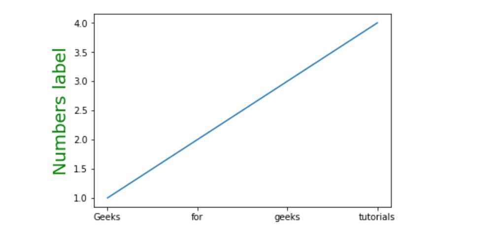
fontdict:將字體樣式添加到標簽
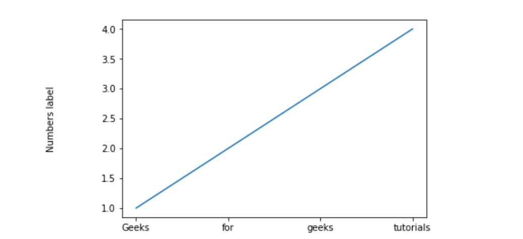
labelpad:這有助於我們設置標簽和軸之間的間距
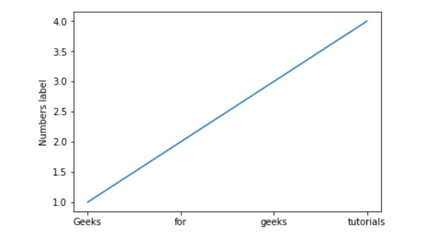
範例1:
import matplotlib.pyplot as plt

# setting x values
x =['Geeks', 'for', 'geeks', 'tutorials']

# Setting y values
y =[1, 2, 3, 4]

# Adding label on the y-axis
plt.ylabel('Numbers label')

# plotting the graph
plt.plot(x, y)
輸出:
範例2:
import matplotlib.pyplot as plt

x =['Geeks', 'for', 'geeks', 'tutorials']
y =[1, 2, 3, 4]

# Adding space between label and
# axis by setting labelpad
plt.ylabel('Numbers label', labelpad = 50)

plt.plot(x, y)
輸出:
範例3:
import matplotlib.pyplot as plt

x =['Geeks', 'for', 'geeks', 'tutorials']
y =[1, 2, 3, 4]

# Setting font dictionary
font = {'family':'Verdana',
        'color':  'green',
        'size':20,
        }

# Adding the font styles to the label
plt.ylabel('Numbers label', fontdict = font)

plt.plot(x, y)
輸出:
相關用法
注:本文由純淨天空篩選整理自sathvik chiramana大神的英文原創作品 Matplotlib.pyplot.ylabel() in Python。非經特殊聲明,原始代碼版權歸原作者所有,本譯文未經允許或授權,請勿轉載或複製。