數據可視化是分析數據的重要部分,因為繪製圖形有助於更好地了解和理解問題。 Matplotlib.pyplot是執行此操作的最常用的庫之一。它有助於創建有吸引力的數據,並且超級易於使用。
Matplotlib.pyplot.semilogx()函數
此函數用於以x軸轉換為對數格式的方式顯示數據。當參數之一非常大並因此最初以緊湊方式存儲時,此函數特別有用。它支持plot()和matplotlib.axes.Axes.set_xscale()的所有關鍵字參數。其他參數是basex,subsx和nonposx。
用法:Matplotlib.pyplot.semilogx(x, y, )
參數:一些重要的參數是:
- x:X軸上的值。
- y:Y軸上的值。
- color:(可選)線條或符號的顏色。
- linewidth:(可選)線的寬度。
- label:(可選)指定圖的標簽
- basex:(可選)x對數的底數。標量應大於1。
- subsx:(可選)次要ticks的位置;沒有默認值是自動訂閱,這取決於情節中的十年數。
- nonposx:(可選)可以將x中的非正值掩蓋為無效值,或將其裁剪為非常小的正數。
- marker:(可選)將點顯示為上述符號。
- markersize:(可選)更改所有標記的大小。
Return:X軸上的log-scaled圖。
範例1:簡單的情節。
Python3
#import required library
import matplotlib.pyplot as plt

# defining the values
# at X and Y axis
x = [1, 2, 3,
     4, 5, 6]
y = [100, 200, 300,
     400, 500, 600]

# plotting the given graph
plt.semilogx(x, y, marker = ".",
             markersize = 15,
             color = "green")
# plot with grid
plt.grid(True)

# show the plot
plt.show()
輸出:
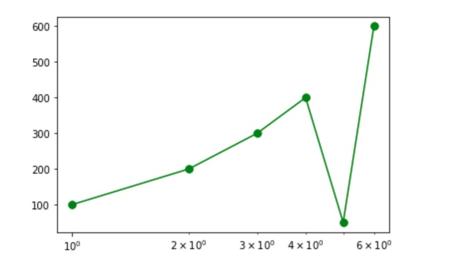
一個簡單的情節
示例2:在X和Y軸上使用負值和零值。
由於X軸包含在對數函數中,因此很明顯,如nonposx參數所指定的,負值或正值將被裁剪或屏蔽。默認情況下,將裁剪負值或零值。
Python3
# importing required libraries
import matplotlib.pyplot as plt


# defining the values
# at X and Y axis
x = [-1, -2, 0]
y = [5, -2, 0]

# plotting the given graph
plt.semilogx(x,y)

# show the plot
plt.show()
輸出:
由於所有值均為負x值,因此未繪製任何值
範例3:如果使用符號,則僅刪除負值或零值,僅繪製正值。
Python3
#import required library
import matplotlib.pyplot as plt

# defining the values at X and Y axis
x = [-10, 30, 0, 20,
     -50, 25, 29, -3
     , 23, 25, 29, 31]
y = [-3, 30, -10, 0,
     -40, 3, 8, 0,
     -24, 40, 43, 25]

# plotting the graph
plt.semilogx(x,y,'g^', color = "red")

# plot with grid
plt.grid(True)

# set y axis label
plt.ylabel('---y---')

# set x axis label
plt.xlabel('---x---')

# show the plot
plt.show()
輸出:
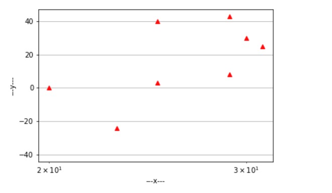
僅繪製正值
範例4:如果使用這些行,則將剪切值。
Python3
#import required library
import matplotlib.pyplot as plt

# defining the values
# at X and Y axis
x = [1, 2, -3,
     -4, 5, 6]
y = [100, 200, 300,
     400, 500, 600]

# plotting the graph
plt.semilogx(x, y, marker = ".",
             markersize = 15)

# plot with grid
plt.grid(True)

# show the plot
plt.show()
輸出:
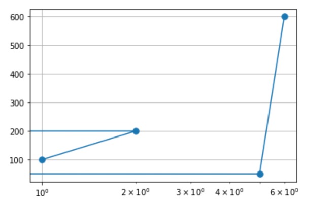
裁剪對應於-3和-4的值
範例5:以下子圖將使區別更加清楚。
Python3
#import required library
import matplotlib.pyplot as plt

# specifing the subplot
fig, axes = plt.subplots(nrows = 4,
                         ncols = 4,
                         figsize = (10,10))

# Or equivalently,
# "plt.tight_layout()"
fig.tight_layout()

# subplot 1
plt.subplot(2, 2, 1)
x2 = [0.1, 10, -30]
y2 = [40, -10, 45]

# plotting the given graph
plt.semilogx(x2, y2,
             color = "blue",
             linewidth = 4)
# set the title
plt.title("USING LINE")

# set y axis label
plt.ylabel('-----------y-----------')

# set x axis label
plt.xlabel('-----------x-----------')

# plot with grid
plt.grid(True)


# subplot 2
plt.subplot(2, 2, 2)
x2 = [0.1, 10, -30]
y2 = [40, -10, 45]

# plotting the given graph
plt.semilogx(x2, y2,
             'g^',
             markersize = 20,
             color = "black")
# set the title
plt.title("USING SYMBOL")

# set y axis label
plt.ylabel('-----------y-----------')

# set x axis label
plt.xlabel('-----------x-----------')

# plot with grid
plt.grid(True)

# subplot 3
plt.subplot(2, 2, 3)
x2 = [0.1, 10, -30]
y2 = [40, -10 ,45]

# plotting the given graph
plt.semilogx(x2, y2,
             nonposx = "clip",
             color = "red",
             linewidth = 4)
# set the title
plt.title("CLIPPED")

# set y axis label
plt.ylabel('-----------y-----------')

# set x axis label
plt.xlabel('-----------x-----------')

# plot with grid
plt.grid(True)

# subplot 4
plt.subplot(2, 2, 4)
x2 = [0.1, 10, -30]
y2 = [40, -10, 45]

# plotting the given graph
plt.semilogx(x2, y2,
             nonposx = "mask",
             color = "green",
             linewidth = 4)

# set the title
plt.title("MASKED")

# set y axis label
plt.ylabel('-----------y-----------')

# set x axis label
plt.xlabel('-----------x-----------')

# plot with grid
plt.grid(True)

# show the plot
plt.show()
輸出:
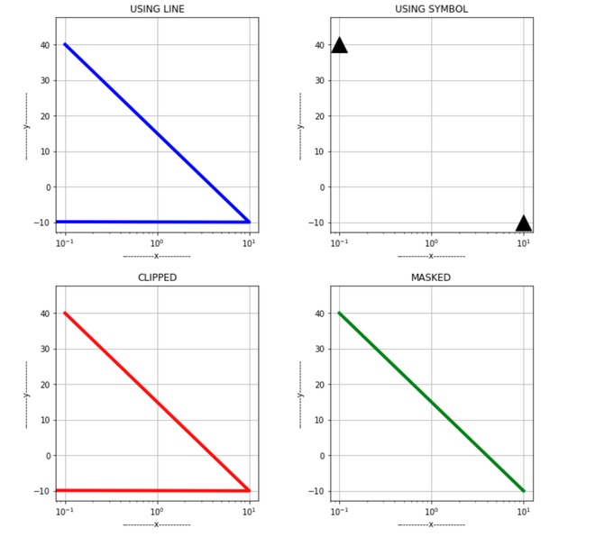
所有情節之間的差異。
示例6:使用nonposx參數。
遮罩會刪除無效值,而剪裁會將其設置為非常低的可能值。
下圖將更清楚地顯示裁剪和遮罩之間的區別。
Python3
# import required library
import matplotlib.pyplot as plt

fig, axes = plt.subplots(nrows = 1,
                         ncols = 2,
                         figsize = (15,9))
# Or equivalently,  "plt.tight_layout()"
fig.tight_layout()


# subplot 1
x1 = [-1, 2, 0,
      -3, 5, 9,
      10, -3, -8,
      15, 12, 0.1,0.9]

y1 = [5, -2, 0,
      10, 20, 30,
      25, 28, 16,
      25, 28, 3, 5]

plt.subplot(1,2,1)

# plotting the graph
plt.semilogx(x1, y1,
             marker = ".",
             markersize = 20,
             nonposx = "clip",
             color = "green" )

# set the y-axis label
plt.ylabel('---y---')

# set the x-axis label
plt.xlabel('---x---')

# set the title
plt.title('CLIP')

# plot with grid
plt.grid(True)


# subplot 2
x2 = [-1, 2, 0,
      -3, 5, 9,
      10, -3, -8,
      15, 12, 0.1, 0.9]

y2 = [5, -2, 0,
      10, 20, 30,
      25, 28, 16,
      25, 28, 3, 5]

plt.subplot(1,2,2)
plt.semilogx(x2, y2,
             nonposx = "mask",
             color ="green",
             linewidth = 4,
             marker = ".",
             markersize = 20)

# set the title
plt.title('MASK')

# set the y-axis label
plt.ylabel('---y---')

# set the x-axis label
plt.xlabel('---x---')

# plot with grid
plt.grid(True)

# show the plot
plt.show()
輸出:
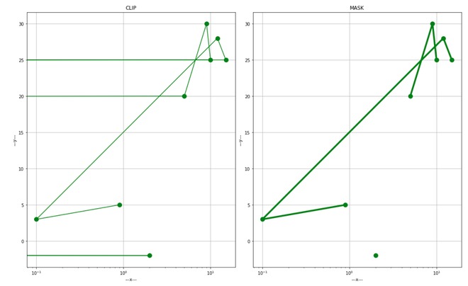
遮罩和夾子之間的區別
例7:更換底座。
可以根據方便設置底數,並且應該大於1才能滿足對數性質。
Python3
# importing the required libraries
import numpy as np
import matplotlib.pyplot as plt

# function that will
# ouput the values
def function(t):
    return np.exp(-t)*np.sin(2*np.pi.t)/2 + np.tan(t)

# define the x-axis values
t1 = np.arange(-0.01, 1.0, 0.08)
t2 = np.arange(0.0, 5.0, 0.02)


# subplot 1
plt.figure(figsize = (10,10))
plt.subplot(211)

# plot the graph
plt.semilogx(t1, f(t1),
             'bo', t2, f(t2),
             'k', color = "blue",
             basex = 3)
# set the title
plt.title("BASE:3")

# subplot 2
plt.subplot(212)

# plot the graph
plt.semilogx(t2, np.cos(2*np.pi*t2),
             'r--', color = "brown",
             linewidth = 2, basex = 4)

# set the title
plt.title("BASE:4")

# show the plot
plt.show()
輸出:
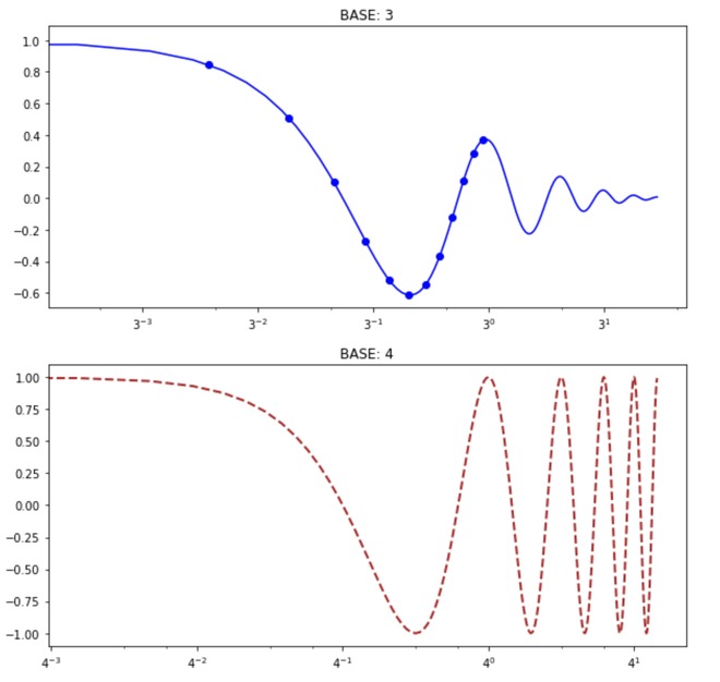
改變基礎
示例8:使用subsx參數。
指定X軸上的次要Xticks。默認情況下,它取決於圖中的幾十年數。
Python3
# import required library
import matplotlib.pyplot as plt

fig, axes = plt.subplots(nrows = 2,
                         ncols = 2,
                         figsize = (10,7))

# Or equivalently,  "plt.tight_layout()"
fig.tight_layout()

# subplot 1
plt.subplot(2, 2, 1)
x = [1, 11]
y = [4, 6]

# plot the graph
plt.semilogx(x, y, marker = ".",
             markersize = 20,
             color = "green")

# set the title
plt.title("Without subsx - line ")

# plot with grid
plt.grid(True)


# subplot 2
plt.subplot(2, 2, 2)
x = [1, 11]
y = [4, 6]

# plot the graph
plt.semilogx(x, y, subsx = [2, 3, 9, 10],
             marker = ".", markersize = 20,
             color = "green")

# set the title
plt.title("With subsx - line ")
plt.grid(True)


# subplot 3
plt.subplot(2, 2, 3)
x = [1, 11]
y = [4, 6]
plt.semilogx(x, y, 'g^', marker = ".",
             markersize = 20,
             color = "blue")
plt.title("Without subsx - symbol ")
plt.grid(True)


# subplot 4
plt.subplot(2, 2, 4)
x = [1, 11]
y = [4, 6]
plt.semilogx(x, y, 'g^', subsx=[2, 3, 9, 10],
             marker = ".", markersize = 20,
             color = "blue")
plt.title("With subsx - symbol ")
plt.grid(True)

plt.show()輸出:
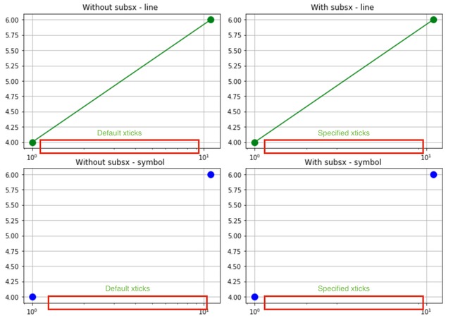
SUBSX參數
概要:
- X軸以對數方式繪製,並且可以通過定義basex屬性來指定基數。基數應大於1
- 如果繪製線,則默認情況下會裁剪負值或零值。
- mask屬性會刪除負值/零值,而clip屬性會將其設置為非常低的正值。
- 如果使用符號,則默認情況下會掩蓋負數/零。
- 半對數遵循plot()和matplotlib.axes.Axes.set_xscale()的所有參數。
- s參數定義次要提要。
注:本文由純淨天空篩選整理自2001guljain大神的英文原創作品 Matplotlib.pyplot.semilogx() in Python。非經特殊聲明,原始代碼版權歸原作者所有,本譯文未經允許或授權,請勿轉載或複製。