Matplotlib是用於數據可視化的最受歡迎的Python軟件包之一。它是一個cross-platform庫,用於根據數組中的數據製作2D圖。 Pyplot是使matplotlib像MATLAB一樣工作的命令樣式函數的集合。
matplotlib.pyplot.broken_barh()
broken_barh()函數用於繪製水平矩形序列。為xrange的每個組成部分繪製一個矩形,該矩形由一係列元組組成。所有矩形都具有相同的垂直位置,並以yrange為特征進行估計。
用法: matplotlib.pyplot.broken_barh(xranges, yrange, *, data=None, **kwargs)
參數:
- xranges:元組序列(xmin,xwidth)
每個元組給出矩形的位置(xmin)以及從該位置開始的水平擴展(xwidth)。 - yranges:(ymin,ymax)
在上述屬性中,ymin給出矩形的位置,ymax給出從ymin開始的垂直延伸。
返回值:
- BrokenBarHCollection:橫杠的集合,橫杠跨越yrange和一係列xrange。
舉例說明matplotlib.pyplot.broken_barh()函數如下:
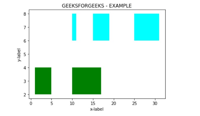
範例1:
# importing module
import matplotlib.pyplot as plt


# Adding title to the plot
plt.title('GEEKSFORGEEKS - EXAMPLE')

# adding x axis label to the plot
plt.xlabel('x-label')

# label for y axis  for the plot
plt.ylabel('y-label')

x_1 = [(1, 4), (10, 7)]
y_1 = (2, 2)

# Plotting the chart
plt.broken_barh(x_1, y_1, facecolors ='green')

x_2 = [(10, 1), (15, 4), (25, 6)]
y_2 = (6, 2)

# Plotting the chart
plt.broken_barh(x_2, y_2, facecolors ='cyan')

plt.show()
輸出:
範例2:
# importing module
import matplotlib.pyplot as plt


# Adding title to the plot
plt.title('GEEKSFORGEEKS - EXAMPLE')

# adding x axis label to the plot
plt.xlabel('Number of Cars')

# label for y axis  for the plot
plt.ylabel('Average Speed')

x_1 = [(10, 3), (15, 4)]
y_1 = (50, 10)

# Plotting the chart
plt.broken_barh(x_1, y_1, facecolors ='cyan')

x_2 = [(1, 4), (10, 1), (15, 4), (25, 6)]
y_2 = (70, 10)

# Plotting the chart
plt.broken_barh(x_2, y_2, facecolors ='green')

x_3 = [(5, 3), (11, 2), (18, 5)]
y_3 = (90, 10)

# Plotting the chart
plt.broken_barh(x_3, y_3, facecolors ='blue')

plt.show()
輸出:

相關用法
注:本文由純淨天空篩選整理自shardul_singh_tomar大神的英文原創作品 Matplotlib.pyplot.broken_barh() in Python。非經特殊聲明,原始代碼版權歸原作者所有,本譯文未經允許或授權,請勿轉載或複製。