直方圖是將數據集分成稱為M的小equal-sized個間隔,是可視化數據集頻率分布的最佳方法。 Numpy直方圖函數類似於hist()matplotlib庫的函數,唯一的區別是Numpy直方圖給出了數據集的數值表示,而hist()給出數據集的圖形表示。
創建數字直方圖
Numpy有內置numpy.histogram()函數以圖形形式表示數據分發的頻率。具有相等水平尺寸的矩形對應於稱為區間的類間隔,並且對應於頻率的可變高度。
用法:
numpy.histogram(data, bins=10, range=None, normed=None, weights=None, density=None)
上述函數的屬性如下:
| 屬性 | 參數 |
|---|---|
| data | 要繪製的數組或數組的序列 |
| bins | int或str序列定義一個範圍內的等寬框數,默認值為10 |
| range | 可選參數設置箱子的上下限 |
| normed | 與density屬性相同的可選參數,對於不等的箱寬給出錯誤的結果 |
| weights | 可選參數定義與數據具有相同維度的權重數組 |
| density | 可選參數,如果結果為假,則每個倉中包含樣本數;如果結果為真,則倉中包含概率密度函數 |
該函數具有兩個返回值hist,該值提供直方圖的值的數組,而edge_bin是浮點數據類型的數組,其中包含長度比hist長一的bin邊。
例:
# Import libraries
import numpy as np


# Creating dataset
a = np.random.randint(100, size =(50))

# Creating histogram
np.histogram(a, bins = [0, 10, 20, 30, 40,
                        50, 60, 70, 80, 90,
                        100])

hist, bins = np.histogram(a, bins = [0, 10,
                                     20, 30,
                                     40, 50,
                                     60, 70,
                                     80, 90,
                                     100])

# printing histogram
print()
print (hist)
print (bins)
print()
輸出:

圖示
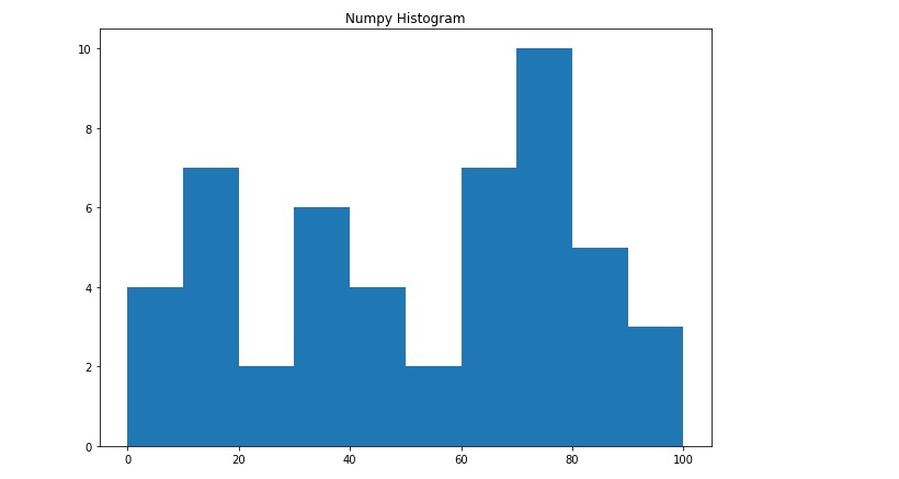
上麵的直方圖數字表示形式可以轉換為圖形形式。plt()函數存在於pyplotMatplotlib的子模塊將數據集數組和bin數組作為參數,並創建相應數據值的直方圖。
例:
# import libraries
from matplotlib import pyplot as plt
import numpy as np


# Creating dataset
a = np.random.randint(100, size =(50))

# Creating plot
fig = plt.figure(figsize =(10, 7))

plt.hist(a, bins = [0, 10, 20, 30,
                    40, 50, 60, 70,
                    80, 90, 100])

plt.title("Numpy Histogram")

# show plot
plt.show()
輸出:
相關用法
- Python next()用法及代碼示例
- Python set()用法及代碼示例
- Python os.dup()用法及代碼示例
- Python PIL composite()用法及代碼示例
- Python PyTorch abs()用法及代碼示例
- Python Pandas.cut()用法及代碼示例
- Python PIL blend()用法及代碼示例
- Python os.getenv()用法及代碼示例
- Python sympy.Pow()用法及代碼示例
- Python sympy.tan()用法及代碼示例
- Python turtle.pos()用法及代碼示例
- Python os.getpid()用法及代碼示例
- Python os.waitid()用法及代碼示例
- Python os.WIFEXITED()用法及代碼示例
- Python sympy.nP()用法及代碼示例
- Python sympy.ones()用法及代碼示例
- Python PIL BoxBlur()用法及代碼示例
- Python os.getcwdb()用法及代碼示例
注:本文由純淨天空篩選整理自jeeteshgavande30大神的英文原創作品 NumPy.histogram() Method in Python。非經特殊聲明,原始代碼版權歸原作者所有,本譯文未經允許或授權,請勿轉載或複製。