Matplotlib是Python中令人驚歎的可視化庫,用於二維陣列圖。 Matplotlib是一個基於NumPy數組的多平台數據可視化庫,旨在與更廣泛的SciPy堆棧配合使用。
Matplotlib.pyplot.title()
的title()matplotlib模塊中的method方法用於指定所描繪的可視化文件的標題,並使用各種屬性顯示標題。
用法: matplotlib.pyplot.title(label, fontdict=None, loc=’center’, pad=None, **kwargs)
參數:
-
label(str):此參數指的是所描述可視化的實際標題文本字符串。 -
fontdict(dict):此參數使用字典控製文本的外觀,例如文本大小,文本對齊方式等。下麵是默認的fontdict:fontdict = {‘fontsize’:rcParams [‘axes.titlesize’],
‘fontweight’:rcParams [‘axes.titleweight’],
‘verticalalignment’:‘baseline’,
‘horizontalalignment’:loc} -
loc(str):此參數表示標題的位置,采用字符串值,例如'center','left'和'right'。 -
pad(float):此參數指的是標題距軸頂部的偏移量(以磅為單位)。其默認值為“無”。 -
**kwargs:此參數是指使用其他關鍵字參數作為文本屬性,例如
color,fonstyle,linespacing,backgroundcolor,rotation等等
返回類型:的title()方法返回一個表示標題文本本身的字符串。
以下是一些示例以說明title()方法:
範例1:使用matplotlib.pyplot描繪線性圖並使用顯示其標題matplotlib.pyplot.title()。
# importing module
import matplotlib.pyplot as plt


# assigning x and y coordinates
y = [0,1,2,3,4,5]
x= [0,5,10,15,20,25]

# depicting the visualization
plt.plot(x, y, color='green')
plt.xlabel('x')
plt.ylabel('y')

# displaying the title
plt.title("Linear graph")

plt.show()
輸出:
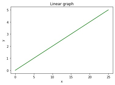
在以上示例中,僅label參數在中被分配為“Linear graph”title()方法和其他參數被分配為其默認值。的分配label參數是顯示可視化標題的最低要求。
範例2:使用matplotlib.pyplot描繪ReLU函數圖並使用顯示其標題matplotlib.pyplot.title()。
# importing module
import matplotlib.pyplot as plt


# assigning x and y coordinates
x = [-5,-4,-3,-2,-1,0,1,2, 3, 4, 5]
y = []

for i in range(len(x)):
    y.append(max(0,x[i]))

# depicting the visualization
plt.plot(x, y, color='green')
plt.xlabel('x')
plt.ylabel('y')

# displaying the title
plt.title(label="ReLU function graph",
          fontsize=40,
          color="green")
輸出:
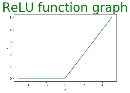
上麵的程序說明了label參數fontsize的關鍵fontdict論點和color參數是一個額外的參數(由於**kwargs),以更改文本的顏色。
範例3:使用matplotlib.pyplot描繪條形圖並使用顯示其標題matplotlib.pyplot.title()。
# importing modules
import matplotlib.pyplot as plt
import numpy as np

# assigning x and y coordinates
language = ['C','C++','Java','Python']
users = [80,60,130,150]

# depicting the visualization
index = np.arange(len(language))
plt.bar(index, users, color='green')
plt.xlabel('Users')
plt.ylabel('Language')
plt.xticks(index, language)

# displaying the title
plt.title(label='Number of Users of a particular Language',
          fontweight=10,
          pad='2.0')
輸出:
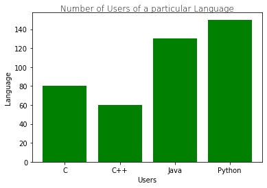
在這裏fontweight的關鍵fontdict論點和pad參數用於title()方法以及label參數。
範例4:使用matplotlib.pyplot描繪餅圖並使用顯示其標題matplotlib.pyplot.title()。
# importing modules
from matplotlib import pyplot as plt

# assigning x and y coordinates
foodPreferance = ['Vegetarian', 'Non Vegetarian',
                  'Vegan', 'Eggitarian']

consumers = [30,100,10,60]

# depicting the visualization
fig = plt.figure()
ax = fig.add_axes([0,0,1,1])
ax.axis('equal')
ax.pie(consumers, labels = foodPreferance,
       autopct='%1.2f%%')

# displaying the title
plt.title(label="Society Food Preferance",
          loc="left",
          fontstyle='italic')
輸出:
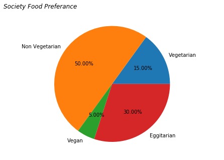
在上麵的餅圖數據可視化中,label,fontweight
關鍵字來自fontdict和fontstyle(**kwargs)arguments(采用字符串值,例如'italic','bold'和'oblique')用於title()顯示餅圖標題的方法。
範例5:使用matplotlib.pyplot可視化圖形中的信號並使用顯示其標題matplotlib.pyplot.title()。
# importing modules
from matplotlib import pyplot
import numpy

# assigning time values of the signal
# initial time period, final time period
# and phase angle
signalTime = numpy.arange(0, 100, 0.5);

# getting the amplitude of the signal
signalAmplitude = numpy.sin(signalTime)

# depicting the visualization
pyplot.plot(signalTime, signalAmplitude, color ='green')

pyplot.xlabel('Time')
pyplot.ylabel('Amplitude')

# displaying the title
pyplot.title("Signal",
             loc='right',
             rotation=45)
輸出:
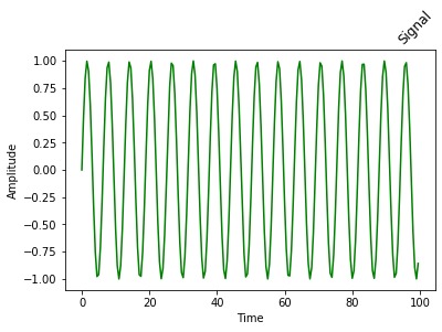
在這裏label參數分配給'signal',loc參數分配給'right'和rotation論點(**kwargs以度為單位的角度值的)被指定為45度。
範例6:使用matplotlib.pyplot顯示圖像並使用顯示標題matplotlib.pyplot.title()。
# importing modules
from PIL import ImageTk, Image
from matplotlib import pyplot as plt

# depicting the visualization
testImage = Image.open('g4g.png')

# displaying the title
plt.title("Geeks 4 Geeks",
          fontsize='20',
          backgroundcolor='green',
          color='white')
plt.imshow(testImage)
輸出:
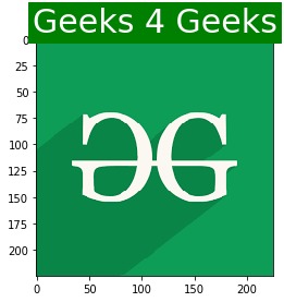
在上麵的示例中,使用title()有參數的方法label如"Geeks 4 Geeks",fontsize來自的關鍵fontdict如'20',backgroundcolor和color是具有字符串值的額外參數'green'和'white'分別。
相關用法
注:本文由純淨天空篩選整理自RITURAJSAHA大神的英文原創作品 Matplotlib.pyplot.title() in Python。非經特殊聲明,原始代碼版權歸原作者所有,本譯文未經允許或授權,請勿轉載或複製。