Matplotlib是用於數據可視化的最受歡迎的Python軟件包之一。它是一個cross-platform庫,用於根據數組中的數據製作2D圖。 Pyplot是使matplotlib像MATLAB一樣工作的命令樣式函數的集合。每個pyplot函數都會對圖形進行一些更改:例如,創建圖形,在圖形中創建繪圖區域,在繪圖區域中繪製一些線條,用標簽裝飾繪圖等。
Matplotlib.pyplot.legend()
圖例是描述圖形元素的區域。在matplotlib庫中,有一個名為legend()的函數,該函數用於在軸上放置圖例。
屬性Loc inlegend()用於指定圖例的位置。loc的默認值為loc =“ best”(左上方)。字符串“左上方”,“右上方”,“左下方”,“右下方”將圖例放置在軸/圖形的相應角上。
legend()函數的屬性bbox_to_anchor =(x,y)用於指定圖例的坐標,屬性ncol表示圖例具有的列數。默認值為1。
用法:
matplotlib.pyplot.legend([“blue”, “green”], bbox_to_anchor=(0.75, 1.15), ncol=2)
以下是函數的更多屬性legend():
- shadow:[None or bool]是否在圖例後麵繪製陰影。默認值為“無”。
- markerscale:[無,整數或浮點型]圖例標記與原始繪製標記的相對大小。默認值為無。
- numpoints:[無或整數]為Line2D(線)創建圖例條目時,圖例中標記點的數量。默認值為無。
- fontsize:圖例的字體大小。如果值為數字,則該大小將是絕對字體大小(以磅為單位)。
- facecolor:[無,或“inherit”或顏色]圖例的背景顏色。
- edgecolor:[無,或“inherit”或顏色]圖例的背景色塊邊顏色。
在Python中使用legend()函數的方法-
範例1:
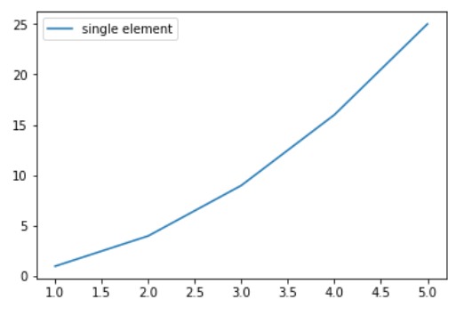
import numpy as np
import matplotlib.pyplot as plt

# X-axis values
x = [1, 2, 3, 4, 5]

# Y-axis values
y = [1, 4, 9, 16, 25]

# Function to plot
plt.plot(x, y)

# Function add a legend
plt.legend(['single element'])

# function to show the plot
plt.show()
輸出:
範例2:
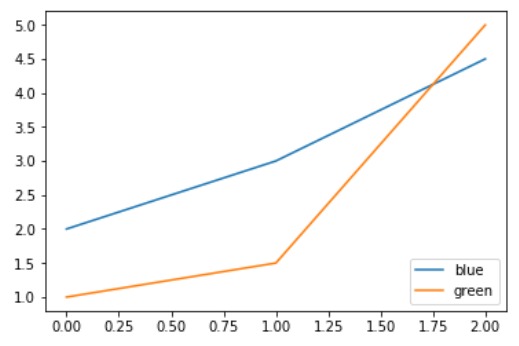
# importing modules
import numpy as np
import matplotlib.pyplot as plt

# Y-axis values
y1 = [2, 3, 4.5]

# Y-axis values
y2 = [1, 1.5, 5]

# Function to plot
plt.plot(y1)
plt.plot(y2)

# Function add a legend
plt.legend(["blue", "green"], loc ="lower right")

# function to show the plot
plt.show()
輸出:
範例3:
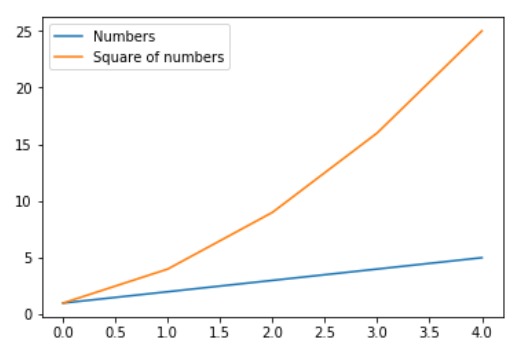
import numpy as np
import matplotlib.pyplot as plt

# X-axis values
x = np.arange(5)

# Y-axis values
y1 = [1, 2, 3, 4, 5]

# Y-axis values
y2 = [1, 4, 9, 16, 25]

# Function to plot
plt.plot(x, y1, label ='Numbers')
plt.plot(x, y2, label ='Square of numbers')

# Function add a legend
plt.legend()

# function to show the plot
plt.show()
輸出:
範例4:
import numpy as np
import matplotlib.pyplot as plt

x = np.linspace(0, 10, 1000)
fig, ax = plt.subplots()

ax.plot(x, np.sin(x), '--b', label ='Sine')
ax.plot(x, np.cos(x), c ='r', label ='Cosine')
ax.axis('equal')

leg = ax.legend(loc ="lower left");
輸出:

範例5:
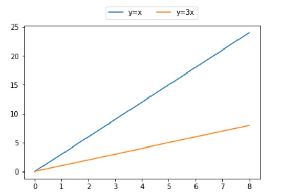
# importing modules
import numpy as np
import matplotlib.pyplot as plt

# X-axis values
x = [0, 1, 2, 3, 4, 5, 6, 7, 8]

# Y-axis values
y1 = [0, 3, 6, 9, 12, 15, 18, 21, 24]
# Y-axis values
y2 = [0, 1, 2, 3, 4, 5, 6, 7, 8]

# Function to plot
plt.plot(y1, label ="y = x")
plt.plot(y2, label ="y = 3x")

# Function add a legend
plt.legend(bbox_to_anchor =(0.75, 1.15), ncol = 2)

# function to show the plot
plt.show()
輸出:
相關用法
注:本文由純淨天空篩選整理自shardul_singh_tomar大神的英文原創作品 Matplotlib.pyplot.legend() in Python。非經特殊聲明,原始代碼版權歸原作者所有,本譯文未經允許或授權,請勿轉載或複製。