顏色條是從標量值到顏色的映射的可視化。在Matplotlib中,它們被繪製到專用軸中。
注意:通常通過Figure.colorbar或其pyplot包裝器pyplot.colorbar創建顏色條,該內部使用make_axes和Colorbar。作為end-user,您很可能不必調用該方法或顯式實例化此模塊中的類。
python中的matplotlib.pyplot.colorbar()
matplotlib的pyplot模塊中的colorbar()函數將色條添加到指示色標的圖。
用法:matplotlib.pyplot.colorbar(mappable=None, cax=None, ax=None, **kwarg)
參數:
ax:此參數是可選參數,它包含軸或軸列表。
** kwarg(關鍵字參數):此參數是可選參數,有兩種:
colorbar properties:
extend:{‘neither’, ‘both’,‘min’, ‘max’}的尖頭超出範圍
值。
label:彩條的長軸上的標簽。
刻度:沒有或沒有刻度或定位器列表。
返回值:colorbar是“ matplotlib.colorbar.Colorbar”類的實例。
以下示例說明了matplotlib.pyplot中的matplotlib.pyplot.colorbar()函數:
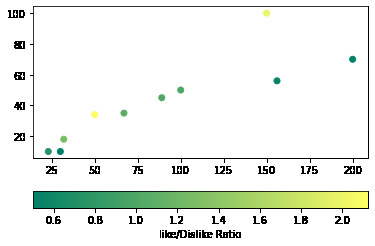
範例1:向散點圖添加水平色條。
Python3
# Python Program illustrating
# pyplot.colorbar() method
import numpy as np
import matplotlib.pyplot as plt

# Dataset
# List of total number of items purchased
# from each products
purchaseCount = [100, 200, 150, 23, 30, 50,
                 156, 32, 67, 89]

# List of total likes of 10 products
likes = [50, 70, 100, 10, 10, 34, 56, 18, 35, 45]

# List of Like/Dislike ratio of 10 products
ratio = [1, 0.53, 2, 0.76, 0.5, 2.125, 0.56,
         1.28, 1.09, 1.02]

# scatterplot
plt.scatter(x=purchaseCount, y=likes, c=ratio, cmap="summer")

plt.colorbar(label="Like/Dislike Ratio", orientation="horizontal")
plt.show()
輸出:
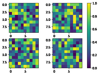
範例2:向多個子圖添加單個顏色條。
Python3
# Python Program illustrating
# pyplot.colorbar() method
import matplotlib.pyplot as plt

# creates four Axes
fig, axes = plt.subplots(nrows=2, ncols=2)

for ax in axes.flat:
    im = ax.imshow(np.random.random((10, 10)), vmin=0, vmax=1)

plt.colorbar(im, ax=axes.ravel().tolist())

plt.show()
輸出:
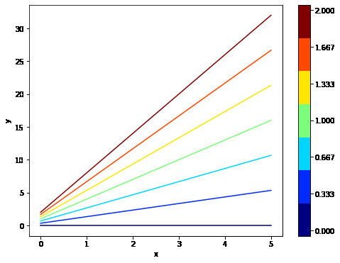
範例3:向非映射對象添加顏色條。
Python3
# Python Program illustrating
# pyplot.colorbar() method
import numpy as np
import matplotlib as mpl
import matplotlib.pyplot as plt

x = np.linspace(0, 5, 100)
N = 7

# colormap
cmap = plt.get_cmap('jet', N)

fig, ax1 = plt.subplots(1, 1, figsize=(8, 6))

for i, n in enumerate(np.linspace(0, 2, N)):
    y = x*i+n
    ax1.plot(x, y, c=cmap(i))

plt.xlabel('x-axis')
plt.ylabel('y-axis')

# Normalizer
norm = mpl.colors.Normalize(vmin=0, vmax=2)

# creating ScalarMappable
sm = plt.cm.ScalarMappable(cmap=cmap, norm=norm)
sm.set_array([])

plt.colorbar(sm, ticks=np.linspace(0, 2, N))


plt.show()
輸出:
相關用法
- Python Wand function()用法及代碼示例
- Python Sorted()用法及代碼示例
- Python Numbers choice()用法及代碼示例
- Python Tkinter askopenfile()用法及代碼示例
- Python ord()用法及代碼示例
- Python round()用法及代碼示例
- Python id()用法及代碼示例
注:本文由純淨天空篩選整理自ranjithamva大神的英文原創作品 Matplotlib.pyplot.colorbar() function in Python。非經特殊聲明,原始代碼版權歸原作者所有,本譯文未經允許或授權,請勿轉載或複製。