Matplotlib是Python中的一個庫,它是數字的-NumPy庫的數學擴展。 Pyplot是Matplotlib模塊的基於狀態的接口,該模塊提供了MATLAB-like接口。在Pyplot中可以使用各種圖,例如線圖,輪廓圖,直方圖,散點圖,3D圖等。
matplotlib.pyplot.cohere()函數:
matplotlib庫的pyplot模塊中的cohere()函數用於繪製x和y之間的相幹性。相幹性是歸一化的交叉頻譜密度。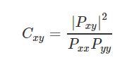
用法: matplotlib.pyplot.cohere(x, y, NFFT=256, Fs=2, Fc=0, detrend=, window=, noverlap=0, pad_to=None, sides=’default’, scale_by_freq=None, *, data=None, **kwargs)
參數:此方法接受以下描述的參數:
- x, y:這些參數是數據序列。
- Fs:此參數是標量。默認值為2。
- window:此參數將數據段作為參數,並返回該段的窗口版本。其默認值為window_hanning()
- sides:此參數指定要返回頻譜的哪一側。它可以具有以下值:‘default’,‘onesided’和‘twosided’。
- pad_to:此參數包含填充數據段的整數值。
- Fc:此參數還包含一個整數值,用於抵消曲線圖的x範圍以反映頻率範圍。其默認值為0
- NFFT:此參數包含每個塊中用於FFT的數據點數。
- detrend:此參數包含應用於fft-ing之前的每個段的函數,旨在刪除均值或線性趨勢{‘none’,‘mean’,‘linear’}。
- scale_by_freq:該參數允許對返回的頻率值進行積分。
- noverlap:此參數是塊之間的重疊點數。
- Fc:此參數是x的中心頻率。
返回值:這將返回以下內容:
- Cxy:這將返回相幹矢量。
- freqs:這將返回Cxy中元素的頻率。
結果是(Cxy,freqs)
以下示例說明了matplotlib.axes中的matplotlib.pyplot.figure()函數:
範例1:
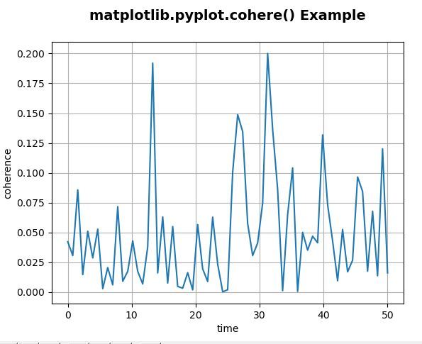
# Implementation of matplotlib function
import numpy as np
import matplotlib.pyplot as plt

dt = 0.01
t = np.arange(0, 30, dt)
nse1 = np.random.randn(len(t))
nse2 = np.random.randn(len(t))

s1 = 1.5 * np.sin(2 * np.pi * 10 * t) + nse1
s2 = np.cos(np.pi * t) + nse2

plt.cohere(s1, s2**2, 128, 1./dt)
plt.xlabel('time')
plt.ylabel('coherence')
plt.title('matplotlib.pyplot.cohere() Example\n',
               fontsize = 14, fontweight ='bold')
plt.show()
輸出:
示例2:
# Implementation of matplotlib function
import numpy as np
import matplotlib.pyplot as plt

dt = 0.01
t = np.arange(0, 30, dt)
nse1 = np.random.randn(len(t))
nse2 = np.random.randn(len(t))
r = np.exp(-t / 0.05)

cnse1 = np.convolve(nse1, r, mode ='same')*dt
cnse2 = np.convolve(nse2, r, mode ='same')*dt

s1 = 1.5 * np.sin(2 * np.pi * 10 * t) + cnse1
s2 = np.cos(np.pi * t) + cnse2 + np.sin(2 * np.pi * 10 * t)

fig, [ax1, ax2] = plt.subplots(2, 1)
ax1.set_title('matplotlib.pyplot.cohere() Example\n',
                    fontsize = 14, fontweight ='bold')

ax1.plot(t, s1, t, s2)
ax1.set_xlim(0, 5)
ax1.set_xlabel('time')
ax1.set_ylabel('s1 and s2')
ax1.grid(True)

ax2.cohere(s1, s2, 256, 1./dt)
ax2.set_ylabel('coherence')
plt.show()
輸出:

相關用法
注:本文由純淨天空篩選整理自SHUBHAMSINGH10大神的英文原創作品 matplotlib.pyplot.cohere() in Python。非經特殊聲明,原始代碼版權歸原作者所有,本譯文未經允許或授權,請勿轉載或複製。