Matplotlib是一個非常強大的繪圖庫,對於使用Python和NumPy的人很有用。為了產生統計幹擾,非常有必要可視化我們的數據,而Matplotlib是為此目的非常有用的工具。它提供類似於MATLAB的接口,唯一的區別是它使用Python並且是開源的。
matplotlib.pyplot.arrow()
此函數根據傳遞給它的坐標將箭頭添加到圖形中。
用法: matplotlib.pyplot.arrow(x, y, dx, dy, **kwargs)
參數:
x, y:箭頭基準的x和y坐標。
dx, dy:箭頭沿x和y方向的長度。
**kwargs:有助於為箭頭添加屬性的可選參數,例如
為箭頭添加顏色,更改箭頭的寬度
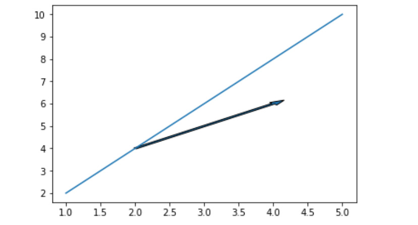
例子1
import matplotlib.pyplot as plt


# Initilaizing values
# of x and y
x =[1, 2, 3, 4, 5]
y =[2, 4, 6, 8, 10]

# Plotting the graph
plt.plot(x, y)

# Adding an arrow to graph starting
# from the base (2, 4) and with the
# length of 2 units from both x and y
# And setting the width of arrow for
# better visualization
plt.arrow(2, 4, 2, 2, width = 0.05)

# Showing the graph
plt.show()
輸出:
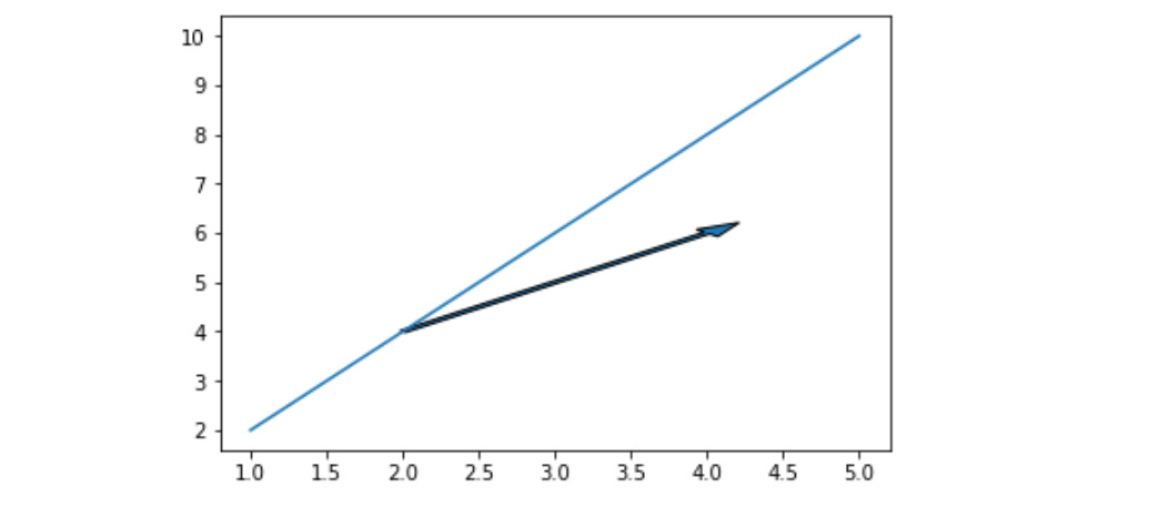
示例2#
import matplotlib.pyplot as plt


x =[1, 2, 3, 4, 5]
y =[2, 4, 6, 8, 10]

plt.plot(x, y)

# Increasing head_width of
# the arrow by setting
# head_width parameter
plt.arrow(2, 4, 2, 2,
          head_width = 0.2,
          width = 0.05)

plt.show()
輸出:
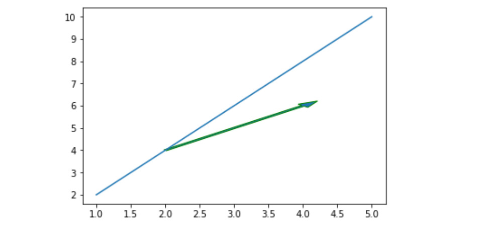
例子#3
import matplotlib.pyplot as plt


x =[1, 2, 3, 4, 5]
y =[2, 4, 6, 8, 10]
plt.plot(x, y)

# changing the edge color
# to green
plt.arrow(2, 4, 2, 2,
          head_width = 0.2,
          width = 0.05,
          ec ='green')

plt.show()
輸出:
注:本文由純淨天空篩選整理自sathvik chiramana大神的英文原創作品 matplotlib.pyplot.arrow() in Python。非經特殊聲明,原始代碼版權歸原作者所有,本譯文未經允許或授權,請勿轉載或複製。