Matplotlib是Python中令人驚歎的可視化庫,用於二維陣列圖。 Matplotlib是一個基於NumPy數組的多平台數據可視化庫,旨在與更廣泛的SciPy堆棧配合使用。
matplotlib.colors.from_levels_and_colors()
的matplotlib.colors.from_levels_and_colors()函數是一個輔助函數,可以幫助創建cmap和norm實例,其行為類似於Contourf的level和colors參數的行為。
用法: matplotlib.colors.from_levels_and_colors(levels, colors, extend=’neither’)
參數:
- levels:它是一個數字序列,代表用於構造BoundaryNorm的量化級別。如果lev [k] <= v <lev [k + 1],則將值v量化為級別k。
- colors:它是一係列顏色,用作每個級別的填充顏色。如果擴展名為“neither”,則必須為n_level-1種顏色。為“min”或“max”的擴展添加一種額外的顏色,為“both”的擴展添加兩種顏色。
- extend:它是一個可選參數,接受四個值之一,即‘neither’,‘min’,‘max’或‘both’。
返回類型:此函數返回規範化的cmap和colormap規範
範例1:
import numpy as np
import matplotlib.pyplot as plt
import matplotlib.colors
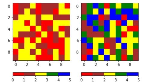
data1 = 3 * np.random.random((10, 10))
data2 = 5 * np.random.random((10, 10))
levels = [0, 1, 2, 3, 4, 5]
colors = ['red', 'brown',
'yellow', 'green',
'blue']
cmap, norm = matplotlib.colors.from_levels_and_colors(levels,
colors)
fig, axes = plt.subplots(ncols = 2)
for ax, dat in zip(axes, [data1, data2]):
im = ax.imshow(dat,
cmap = cmap,
norm = norm,
interpolation ='none')
fig.colorbar(im, ax = ax, orientation ='horizontal')
plt.show()輸出:
範例2:
import numpy as np
import matplotlib.pyplot as plt
from matplotlib.colors import from_levels_and_colors
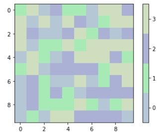
nvals = np.random.randint(2, 20)
data = np.random.randint(0, nvals,
(10, 10))
colors = np.random.random((nvals, 3))
# Make the colors pastels...
colors = colors / 2.5 + 0.55
levels = np.arange(nvals + 1) - 0.5
cmap, norm = from_levels_and_colors(levels,
colors)
fig, ax = plt.subplots()
im = ax.imshow(data,
interpolation ='nearest',
cmap = cmap,
norm = norm)
fig.colorbar(im, ticks = np.arange(nvals))
plt.show()輸出:
相關用法
注:本文由純淨天空篩選整理自RajuKumar19大神的英文原創作品 Matplotlib.colors.from_levels_and_colors() in Python。非經特殊聲明,原始代碼版權歸原作者所有,本譯文未經允許或授權,請勿轉載或複製。