repeating-radial-gradient()函數是CSS中的內置函數,用於重複徑向漸變。
用法:
background-image:repeating-radial-gradient(shape size at position,
start-color, ..., last-color);
參數:此函數接受以下列出的許多參數:
- shape:此參數用於定義漸變的形狀。它有兩個可能的值圓形或橢圓形。默認形狀值為橢圓。
- size:此參數用於定義漸變的大小。可能的值為:farthest-corner(默認值),closest-side,closest-corner,farthest-side。
- position:此參數用於定義漸變的位置。默認值為center。
- start-color,…,last-color:此參數用於保留顏色值及其後的可選停止位置。
以下示例說明了CSS中的repeating-radial-gradient()函數:
例:
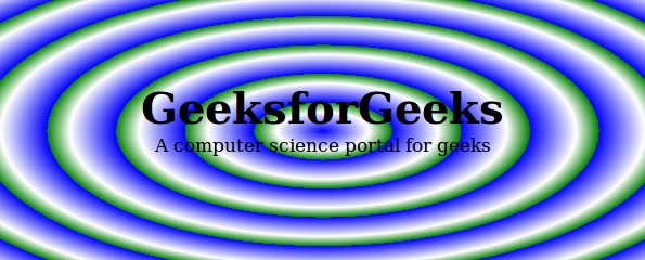
<!DOCTYPE html>
<html>
    <head>
        <title>CSS Gradients</title>
        <style>
            #main {
                height:250px;
                width:600px;
                background-color:white;
                background-image:repeating-radial-gradient(blue,
                white 10%, green 15%)
            }
            .gfg {
                text-align:center;
                font-size:40px;
                font-weight:bold;
                padding-top:80px;
            }
            .geeks {
                font-size:17px;
                text-align:center;
            }
        </style>
    </head>
    <body>
        <div id="main">
            <div class = "gfg">GeeksforGeeks</div>
            <div class = "geeks">A computer science portal for geeks</div>
        </div>
    </body>
</html>
輸出:
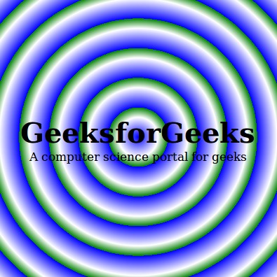
範例2:
<!DOCTYPE html>
<html>
    <head>
        <title>CSS Gradients</title>
        <style>
            #main {
                height:400px;
                width:400px;
                background-color:white;
                background-image:repeating-radial-gradient(circle,
                blue, white 10%, green 15%)
            }
            .gfg {
                text-align:center;
                font-size:40px;
                font-weight:bold;
                padding-top:170px;
            }
            .geeks {
                font-size:17px;
                text-align:center;
            }
        </style>
    </head>
    <body>
        <div id="main">
            <div class = "gfg">GeeksforGeeks</div>
            <div class = "geeks">A computer science portal for geeks</div>
        </div>
    </body>
</html>
輸出:
相關用法
- PHP pi( )用法及代碼示例
- PHP max( )用法及代碼示例
- PHP dir()用法及代碼示例
- CSS url()用法及代碼示例
- d3.js d3.min()用法及代碼示例
- d3.js d3.hsl()用法及代碼示例
- d3.js d3.rgb()用法及代碼示例
- CSS rgb()用法及代碼示例
- PHP Ds\Map xor()用法及代碼示例
- PHP Ds\Map put()用法及代碼示例
- PHP pow( )用法及代碼示例
- PHP end()用法及代碼示例
注:本文由純淨天空篩選整理自Mahadev99大神的英文原創作品 CSS | repeating-radial-gradient() Function。非經特殊聲明,原始代碼版權歸原作者所有,本譯文未經允許或授權,請勿轉載或複製。